By Andy Woodruff on 15 February 2018
Just a map for fun, made without writing any code, which is a nice change of pace.
I finally spent a bit of time catching up with the great Daniel Huffman’s excellent tutorial on creating shaded relief maps with Blender. Do try it out if you haven’t; he’s written it up thoroughly and helpfully, showing and explaining why Blender is good for this purpose. I’ll wait here while you read through it.
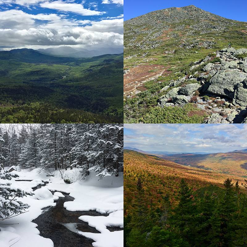
The White Mountains of New Hampshire provide the setting for my attempts. This is where we go from Boston for good hiking and other outdoor activities. My significant other has gotten me into enjoying the area in all seasons. Mostly we do big hikes up various mountains, but she’s even persuaded me to try skiing for the first time in my life soon.
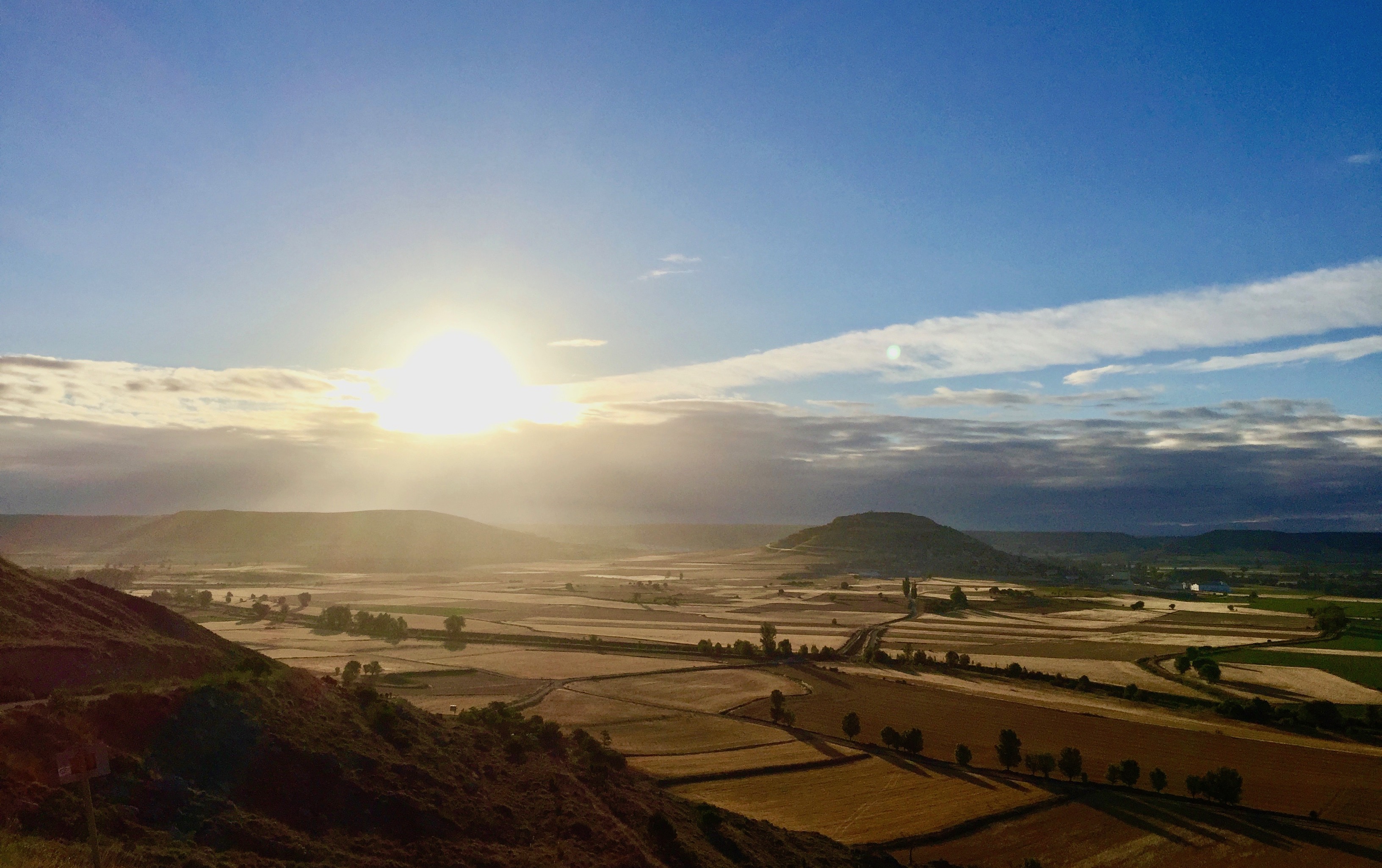
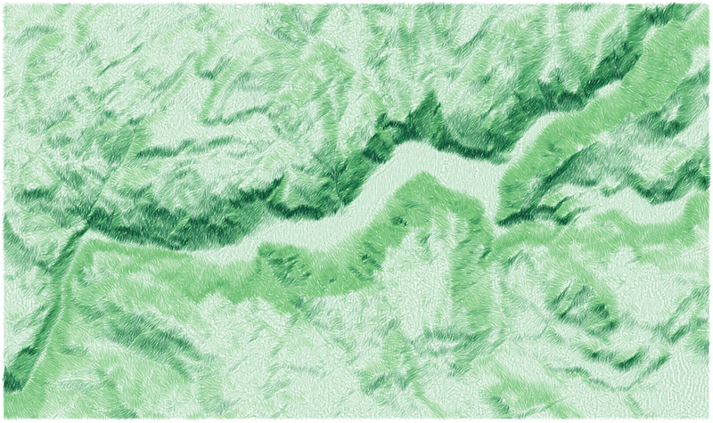
Anyway, an idea came up of making a shaded relief map of the White Mountains in each of the four seasons. Here’s what I’ve got so far. (Click/tap for big version that’s like 27 MB.)

This is a combination of elevation and blurred land cover data, plus TIGER/Line water polygons. Spring, summer, and autumn all use the same hillshade, but winter’s different, having a lower and weaker sun. Besides that, it’s a bunch of Photoshopping to try to evoke the look and feel of each season.
Summer (top right) is probably the most straightforward, with the land cover layer mostly left alone. Green areas are a bit yellow, an attempt at a kind of warm, dry look. Spring (top left) colors are little cooler and brighter, but only at lower elevations. Deciduous forests up higher are still bare, and there’s even still some snow on the higher peaks. Later, in autumn (bottom right), I made a splotchy texture of greens, yellows, oranges, reds, and browns to suggest the lovely fall colors of the region. In winter (bottom left) I really went for it on the lighting. As mentioned earlier, the rendered relief has a low sun. Shadows have a lot more blue than the other seasons, and highlights are warmer, as though the sun were setting. And, of course, there’s snow. In reality the whole region would be snowy, but I liked having some variety, so the lower parts are bare, except evergreen forests. Evergreens, of course are the only thing that’s green across all four maps—not that I was consistent in their color.
Technical tricks are probably not really worth getting into here because I’m not much of an expert. Most of the things I’ve tried involve Photoshop adjustment layers and layer masks based on elevation and/or the shaded relief itself. When the shadow and highlight layers are cranked up to 11 on the winter map, for instance, you can see how the areas to which they apply are based on both lighting and elevation. Daniel Huffman also has some related tips (and many more) in his article on terrain in Photoshop.
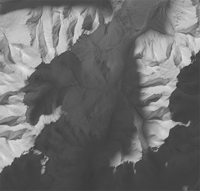
The winter map especially showed me how nice Blender is for shaded relief. As you’ll hear from Daniel, it’s 3D modeling software that renders realistic lighting and shadows. When the light source is low, as in my winter map, you can really see how shadows behave like actual shadows. For example, notice how the Presidential Range (left, below) casts a shadow onto the other side of the valley. A more typical hillshade doesn’t really model shadows but rather shades the left side the of valley (facing away from the light source) dark and the right side light.
Anyway, I’ll probably keep messing around with these maps forever, and try to make a real map with labels and everything. Meanwhile, I’ll also keep visiting the White Mountains frequently!
| Comments Off on Seasonal relief
By Andy Woodruff on 8 January 2018
Back in October in Montréal I finished my term on the NACIS board of directors at the annual conference. (Side note: see video of the conference talks!) Tanya Buckingham (recent NACIS executive director, current candidate for local office) has always kindly handed out thank-you gifts to people who help with the meeting; this time it was a lovely “Maps” notebook, in which I’ve vowed to work on hand-drawn cartography skills.
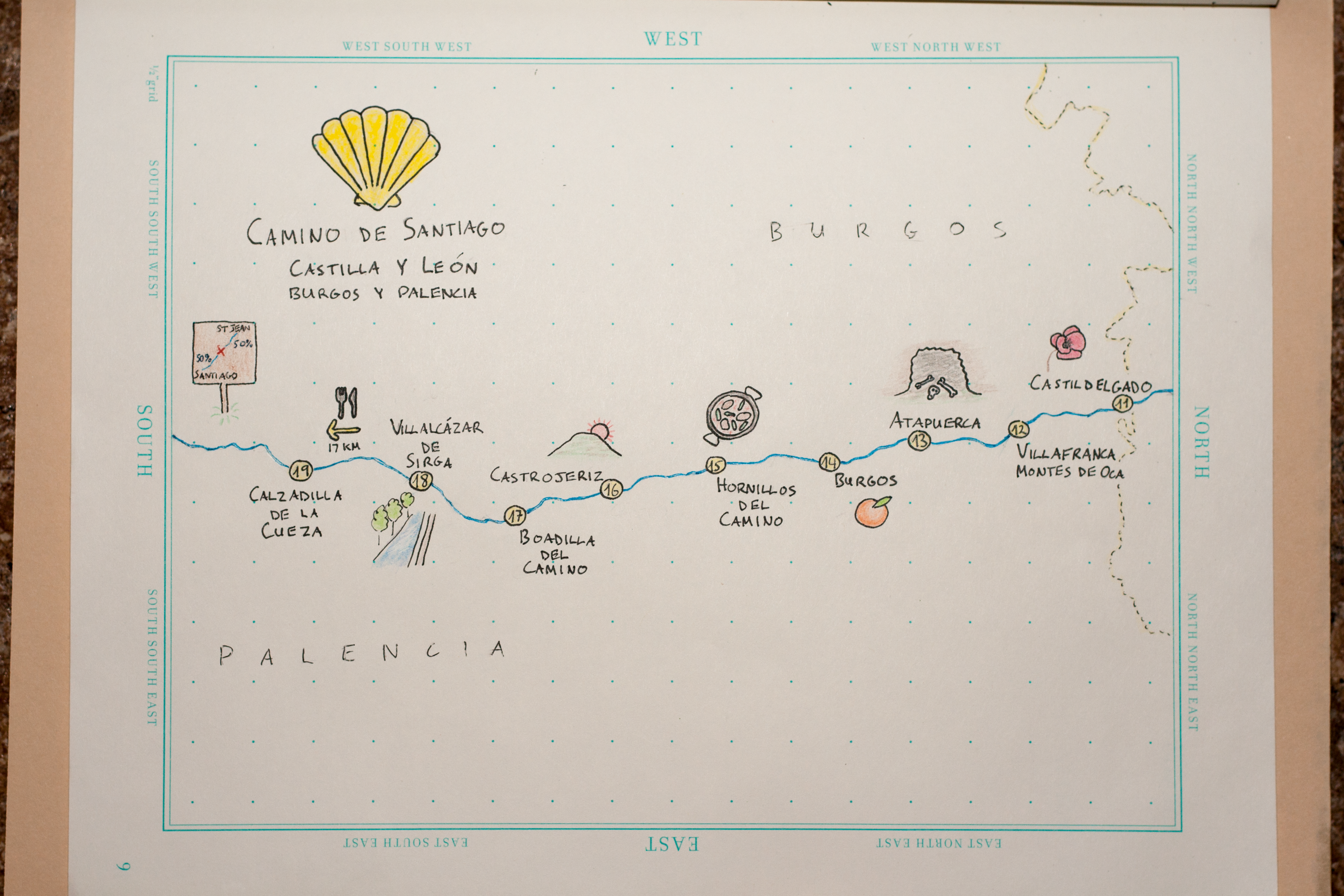
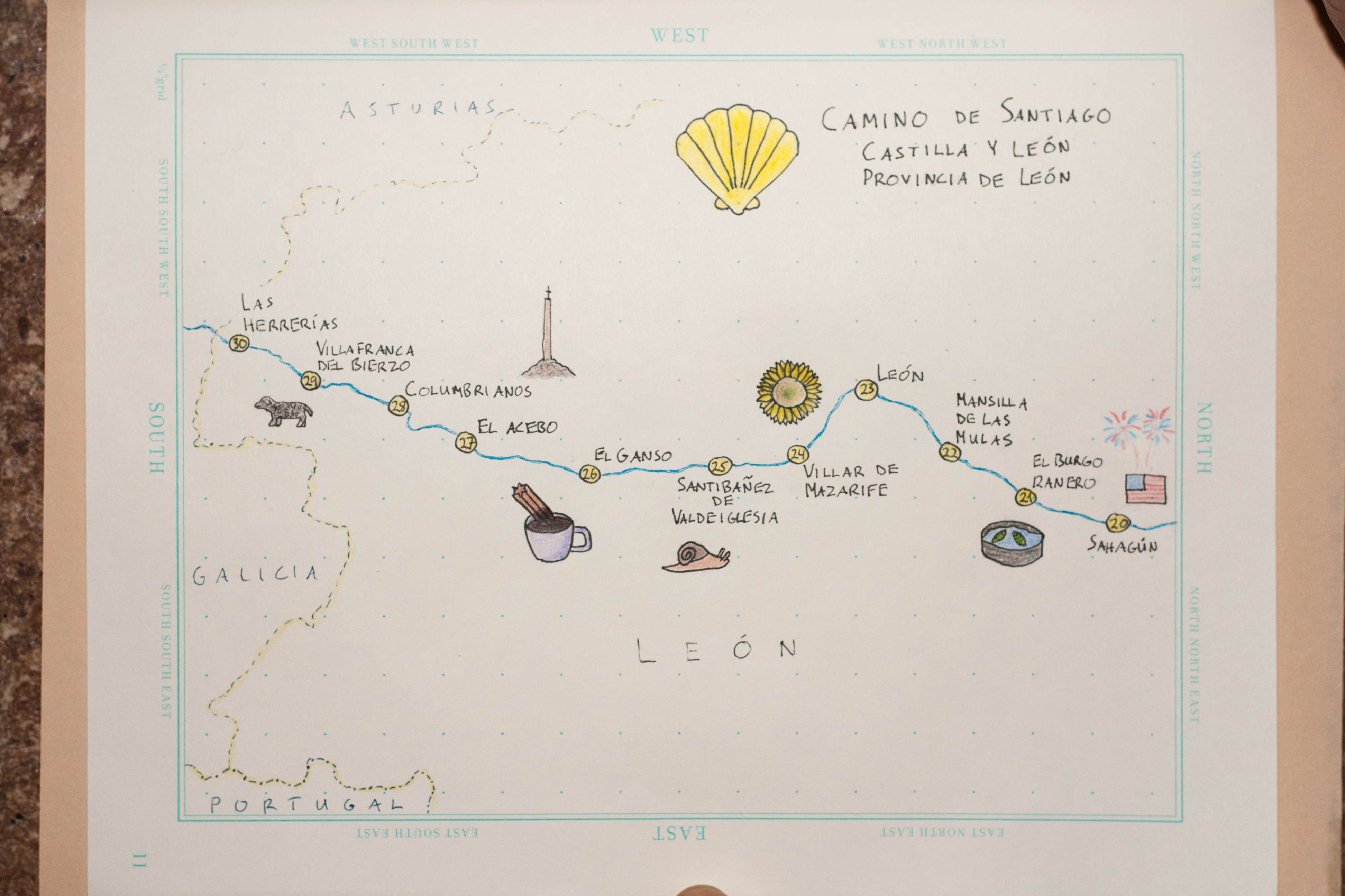
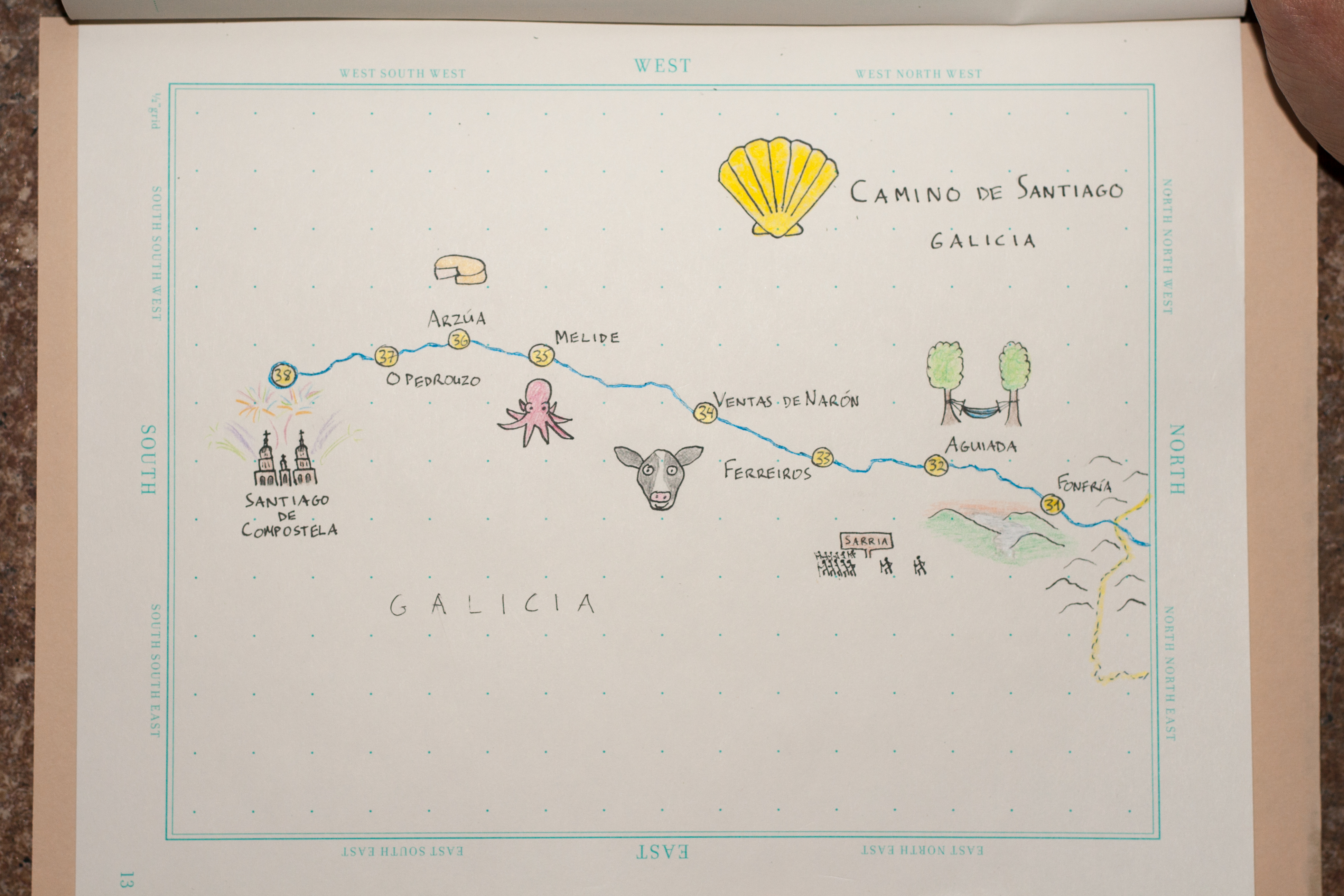
The pages are mostly empty still, but they’ve got a handful of sketches mapping a summer highlight: walking the Camino de Santiago in Spain with my dad and sister.
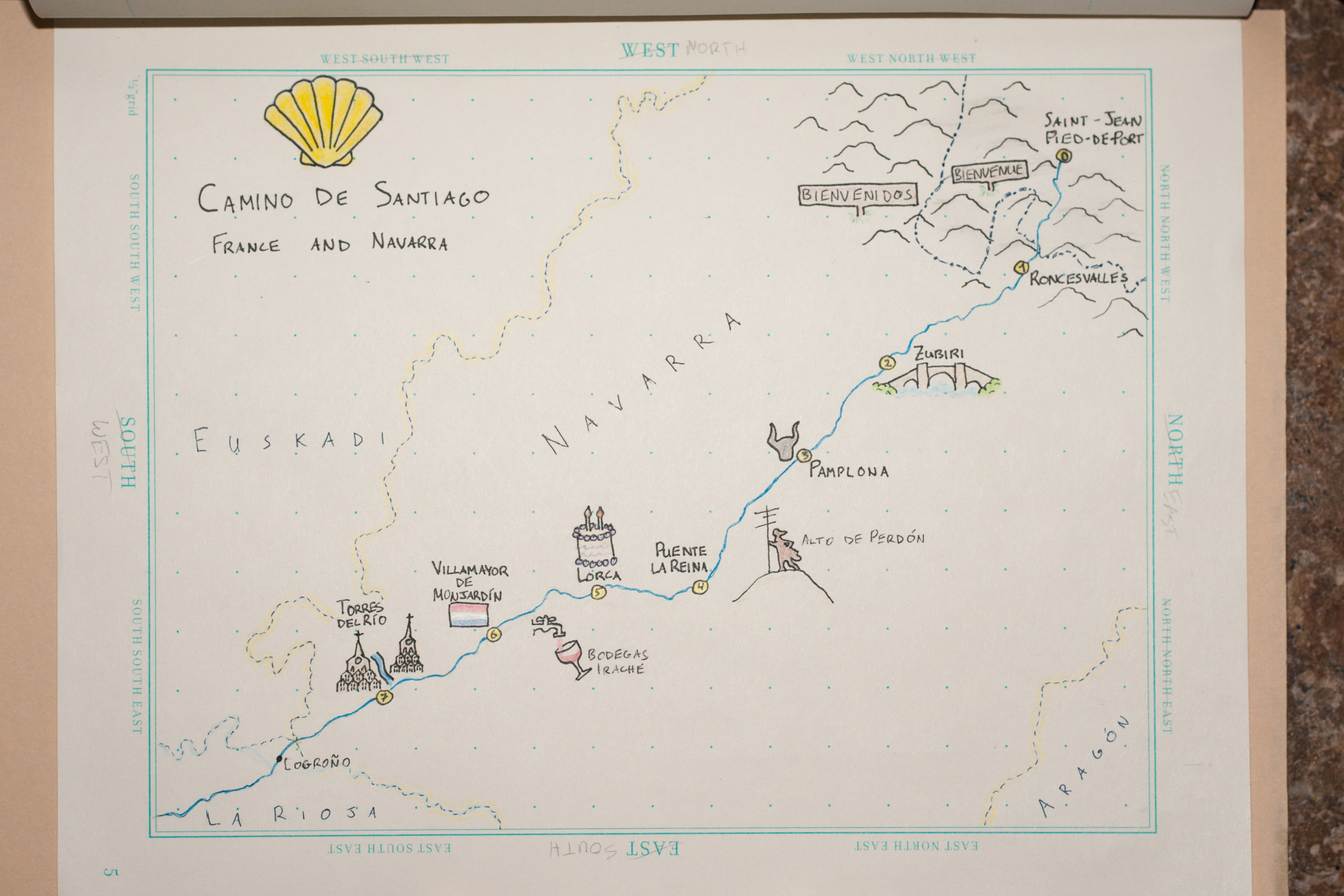
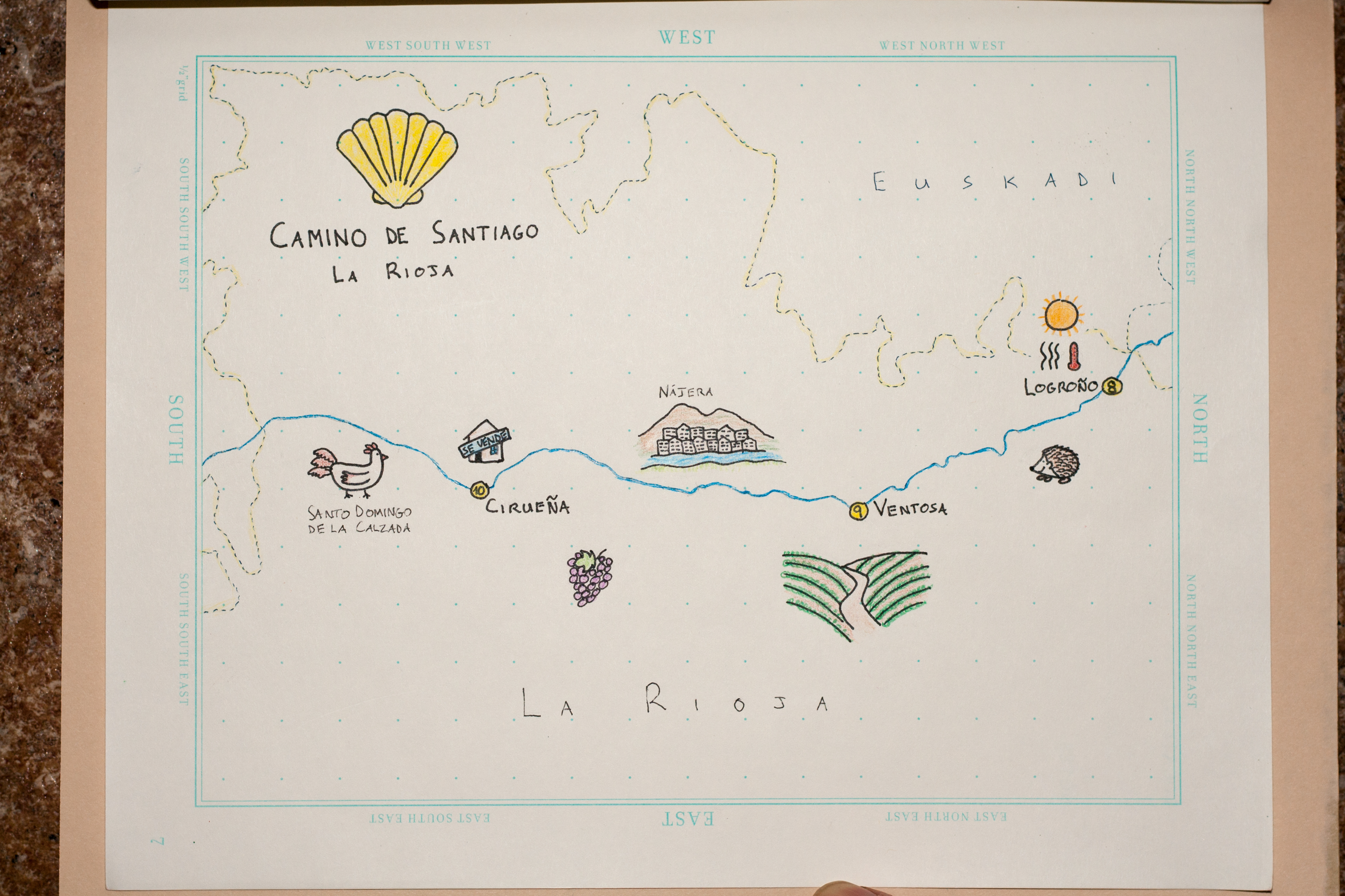
These maps went into a commemorative photo book that we put together as a Christmas gift to my dad. My sister had done this walk before, in 2012, and sparked an interest in my dad of “some day” doing it, which became “now” before time grew too unkind to one’s ability to walk 800 kilometers. Walking long distances day after day was a lot harder than expected despite my fairly frequent strenuous hiking near home (my feet didn’t stop hurting for a few more months), and my dad especially endured a lot of aches and pains, but he never quit or even took a day off, impressing fellow peregrinos we met along the way. 38 days after departing Saint-Jean-Pied-de-Port in France, we arrived in Santiago de Compostela.
People walk the Camino for a variety of reasons: from making the traditional Catholic pilgrimage, to escaping stress at home, to tourism. We didn’t exactly set out with any grand purpose, but with weeks of walking, often in quiet solitude, one starts earning that “spiritual” checkbox on the form that’s filled out at the end. For me, the trek is most meaningful for the family experience, but the geographer in me had a pretty good time, too.
Not to be a preachy “stop and smell the roses” guy, but it’s true that especially in the day of GPS-enabled navigation, we don’t often get to know the places we move through. Nothing beats endless, slow walking for contemplating your environment. We became well-versed in the cereal crops of northern Spain; we really saw every tree and rock (i.e., shade and rest); we took in the cultural landscape (architecture, people, food etc.) at the pace it deserves.
 We used good ol’ paper maps more than I ever do these days, two of them living in the outer side pocket of my backpack, within easy reach. We mostly disabled mobile data for the trip (expensive!), and although I often downloaded a few days’ worth of area on Google Maps when we had evening wifi, it was a lot easier to plan out each day’s walk and breaks using printed maps. Mostly these weren’t for navigating the path, as the Camino Francés is generally very well marked, but for deciding distances and routes (when there was an option).
I drew five maps, divided up by the regions we passed through. They simply show the route of the Camino with our daily stops, along with little sketches of things we saw along the way: landscapes, foods, landmarks, and a few things peculiar to our personal experiences. It’s a pretty gentle way into hand-drawn mapping, mostly being a few lines on top of the notebook’s helpful grid. (The pages also have nice north/south/east/west labels, but I had to ignore them and turn things sideways.) It’s nothing fancy, but it’s progress for my map-drawing and tiny sketch-drawing abilities, which are generally somewhere below kindergarten level.
I could go on and on with like a million photos from the trip, but I’m mostly here to show the carto-mementos. To anyone who may be doing the walk sometime: ¡buen camino!
| Comments Off on Camino de Santiago sketch maps
By Andy Woodruff on 1 June 2017
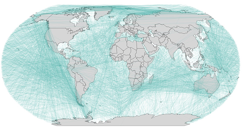
Last year I took a whack at mapping what you’d “see” if you looked straight across the ocean from coastlines around the world. Since then, an interactive version of that has been a back-burner idea. Well, finally, here we go.
To recap, these arcs represent straight-line paths out to sea, perpendicular to the coastline at a sample of locations (around 16,000 points). These “views” often lead to surprising destinations, given the flat maps we’re accustomed to seeing.
This interactive map is just a toy that I hope looks nice—there’s nothing especially marvelous on the technical end. The paths were all calculated beforehand the same way as before; while it’s certainly possible to calculate them on the fly, my method isn’t quite fast enough to keep up with rapid interaction. (And I’m too lazy to solve a few other challenges that would come with it.)
The short technical summary is this. Coastline sample points are drawn (invisibly) as SVG circles, and when you mouse over them their associated path is drawn (again, invisibly) as an SVG path via d3. That SVG path is handy because we can get locations incrementally along it with the getPointAtLength method, which is used for drawing the path on a canvas bit by bit in an animation. There is a constantly-running function that draws any active paths, preceded by a barely-opaque fill across the board, which is how the fading trail effect is achieved. Source code is a bit messy at the moment, but is up on GitHub.
One bit of magic is that d3’s geoPath uses adaptive resampling to draw lines as curves appropriate to a map projection. This means that, for the most part, I only had to include the start and end points in my line data, and d3 would draw the curved great circle path that I was looking for. (I did, however, sometimes have to include extra vertices to convince it to go the longer way around the world when necessary.) As you may be able to see in the QGIS screenshot below, it’s all made up of straight lines.
Anyway, poke around at the map and enjoy the light show!
| Comments Off on Beyond the Sea, flowing and exploding edition
By Andy Woodruff on 14 October 2016
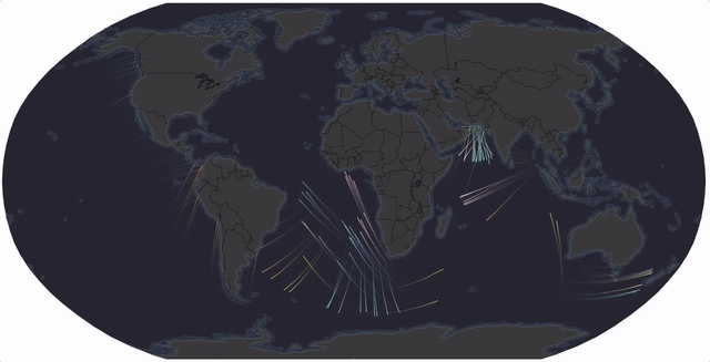
If you poured water over the terrain somewhere in the world, where would it go? That’s perhaps one way to think of the thing that distracted me in the evenings this week.
[Edit: an interactive map should appear here, but there are some unresolved issues. Check out the GitHub-hosted version for something at least partly functional!]
What we have here is more or less an animated flowy map of drainage, although it’s not a serious attempt at an accurate map. It’s just something that turned out to be kind of pretty.
Apologies for its clunkiness; I’m not that good at code. This is another episode in my habit of messing around with terrain mapping in the browser on canvas elements. See for example shaded relief and grassy sketchy thingies. (Side note: calculation of aspect turns out to be poor in those; this way works better and I’ll fix them at some point.) None of this ever turns out zippy, but it’s always a good learning experience and is occasionally art-worthy.
Maybe you can guess what’s going on here. I throw a bunch of random points at a terrain map, and they begin flowing toward lower elevation. That’s all, really: each path continuously asks “what adjacent location is lowest?” and moves in that direction. It’s more complicated behind the curtain, of course, but it’s not awful. I’ve tried to leave helpful comments in the code.
I’ve been inspired for a while to attempt this kind of animation by Cameron Beccario’s amazing global map of wind, etc. (perhaps spurred into mind by everybody posting links to the map during Hurricane Matthew) and the original wind map by Martin Wattenberg and Fernanda Viégas, and other similar maps that they have in turn inspired. I’m not as smart as those people and don’t entirely know how they’ve done it, but I was pleased to learn how to do a kind of fading trail animation one way or another.
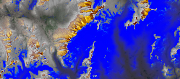
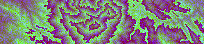
The key to all this is Mapzen’s terrain tiles. The hillshade you see in the map is straight magic from them, and replaces the things I was trying to do on my own with DEM images and canvas. Invisible but crucial are their Terrarium elevation tiles, which are these wild-looking purple and green things—but which encode actual elevation in their colors. Pretty clever.
Just load those in, do some pixel calculations to find which way is downhill, throw down some paths, and animate those according to the calculated directions. And there, you’ve got yourself a map that’s pretty fun to watch.
Anyway, play with the map, and have a look at the GitHub repository if you want to see the code or tell me about anything dumb I have done.
| Comments Off on The rain on terrain
By Andy Woodruff on 17 August 2016
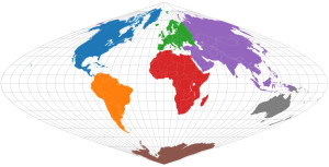
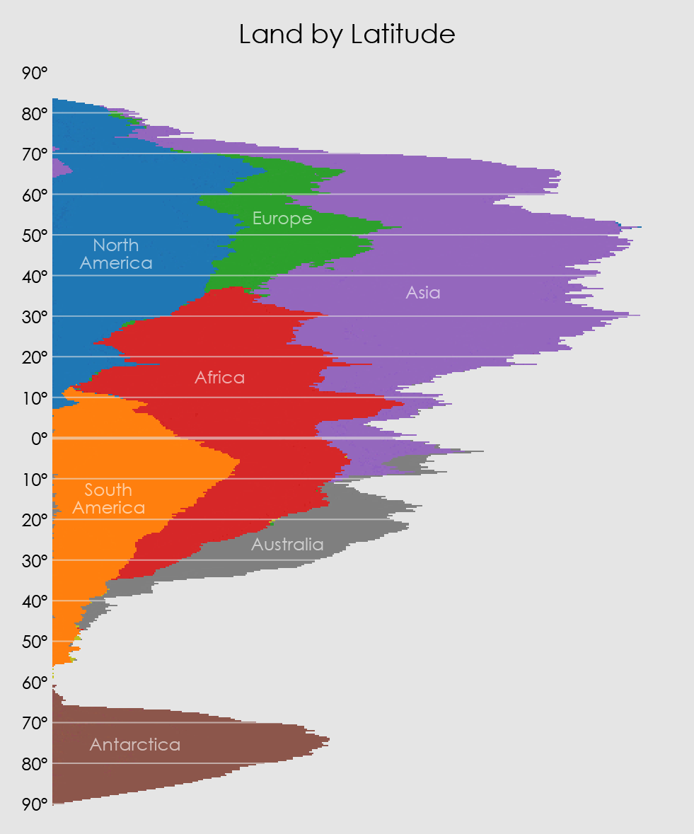
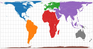
Bill Rankin’s graphs of world population by latitude and longitude popped into mind for no particular reason the other day, followed by a silly-sounding question: “but, like, what about land area by latitude and longitude?”
Silly because, duh, a chart of land area by latitude and longitude is a map. Then again, a map is both latitude and longitude. What if you look at each dimension individually? Heck, let’s just try it.
I did this by, essentially, drawing maps and counting pixels, then collapsing all those pixels against an axis. The important thing is to use an equal-area projection so that each pixel means the same thing everywhere.
For latitude, an equal-area projection with even spacing between parallels so that the axis has a consistent scale of degrees: sinusoidal.
SQUISH!
And similarly, for longitude, one with even spacing between meridians: a cylindrical equal-area projection, Gall-Peters.
MELT!
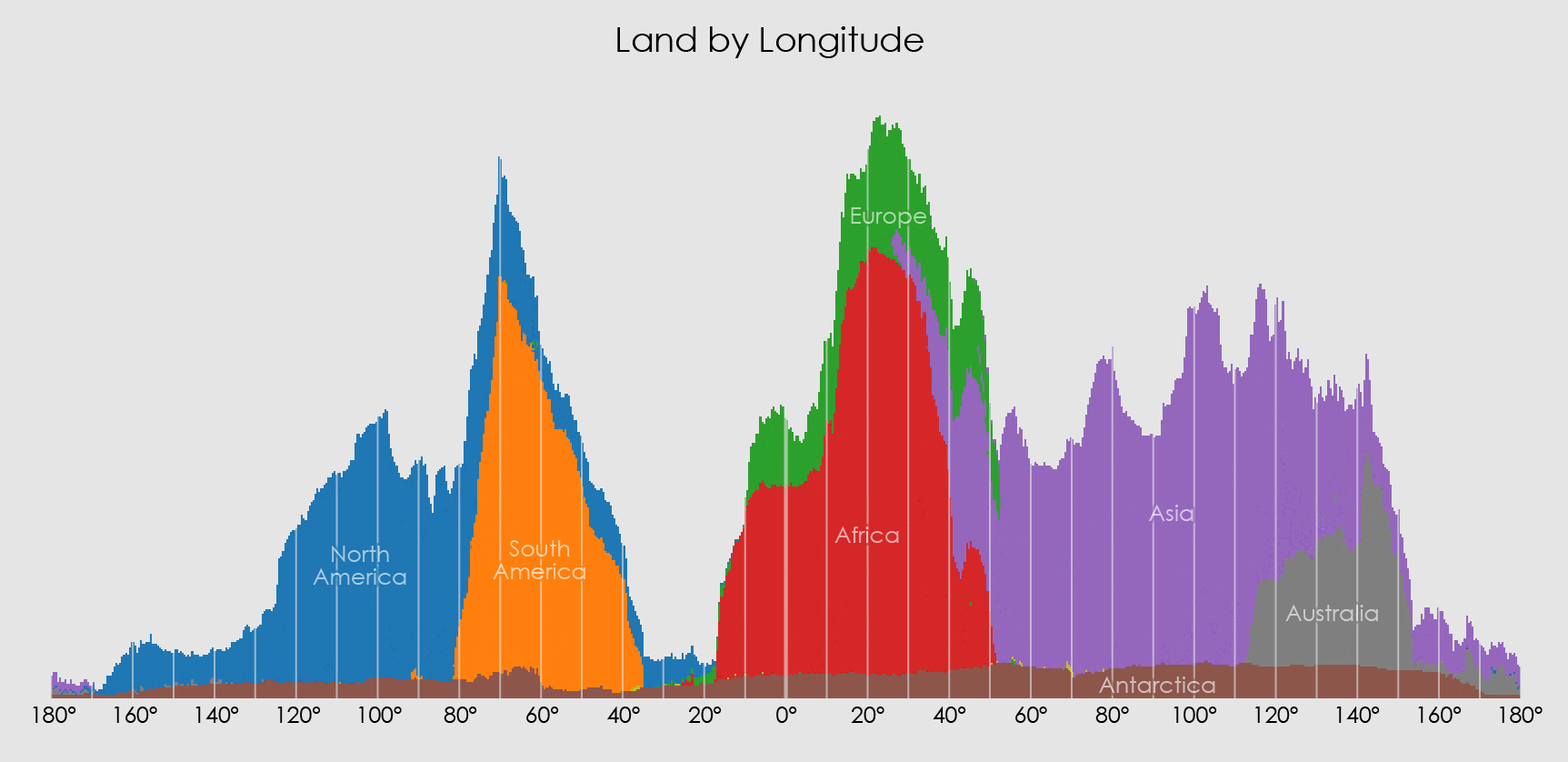
I’m not sure what there is to gain from these quasi-maps. Maybe nothing. But it’s kind of neat to see how the shapes of some continents are still vaguely there even when all squashed together. (By the way, apologies to places like New Zealand that got lumped together with Australia.) It’s kind of like those layered jars of sand art.
If nothing else, it’s fun to go full Play-Doh and cram everything both ways into a blob down the corner.
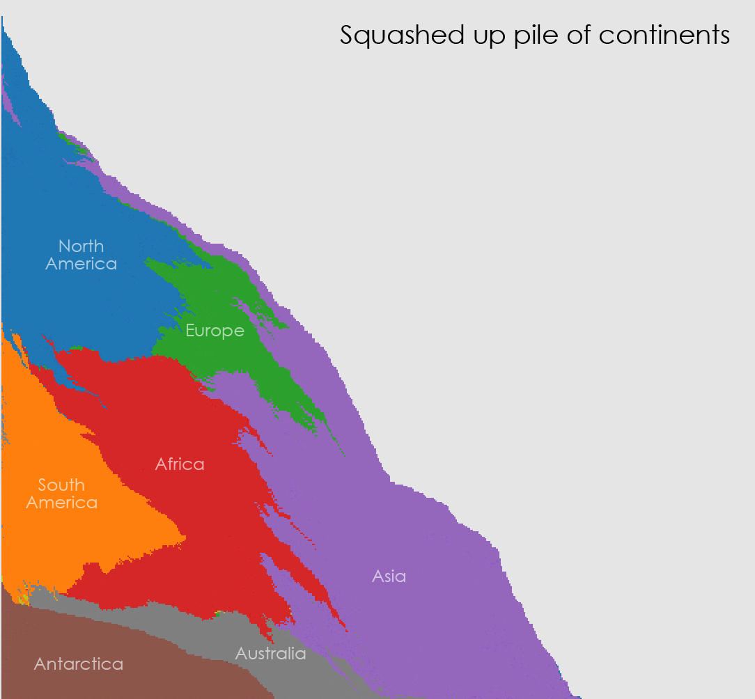
Yeah, so satisfying.
| Comments Off on Land by latitude and longitude, or, a pile of continents
By Andy Woodruff on 9 May 2016
I’ve never been a terrain representation expert, but occasionally I get briefly super interested in some DIY technique for relief mapping, not using typical GIS tools or rendering software. Tom Patterson’s old (but still applicable) Photoshop tutorials were my introduction to the magic simplicity of turning a grayscale image into fancy shaded relief.
Some years ago I wrote code for simple shaded relief, using Flash at the time. I picked that up again just a few months ago and did the same using JavaScript and canvas elements. These were impractical experiments, but they were a super interesting way to learn some basics about how automated relief shading works, and they were a more fun playground than turning knobs or filling in boxes in some software would have been.
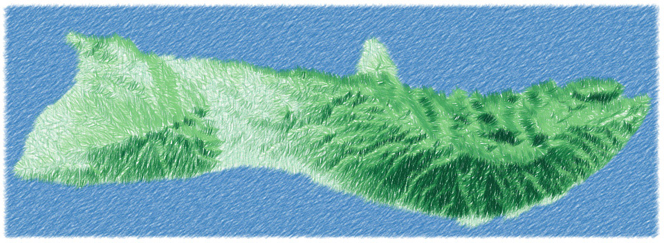
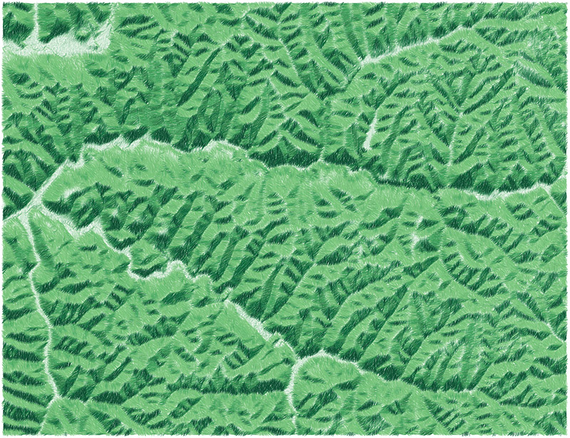
Then the other day, for no particular reason, hachures came to mind. Hachures are an old-fashioned technique in which parallel lines are drawn along slopes. You don’t see them much these days, but they’re one of my favorite techniques; their chapter is still the only one I’ve managed to read in Imhof’s book. From time to time I’ve wished there were an easy way to generate nice hachure maps in GIS or what have you—as far as I know there’s still not much out there.
I tried rendering some hachure-like maps based on the same code I’d used before, that is, in a browser with just some JavaScript. The ultimate result was not so much hachure maps but the kind of sketchy map style you see in these images, almost like something drawn with colored pencils.
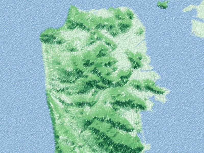
It began with something that I quickly recalled is essentially what Michal Migurski had worked on (later inspiring Eric Fischer) some years back: divide elevation data into a grid and use short strokes to show slope (as line width) and aspect (as rotation).
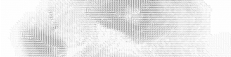
That was kind of cool, but certainly a lot more rigid-looking than classic hachure maps. The next step was to introduce some small random offsets in the grid so things didn’t line up so perfectly, looking slightly more natural.
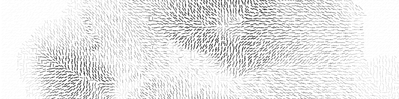
Wanting to move even further from a gridded appearance, next I tried drawing longer strokes at each point, longer than the dimensions of the cell so that lines would start to blend together. I also remembered that I wanted shadow hachures, where stroke weight or shade corresponds to brightness in an illuminated scene, not just slope. (My earlier shaded relief code could calculate this.)
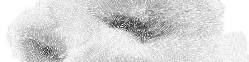
At this point it was starting to look more like a pencil sketch than a true hachure map, so I ran with that and added color. There’s kind of a combination of slope and shadow hachuring here, with stroke width representing slope and color representing shadowing.
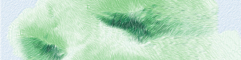
Lastly, there were two subtle steps: add a little more randomness in the form of slight curves, and draw the map at lower opacity several times on top of itself, each time with the sun angle varying a bit. This produced a somewhat smoother scene with a bit more shadow detail, and allowed the various random effects to accumulate into a very grassy look.
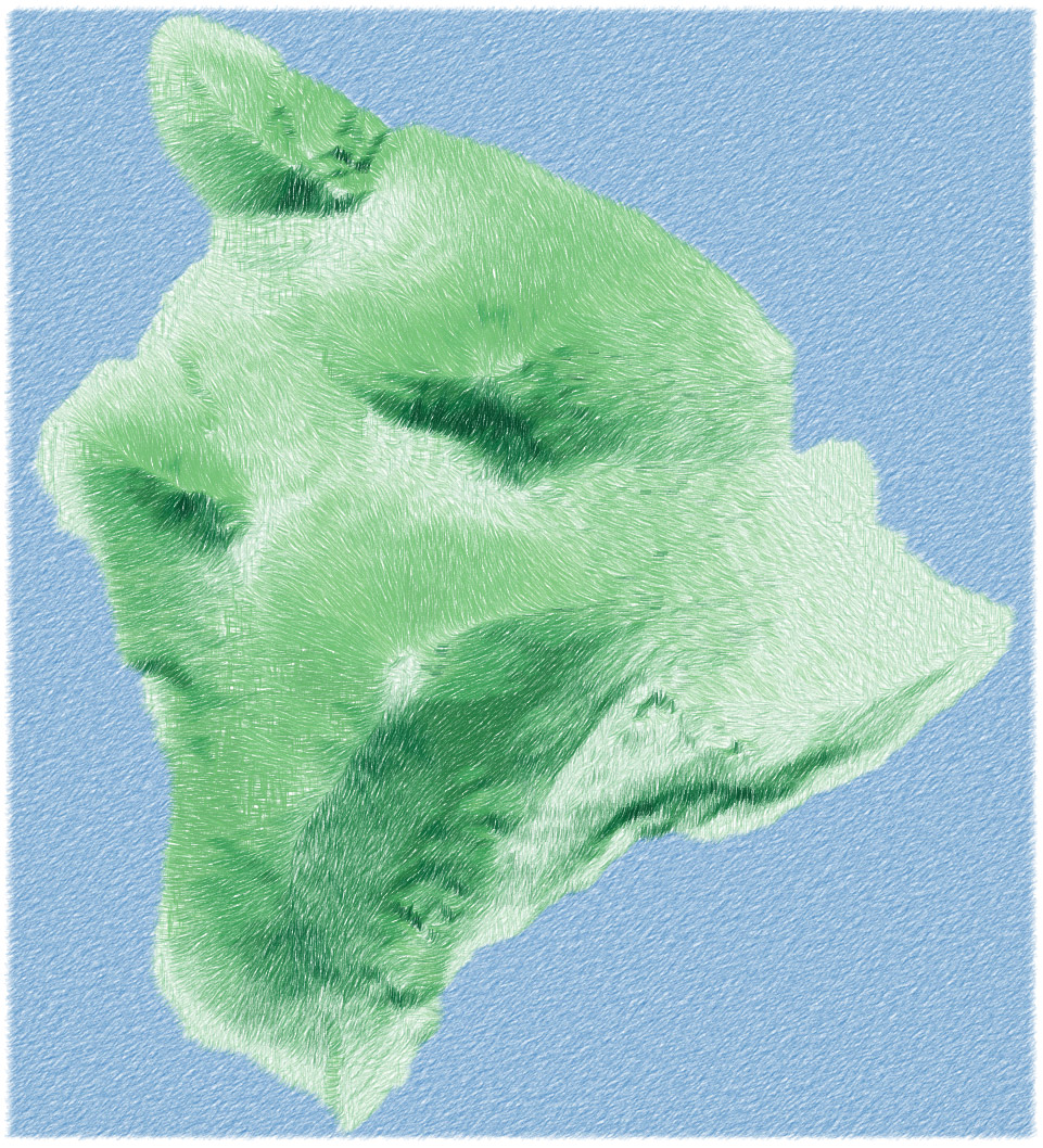
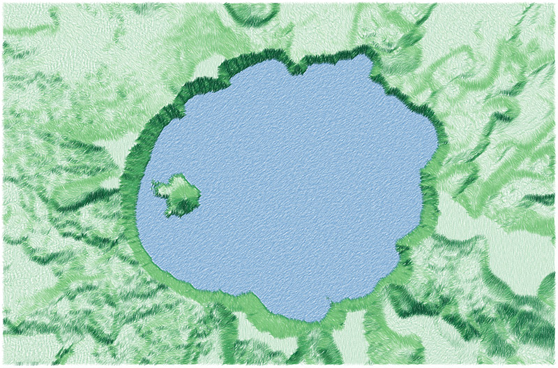
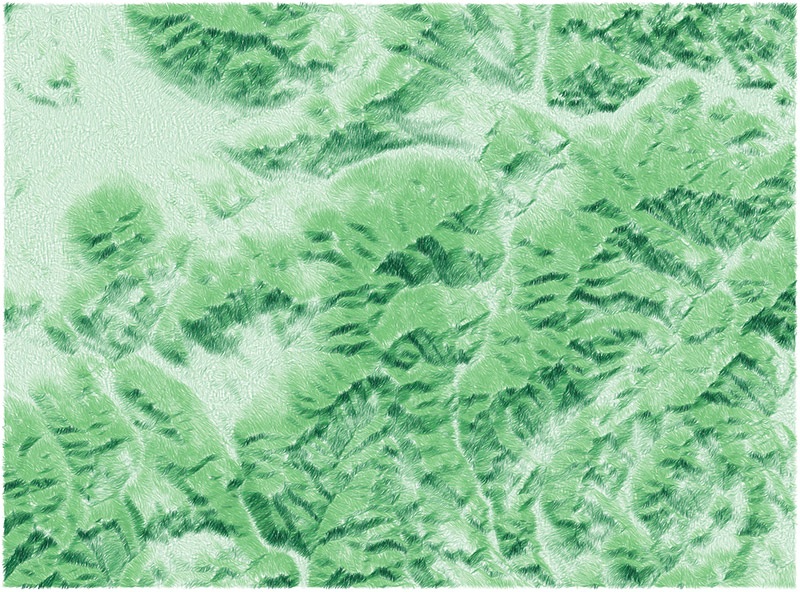
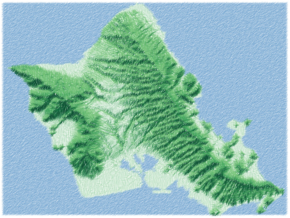
The source code for this is on GitHub here. All in all, it’s not practical code, at least not in this implementation (it would be interesting to try it in a more efficient way, or on something like Mapzen’s elevation tiles), but it’s a fun style to play around with! With more attention to things like color I can imagine some pretty good-looking maps. In any event, here are a few more that I rendered.
Crater Lake:
White Mountains, around Mount Washington:
Oahu:
Yosemite Valley:
Hocking Hills, Ohio:
| Comments Off on Hachures and sketchy relief maps