Hachures and sketchy relief maps
I’ve never been a terrain representation expert, but occasionally I get briefly super interested in some DIY technique for relief mapping, not using typical GIS tools or rendering software. Tom Patterson’s old (but still applicable) Photoshop tutorials were my introduction to the magic simplicity of turning a grayscale image into fancy shaded relief.
Some years ago I wrote code for simple shaded relief, using Flash at the time. I picked that up again just a few months ago and did the same using JavaScript and canvas elements. These were impractical experiments, but they were a super interesting way to learn some basics about how automated relief shading works, and they were a more fun playground than turning knobs or filling in boxes in some software would have been.
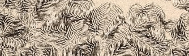
Then the other day, for no particular reason, hachures came to mind. Hachures are an old-fashioned technique in which parallel lines are drawn along slopes. You don’t see them much these days, but they’re one of my favorite techniques; their chapter is still the only one I’ve managed to read in Imhof’s book. From time to time I’ve wished there were an easy way to generate nice hachure maps in GIS or what have you—as far as I know there’s still not much out there.
I tried rendering some hachure-like maps based on the same code I’d used before, that is, in a browser with just some JavaScript. The ultimate result was not so much hachure maps but the kind of sketchy map style you see in these images, almost like something drawn with colored pencils.

It began with something that I quickly recalled is essentially what Michal Migurski had worked on (later inspiring Eric Fischer) some years back: divide elevation data into a grid and use short strokes to show slope (as line width) and aspect (as rotation).
That was kind of cool, but certainly a lot more rigid-looking than classic hachure maps. The next step was to introduce some small random offsets in the grid so things didn’t line up so perfectly, looking slightly more natural.
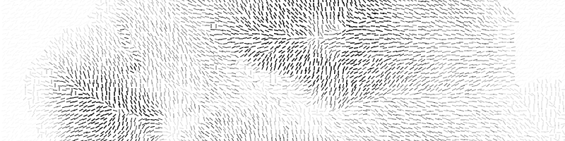
Wanting to move even further from a gridded appearance, next I tried drawing longer strokes at each point, longer than the dimensions of the cell so that lines would start to blend together. I also remembered that I wanted shadow hachures, where stroke weight or shade corresponds to brightness in an illuminated scene, not just slope. (My earlier shaded relief code could calculate this.)
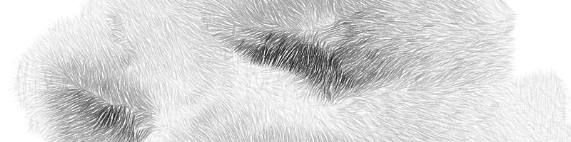
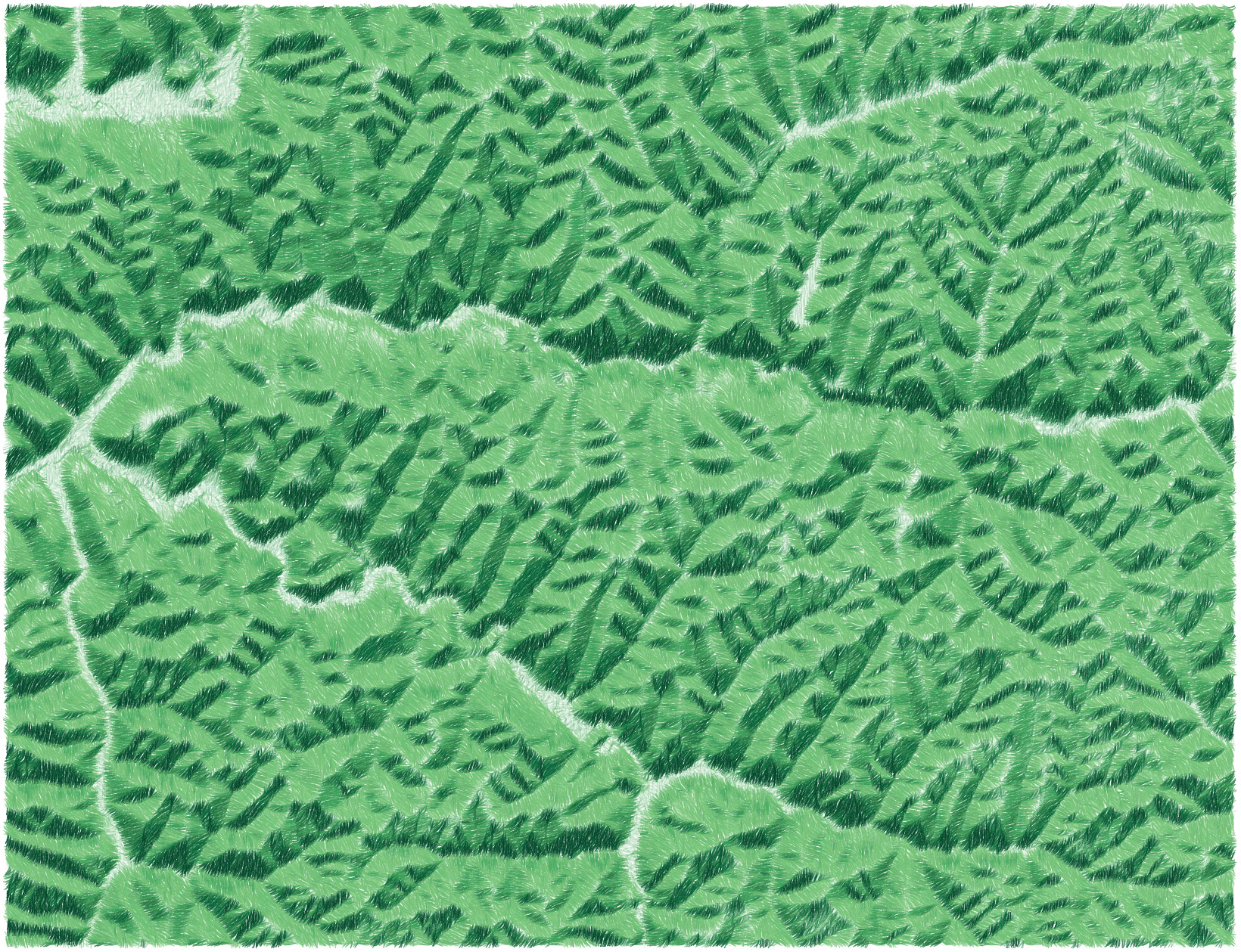
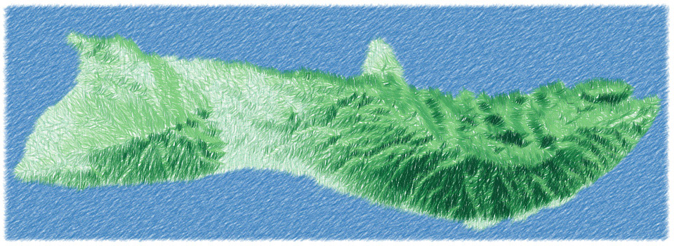
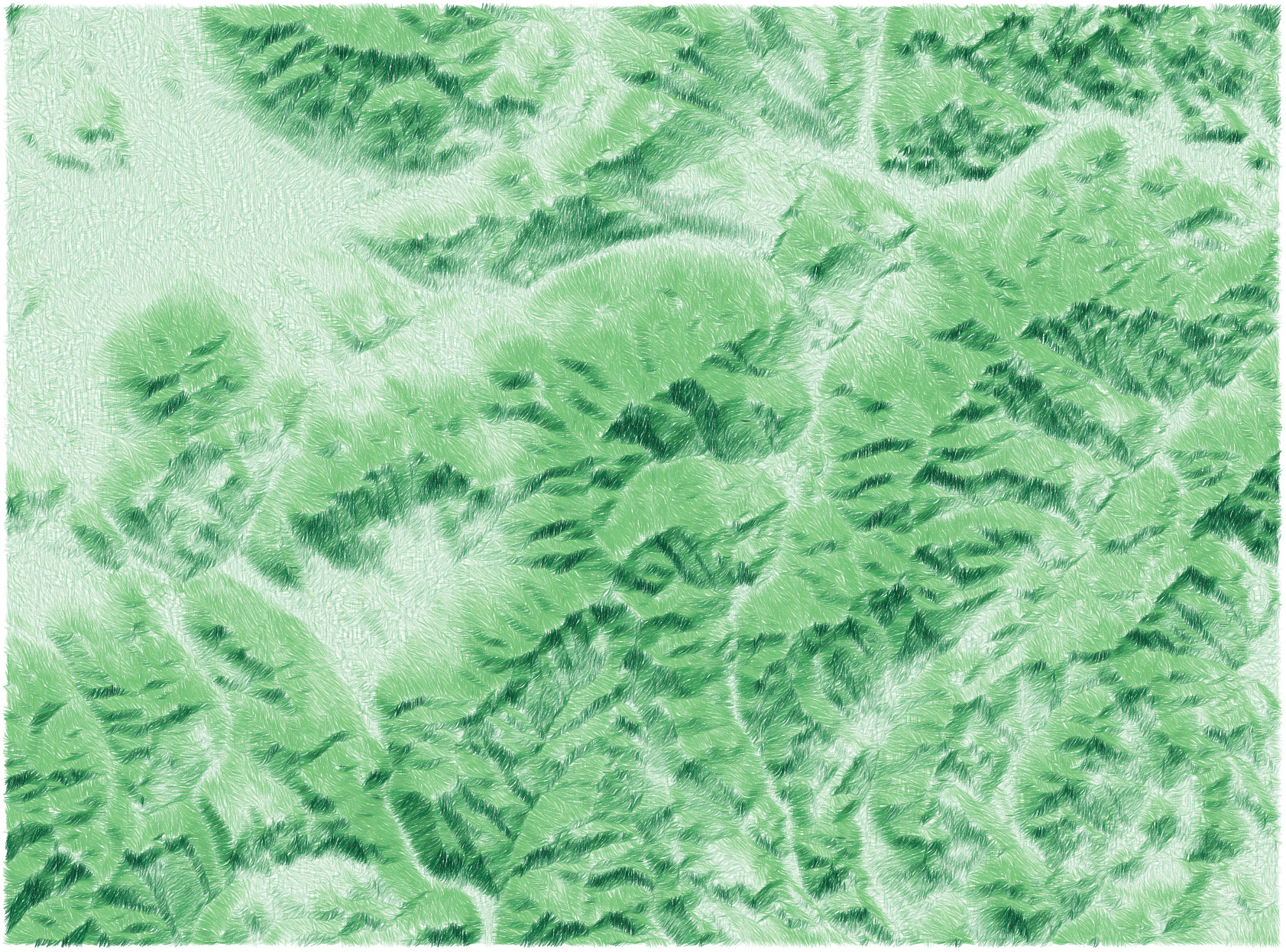
At this point it was starting to look more like a pencil sketch than a true hachure map, so I ran with that and added color. There’s kind of a combination of slope and shadow hachuring here, with stroke width representing slope and color representing shadowing.
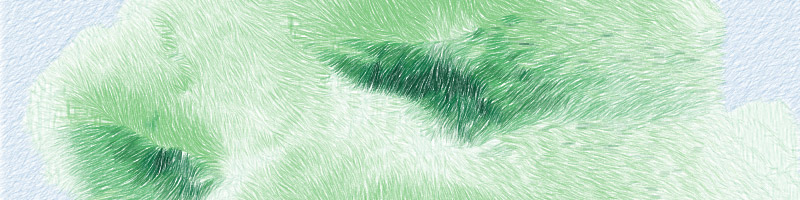
Lastly, there were two subtle steps: add a little more randomness in the form of slight curves, and draw the map at lower opacity several times on top of itself, each time with the sun angle varying a bit. This produced a somewhat smoother scene with a bit more shadow detail, and allowed the various random effects to accumulate into a very grassy look.
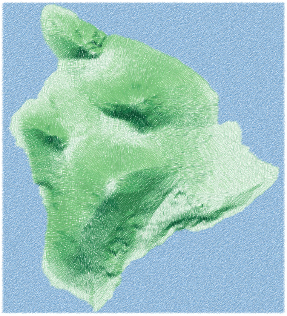
The source code for this is on GitHub here. All in all, it’s not practical code, at least not in this implementation (it would be interesting to try it in a more efficient way, or on something like Mapzen’s elevation tiles), but it’s a fun style to play around with! With more attention to things like color I can imagine some pretty good-looking maps. In any event, here are a few more that I rendered.
Crater Lake:

White Mountains, around Mount Washington:
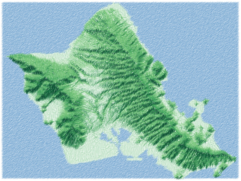
Oahu:
Yosemite Valley:

Hocking Hills, Ohio: