By Andy Woodruff on 3 September 2008
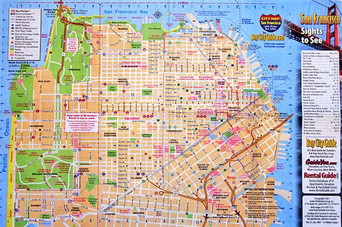
Here’s an interesting map I picked up in San Francisco last year. (Forgive the poor-ish quality. I laid it on the floor and took a photo of it.)

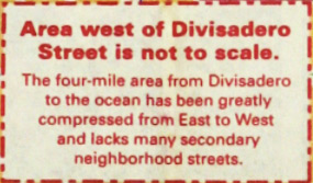
It took a while to realize this, having referred mostly to the downtown area in which I was staying and because the shape doesn’t look too unusual at a glance from a non-local, but the map is actually at two different scales.

The dashed red lines indicate the different scales. The section on the left is 4.5 miles across while the larger section on the right is 2.5 miles across. It’s fascinating because (1) unlike an ordinary inset map, the two differently-scaled areas are adjacent and contiguous and (2) it’s only the horizontal scale that differs. I’d never seen anything like this before. The closest thing I can think of is certain subway maps, such as the updated Vignelli map of New York subways with a tiny Staten Island, but really those are a different animal, often falling in the category of cartogram.
I think I like the idea as a way to show the whole but focus on one section (ostensibly more important for tourists), but then I didn’t attempt to get around anywhere in that western section, so maybe it would actually turn out to be frustrating. San Francisco, it seems, is probably a rare city for which it’s easy to pull this off: it ends abruptly at water on three sides and has a street grid largely aligned to the cardinal directions, meaning the map can be squashed horizontally while preserving most street angles. Are there other maps like this out there?
A PDF of the map is available at Bay City Guide’s site.
Tagged interesting maps, san francisco, scale | 1 comment
By Andy Woodruff on 21 August 2008
Busy busy busy. Big things in the works. Also presently homeless. Meanwhile, just to break the silence, here is a map of all the US counties I have been to.

Relevant points:
- I’ve got 1,105 out of 3,141. I’m thinking about picking up three more in Pennsylvania tomorrow.
- It counts if I was on the ground, either on foot or in a terrestrial vehicle.
- Even so, airport layovers are cheap, but I don’t lose sleep because I only have one or two that are only airport layovers.
- I said been to, not any subjective word like visited. So shut up; it presents facts.
- Besides, a big part of visiting a place for me (as one who appreciates geography) is simply looking around at the landscape anyway, so I would count drive-throughs as visits regardless.
This was created at http://counties.visitedmap.com. If you are nerd enough and have a freakish memory of the exact routes you’ve traveled in your life, give it a go!
Tagged counties, frivolous, travel | Comments Off on Nerd alert
By Andy Woodruff on 2 July 2008
This is probably a stupid idea, but that’s never stopped me before.
Lately some of my Flash mapping colleagues and I have come to rely on transforming geographic data—say, shapefiles—into various map projections on the client side via the ActionScript vector drawing methods. (See, for example, a post by my friend Zachary Johnson with an old-as-the-hills demo. And don’t you worry: we’ll be releasing something way, way cooler eventually.) But as cartographers know, vector data is just one side of things. What about raster data?
These days Flash allows good pixel-level manipulation of raster images with the BitmapData class. As a cartographer, I thought I’d try a little experiment in map projections.
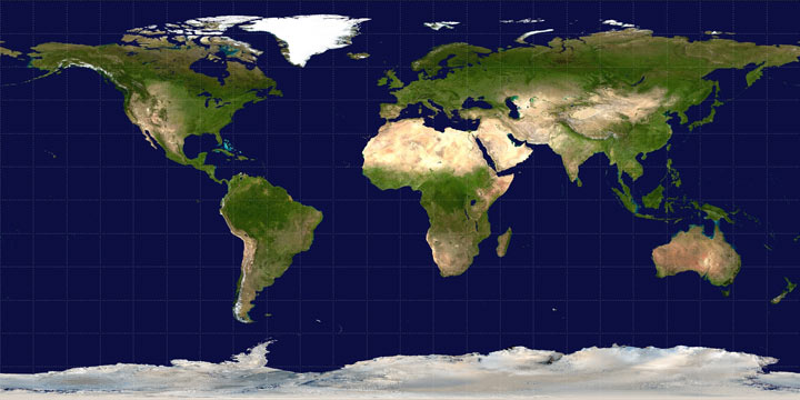
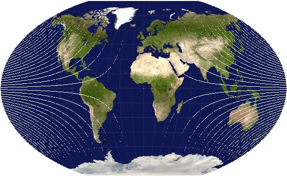
The goal: Convert an “unprojected” (plate carrée) world map map to a Winkel Tripel projection. I used an image from Wikipedia as a starting point.

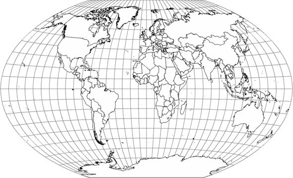
This is what we want to end up with:

Not terribly long ago for a mapping project I wasted a ridiculous amount of time on someone else’s dime attempting to reproject a raster map using the ActionScript DisplacementMapFilter class. If you don’t know, what the DisplacementMapFilter does is use the colors on a displacement map image (a BitmapData object) to determine displacement of pixels on another object. One color channel determines the x displacement and another the y displacement, both relative to the midpoint in the range of values for that color (i.e., 127 out of 255). For example, if we use the red channel for x and the blue channel for y, and a pixel in the displacement map has a red value of 255 and a blue value of 0, the corresponding pixel in the target object will be displaced positively 100% in the x direction and negatively 100% in the y direction. The actual number of pixels that 100% represents depends on a specified scale factor.
For a map projection, then, what we have to do is go through the unprojected source image pixel by pixel and determine how far each pixel has to be displaced on both axes by plugging the latitude and longitude values for the pixel into a projection formula. Using red for the x displacement and blue for the y displacement, below is the displacement map I generated for turning the unprojected map into Winkel Tripel.

I then applied that to the source image. The result? Yuck.

It’s probably possible to mess with this method and produce better results. As previously suggested, though, I’ve already spent too much time doing that without coming up with anything decent. In my experience there are three drawbacks to using the DisplacementMapFilter for map projections: (1) because of the way the filter works, if what you know ahead of time is the exact distance that pixels need to be displaced, it seems to be necessary to iterate over every single pixel twice, once to determine the maximum displacement in each direction for the entire image and once to then actually draw the displacement map; (2) precision in displacement is very limited, as it can only be from 0 to 127, in whole numbers, in either direction (multiplied by the scale factor); and (3) some projections will result in larger images than the original unprojected map, and it is a nuisance to try to deal with those using this method.
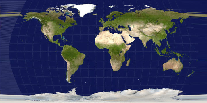
Screw it, then. Why not just move the pixels manually? To do this, we basically look at each pixel in the source image, run its latitude and longitude through the projection formula to determine its new location on the projected map, and then draw that pixel on the projected map with the color of the source pixel. Here’s what happened when I did that:

Hey, it’s the correct shape! But there are two issues with distorting a map to project it, namely, that the map is going to be compressed in some places and stretched in others. I’ve already attempted to deal with the compression in the above image. Instead of directly transferring the color of a source pixel to the projected map, I kept track of all the source colors that corresponded to a pixel on the projected map, then drew the average color on that projected pixel. Otherwise, when more than one source pixel corresponds to a projected pixel, the color would just be replaced every time one of those source pixels is encountered. In this case it was actually difficult to see much difference, but the attempt at resampling seemed like a good idea.
The second issue, the stretched parts, is evident in the above map, showing up as those white (empty) curves emanating from the edges. That occurred where pixels on the projected map had no corresponding source pixel because of distance distortions in the projection. To correct for this I did a simple interpolation in which I identified pixels with no data and assigned each a color that was the average of any neighboring colors. With that, then, we have our final map:

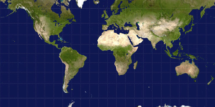
It’s not the most beautiful map, but not too bad, I’d say. That’s just one type of projection, though. As you might expect, the more interpolation that’s needed, the worse it’s going to look with these methods. Below, for example, is part of a Mercator projection. (Remember how I said larger map projections are a nuisance with the DisplacementMapFilter? Well, they’re kind of a nuisance in general, hence “part of” a map here.) The Mercator projection stretches the map pretty significantly in high latitudes, and as you can see the map doesn’t look very good near the top and bottom.

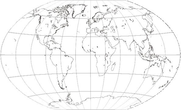
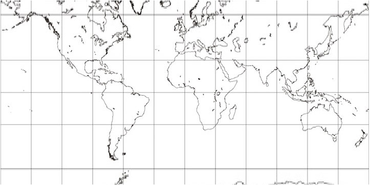
It’s also worth noting that these raster methods are probably best with continuous images like the example used here. The flaws are more noticeable with a rasterized line map, as below (projected using a source image from the wonderful Gallery of Map Projections).

And Mercator’s not so hot:

For the record, here’s what a nice, scalable, vector map projection from a shapefile looks like in Flash:

This little experiment has demonstrated that reprojecting raster maps in ActionScript is possible, perhaps with acceptable results in a pinch, but it’s far from perfect. I don’t doubt that it would be possible to use more advanced resampling and interpolation methods, but this is already a lot to deal with. The projections here took several seconds to compute and draw on my machine. That’s probably already an eternity in computer time, especially for a relatively small image, and it’s only going to grow as the algorithm becomes more complex. (Okay, minus the time that would be saved if my surely inefficient code were improved.) This kind of thing isn’t Flash’s strong suit anyway, right? Real geographic raster processing is being done with things like GDAL.
But again: in a pinch, it works!
Some references:
- The aforementioned Gallery of Map Projections is a good resource for seeing what different projections look like.
- This Java applet demonstrating map projections appears to use a raster map, though I’m not entirely sure how it operates. The source code is available.
- For map projection formulas, I recommend Wolfram Mathworld or Wikipedia.
- If you have access to the journal Cartographic Perspectives, check out Number 59 (Winter 2008) to see a gallery artistic renderings of map projection distortions by daan Strebe. The displacement map image used in this post reminded me of those images, which were presented at the 2007 NACIS conference.
Tagged as3, projections | 9 comments
By Andy Woodruff on 29 June 2008
Following last week’s post on losing context with interactive maps, I wanted to consider the different methods of navigating an interactive map (i.e., panning and zooming) and how they might affect that issue, and while I’m at it look at other aspects of these methods, too.
A great place to start is the 2005 paper by my now co-mappers Mark Harrower and Ben Sheelsey called Designing Better Map Interfaces: A Framework for Panning and Zooming.* (A PDF is available on Professor Harrower’s web site.) In that paper they discuss criteria for evaluating panning and zooming methods, namely functionality and efficiency, and then go on to present and evaluate nine common methods of panning and zooming. With respect to my previous post, it is a lack of what they call “local-global orientation cues” that can lead to the “navigational trauma” of losing context.
Below are small demos of eight of the nine methods listed by Harrower and Sheesley, along with their thoughts and mine on functionality and efficiency as well as a word or two on the prior subject of maintaining context. (For simplicity I’ve left zooming out of most of those demos where it would be accomplished via separate interface widgets.)
Known sometimes as "slippy maps" (from OpenStreetMap?), maps with this kind of panning interaction are the standard these days in the big online mapping services from Google, Yahoo, Microsoft, etc.
Pros: No pesky tools or interface to deal with, and the action is natural and mimics real life manipulation of tangible objects.
Cons: High mouse mileage—you've got to move your mouse every bit as far as you want the map to move.
Context: There are no inherent orientation cues, so with this method alone you'd have to mentally keep track of the map's movements. There is, however, an advantage of methods that directly jump from place to place.
You don't see these a whole lot on maps, but they are of course very common in a lot of applications. What makes a scroll bar "smart" is that its size indicates the proportion of the document you're currently viewing, and it disappears entirely if it's not necessary.
Pros: Easily understood because they're so common, and very efficient for traversing great distances.
Cons: You can only go in one direction at once. That's fine for long written documents, but probably a nuisance for larger images and maps.
Context: Smart scroll bars do provide some local-global orientation cues by indicating how much and what portion of the map you're looking at, but they don't indicate what is actually around the area in view.
The idea here is that as you move your mouse away from the center of the map, the map moves in the direction of the cursor, and the farther it is from the center, the faster it moves. Off the top of my head I can't recall seeing this a lot in interactive maps. What comes to mind first is a couple of the SimCity games, where a certain type of click would activate something like this type of panning.
Pros: Takes up no space on the screen.
Cons: It can be hard to control and can result in disorienting unintentional movement, and it becomes difficult to use the mouse for anything else.
Context: As with "grab and drag" you might be able to follow the movements, but with the map moving all the time (perhaps unintentionally), it's probably pretty easy to get lost.
This is pretty straightforward: usually the arrow keys pan, and the plus and minus keys zoom.
Pros: The mouse is free for other purposes, and no screen real estate is required.
Cons: Users might not know that the functionality exists, and panning is restricted to four or possibly eight directions. Also, as seen in my demo, at least with certain web-based technologies, action is required to prevent the keystrokes from controlling the browser rather than the map.
Context: Pretty much like the slippy map, though perhaps worse depending on exactly how the map moves with the keystroke.
If I'm not mistaken, this was one of the several standard options for a click action in the old days of MapQuest. These days MapQuest still recenters under a single click but doesn't zoom. Google, Yahoo, and Microsoft maps all zoom and recenter with a double click.
Pros: Combines two actions into one, and makes it easy and fast to get to a target that is on screen.
Cons: It's no help getting to an off-screen target, and could result in unintentional movements if a user is just clicking on the map as a part of exploring. (I'm always clicking on non-interactive things and highlighting text for no reason while wandering through the internets.)
Context: You get where you're going in steps, which perhaps makes it easier to see and recall context, but once again there's nothing in particular that provides any orientation cues.
Navigator tabs or an interactive compass are directional buttons either around the map's edges or grouped together somewhere in the interface. Clicking them typically moves the map by a set amount, although continuous movement is certainly possible. I think navigator tabs around the edges used to be common in online maps, but these days the major ones use the interactive compass style.
Pros: It's obvious what the controls do.
Cons: Directions are limited, and if the map moves by predefined amounts, the user can't necessarily achieve the desired view.
Context: No orientation cues here either, though again you are forced to step your way to where you're going, at least permitting you to keep track of where you are.
A zoom box is something I feel like I see most often in GIS-like applications. Here you click on the map and draw a box, specifying the extent and location to which you wish to zoom.
Pros: Efficient and allows precise user control.
Cons: Works poorly for off-screen targets, doesn't help with zooming out, and often requires first activating a tool.
Context: Much like the rest of them. No orientation cues, though you should at least have a rough idea of where you are within the whole since you were the one specifying the extent.
The navigator window is the most sophisticated of the panning and zooming methods presented here. A box in an overview map represents the current map extent. Panning can be accomplished clicking and dragging the box on the overview. Sometimes zooming is also incorporated by allowing the user to draw or resize the box.
Pros: Ridiculously efficient for browsing, as the entire map can be traversed by moving the mouse a short distance.
Cons: Can take up a lot of precious screen real estate.
Context: Finally, a method that provides good local-global orientation cues! With the navigator window you can always see what you're looking at in the context of its surroundings, whether they be the entire map or just a larger area than currently in view. You won't, however, gain any detailed information about the context, simply because of the navigator window's small scale.

I was not about to make my own demo of the ninth method, specifying explicit coordinates or scale. This is basically what the major online mapping services do. You search for where you want to go (an address, a business, or whatever), and the map goes there. This, by the way, is what Harrower and Sheesley call "precise" navigation—knowing where you want to go and going directly there—as opposed to "fuzzy" navigation—browsing the map to find what you're looking for.
Pros: Oh so efficient if you know what you want to find. Type, click (or enter), and you're there.
Cons: To be most useful, the system and the data behind it have to be very flexible. Joe Cartographer can make a map that allows users to jump to a latitude and longitude, but he doesn't have the resources to make an über-map like Google's.
Context: It's a wonderful way to use maps, but this really is the root of the problem we think might exist with losing context. You can find what you're looking for, but this method gives you no indication of what's around it or how you got there.
Now, most good maps of course employ more than one of these methods, ideally maximizing the pros and mitigating the cons. Google Maps, for example, uses six of the above: grab and drag, keyboard controls, zoom and recenter on click, interactive compass, navigator window, and specify extent (search).
It's also worth noting that as a 2005 publication (effectively pre-Google Maps), the Harrower and Sheesley paper is already a bit dated in its list of common panning and zooming methods. A few updates and evolutions:
- Zooming with the mouse scroll wheel. I've heard complaints, but personally I like the way Google et al. do this: when you use the scroll wheel, the point on the map under the cursor remains in the same spot on the screen as the map zooms in or out. By allowing you to anchor the map, perhaps this has some advantages for preventing "navigational trauma."
- Goolge Earth controls. The current Google Earth navigation control is like Interactive Compass 2.0. There are two: one that controls both rotation and tilt, and another that controls panning. Both allow complete freedom in direction.
- Thanks to Chris of mundanemaps for showing this way of giving both context and detail, now possible with online map APIs. It's like a magnifying glass but better: instead of providing just a close-up of a place upon clicking the marker, it shows a complete interactive map at a larger scale. It's almost like an inverted navigator window. If you want, you can use the large map to keep the context while interacting with the smaller maps to view details.
Tagged Academic, interactive maps, interfaces, online maps | 14 comments
By Andy Woodruff on 23 June 2008
Bear with me as I relive some grad school memories (but not the fun ones) for a moment…
Last year two of my University of Wisconsin colleagues (Jamon Van Den Hoek and Eve McGlynn) and I did a small research project to present at the Annual Meeting of the Association of American Geographers in San Francisco. Figuring our Geography Department would reimburse our expenses at a rate proportional to the number of words in the talk’s title, we called it Exploring the Relationship between Navigational Tools and Geographic Context in Interactive and Static Maps. The gist of our work was this question: how does a map user’s knowledge of a given place differ based on the use of an online, interactive map versus a static, printed map of the same design?

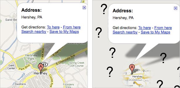
We supposed that the user of a basic interactive map (with panning and zooming) suffers navigational trauma: simply put, getting lost due to jumping from place to place and only viewing a portion of the map at any given time. The user of a static map, in contrast, is able—and sometimes forced—to see the entire map with a constant level of detail and see the context of any particular point of interest. We were interested in seeing how well people knew the geographic context of places on the map, that is, the surroundings of specific places or the overall characteristics of the mapped area. Because of interactivity, the user of an online map doesn’t necessarily need to view things in context, and so we figured that user would have a poorer understanding of their context. Jamon had a story to exemplify this: by searching Google Maps he’d recently been able to travel to Hershey, Pennsylvania without ever knowing where it is within the state.

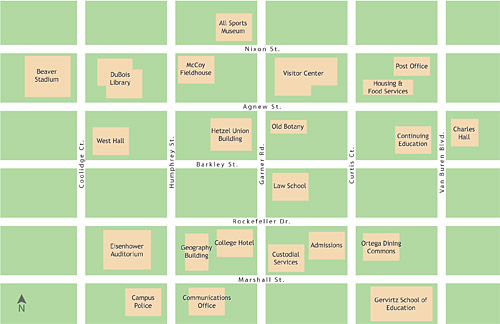
Jamon and Eve were my fellow student workers on the UW online campus map, and at first we were interested in comparing the printed campus map (with which we were also very familiar) with the online map, which tries to maintain the same look as the print map. Using those maps would not prove to be feasible, but we stuck with the campus map idea and generated a fake one. We made two versions: a printed 11×17-inch map and a web-based interactive map that allowed panning, zooming, and searching. (An image of the map is above.) We then gathered subjects for a short experiment. Subjects were presented with either the static or interactive map and given time to locate some specified landmarks. The maps were then removed and subjects were asked questions about the context of those landmarks. After that, a similar process was repeated with the other type of map.
We asked recall questions to assess knowledge of the following:
- Map periphery (“What is the farthest north building?”)
- Relative linear distance (Is Building C two times farther from Building A than Building B is, or four times farther?”)
- Street network distance (“How many blocks are between Street A and Street B?”)
- Overall map context (“Which quadrant of the map has the fewest buildings?”)
- Overall extent (“Is the campus longer east-west or north-south?”)
- “Medial” features (“Name a building between Building A and Building B.”)

Above is a probably confusing scatter plot of accuracy results, showing the number of correct answers in each set of questions (i.e. for both the paper and interactive map) for each subject. For the blue points, the horizontal axis represents the paper map and the vertical axis represents the interactive map. For the red points it’s the other way around. Larger circles indicate multiple observations falling on the same coordinates. Based on our hypothesis, we might expect to see more blue toward the lower right and more red toward the upper left. Although in the first question set the paper map fared better than the interactive map, most other accuracy differences turned out to be insignificant.
To conclude by skipping a lot of boring details, assumptions, and caveats, as we might have expected with a small project that attempted to tackle a broad issue, we learned a few things, but more questions were raised than answered. Ideally this line of inquiry would proceed thus in the future:
- Perform tests with realistic—if not real-world—maps and navigation tasks to get more meaningful results.
- Is there a problem with geographic context knowledge due to interactive map design?
- If so, how can we address the problem through map and interface design?
After spitting out such academic mumbo jumbo, I think we Wisconsin cartographers are proud to always ask the question: so what? What does this mean for actually making maps? Hence number 3 above. Fortunately, because this is a blog and not an academic journal, I can jump past the more scholarly steps, and in the coming days I will post about some different methods of interactive map navigation and how they might affect the issue at hand here (among other practical considerations). Stay tuned!
Tagged Academic, interactive maps | 2 comments
By Andy Woodruff on 15 June 2008

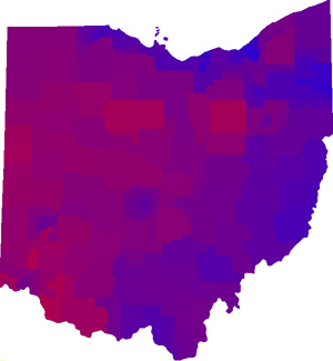
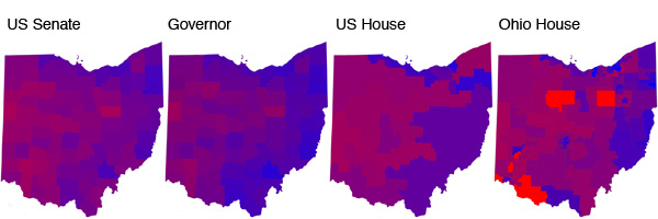
Since election season is nearly upon us again, I was reminded of a brief distraction of mine in 2006, namely the above map. It’s a composite map of Democrat vs. Republican election results in four races in Ohio, ostensibly giving an idea of how “Republican” or “Democrat” an area is.

The process was, quite simply, to make maps (above) of each individual election in the style of the now popular “Purple America” maps by Robert Vanderbei, then overlay them on one another so that the color of each end pixel is the average of the red and blue values of the four component maps.* As the districts in the four elections are different, the shapes seen in the resulting map no longer correspond exactly to those in any of the original maps. (The data could of course be shown by different enumeration units, which would affect the appearance of the final map.)
Do people make maps like this? Is it stupid? When split-ticket voting is pretty common, and because of the different influences on different races, I don’t know how useful it is to try to broadly describe how much an area leans one way or the other based on election results. But hey, it’s always interesting to look at data in different ways. Might be cool to do this for the whole U.S. this year.
Tagged election maps | 3 comments
