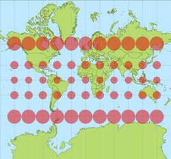
Why are choropleth Mercator maps bad? Because we said so.
The other day I was speaking to a non-map person about the problems with choropleth mapping on the Mercator projection and went looking for a link to something that could explain it more clearly than my bumbling self. It became a familiar exercise, because I’ve done this before: there’s hardly anything out there on the web that really explains this problem in clear detail. We talk about Mercator choropleth maps often enough, and the idea of them ranges from ill-advised to anathema, but we hardly go beyond simply saying “it’s bad because areas are distorted.”
So, two things. First, we could stand to share knowledge better, cartographers! Everyone is pretty good at sharing code and data these days, but we fall short on sharing the why of things, especially those of us who went to school for this and everything.
Second, an attempt at uncovering the problems with choropleth mapping on the Mercator projection.
Now, perhaps nobody really talks about why small-scale Mercator choropleths are bad because the gist of the reason is intuitive enough: bigger looks like “more,” so any map projection that distorts area (especially as severely as Mercator does) will make some values look exaggerated and will thus be misinterpreted. Size comparison is at the heart of many types of statistical graphics, and obviously relative sizes need to be correct for the whole concept to make any sense at all.

Indeed, this sometimes applies to areal mapping, for example “land-use or similar mapping in which a measure of the area occupied by some distribution is crucial to map interpretation” (Muehrcke and Muehrcke, Map Use 3rd ed.). If you need to compare areas, areas cannot be distorted. (Never mind that humans are terrible at estimating and comparing areas of irregular shapes, from what I hear.)
In the typical choropleth map, however, area is not directly the visual variable of interest, and we are not trying to measure it. Still we assume that relative sizes need to be true in order for the map to work. How do we know that? Well, I’m not sure. I flipped through all my cartography textbooks and to my surprise it’s not that I forgot the evidence for this—it’s that they really don’t cite anything on the subject. We accept it on faith and common sense, apparently, although I’d bet a shiny nickel that someone somewhere has done empirical studies to confirm it, or that somewhere buried in How Maps Work is an explanation. Please, if anybody can point me to some of the research behind all this, it would be appreciated!

It turns out, then, that this is not just an internet problem. A textbook education in cartography will not teach you, in scientific terms, why a choropleth Mercator map is worse than a choropleth sinusoidal map or a proportional symbol map. Interpretation of area in quantitative maps gets no quantitative explanation; instead it gets basically the same treatment as propaganda maps and the whole Peters thing, which paraphrased boils down to “bigger things totally look more prominent and important because they’re bigger.” Semiology of Graphics is the only book I have that really addresses size directly and as matter of fact—noting among other things that “it is not possible to disregard it visually” and “in any map representing areas of unequal size, what is seen is [quantity] multiplied by the size of the area”—but even if he was correct, Bertin was pretty much making things up.
Mentioned more commonly but no more deeply explained is the need to normalize data to account for area in choropleth maps, i.e., not mapping counts. Considering this rule, the projection requirement, and a host of “ideal” enumeration unit characteristics, choropleth mapping just starts to sound like a terrible idea for anything at all. Size variation that is not directly related to numerical variation seems to cause nothing but problems. Danny Dorling’s arguments for cartograms and mapping human phenomena in human space, not geographic space, start to sound appealing.
Too bad cartograms are also kind of awful.
Tagged choropleth, map projections, mercator

2 Comments