
Land by latitude and longitude, or, a pile of continents
Bill Rankin’s graphs of world population by latitude and longitude popped into mind for no particular reason the other day, followed by a silly-sounding question: “but, like, what about land area by latitude and longitude?”
Silly because, duh, a chart of land area by latitude and longitude is a map. Then again, a map is both latitude and longitude. What if you look at each dimension individually? Heck, let’s just try it.
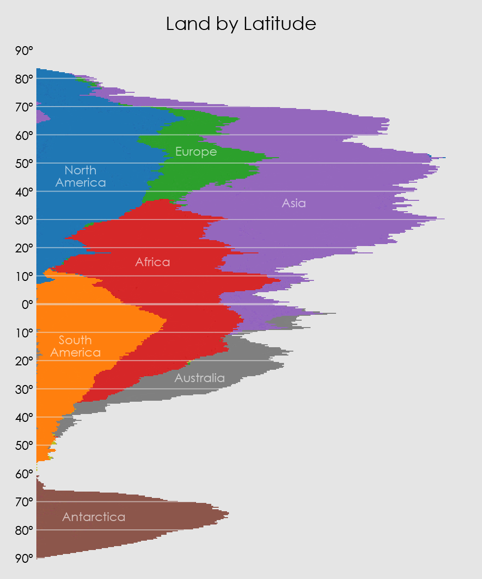
I did this by, essentially, drawing maps and counting pixels, then collapsing all those pixels against an axis. The important thing is to use an equal-area projection so that each pixel means the same thing everywhere.
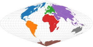
For latitude, an equal-area projection with even spacing between parallels so that the axis has a consistent scale of degrees: sinusoidal.
SQUISH!
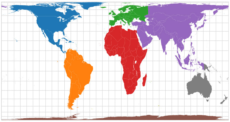
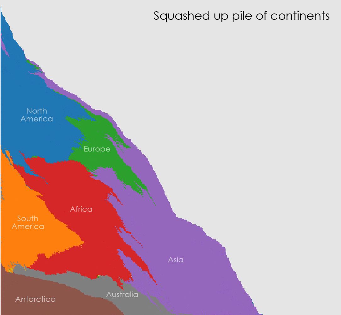
And similarly, for longitude, one with even spacing between meridians: a cylindrical equal-area projection, Gall-Peters.
MELT!
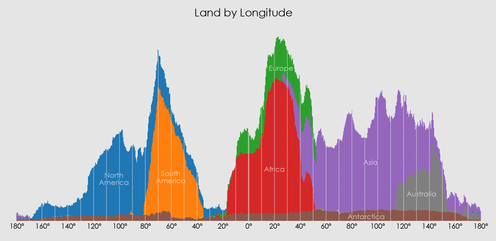
I’m not sure what there is to gain from these quasi-maps. Maybe nothing. But it’s kind of neat to see how the shapes of some continents are still vaguely there even when all squashed together. (By the way, apologies to places like New Zealand that got lumped together with Australia.) It’s kind of like those layered jars of sand art.
If nothing else, it’s fun to go full Play-Doh and cram everything both ways into a blob down the corner.
Yeah, so satisfying.