“It’s just a population map!”
Thou shalt not take xkcd 1138 in vain.
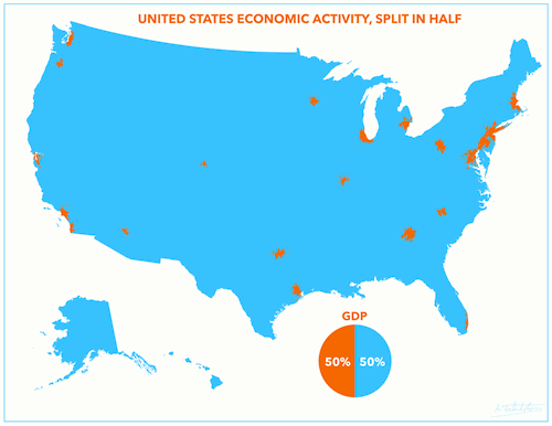
It’s nice that xkcd provides the occasional popular exposure of cartographic topics, but unfortunate that it makes critics’ jobs easier. The comic linked above has been invoked often since it first appeared, including in response to everyone’s latest favorite map to hate, US GDP Split in Half.
If you’re a map person you’ve already seen this a thousand times, often accompanied by hyperbolic words like “incredible,” and you’ve also seen a thousand complaints about how it’s meaningless and simply a map of population density. (Indeed, I was not about to let an opportunity for snark slip by, despite my stated support for bad maps.) The argument is that most people in the US live in metropolitan areas, so of course that’s where most of the economic activity will come from.
Is that true? There are reasons why the map doesn’t say anything significant about economic activity—one of them being that it’s totally arbitrary and there are infinite ways to divide GDP in half geographically—but “just a population map” is a cheap and thoughtless dismissal. The only thing that is actually a population map is a population map.
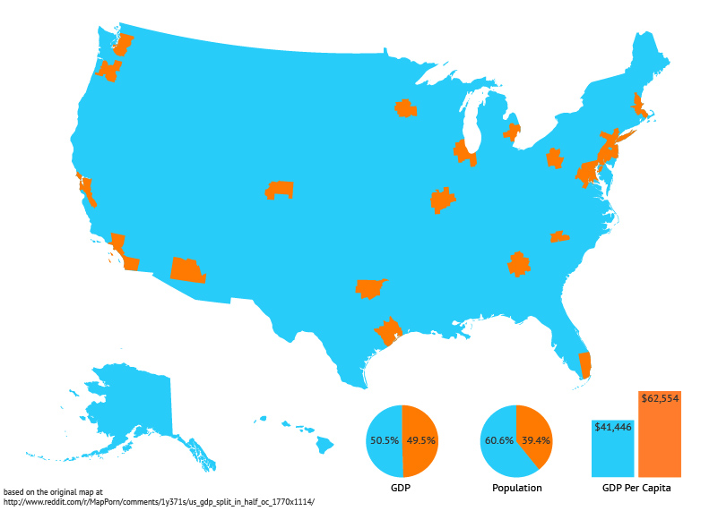
In this case, the numbers show that it’s not quite a population map. The 23 metropolitan areas account for half the GDP but only 39% of the population, and, by extension, their per capita gross metropolitan product is 50% higher than the remainder of the country. There’s wide variation among the metro areas, too: San Jose’s per capita GMP is nearly twice that of Phoenix. Here’s a version of the map with a little extra information based on 2012 source data and population estimates (corrected to show metropolitan areas, not urbanized areas).

That’s not to say the original map did a good job of highlighting contrasts between population and economic activity, or really anything at all—it doesn’t expose any population information, and the arbitrary grouping means that these 23 metros are not necessarily more special than any others—but the point only is that the contrasts do exist and the map is not simply a population map.
So, friends, let’s not be hasty to drop xkcd links and the categorical “just a population map” criticism. There’s nuance to every map, even if we have to go looking for it.


3 Comments