How to make a value-by-alpha map
Last week, Josh Stevens published a superb how-to guide for making bivariate choropleth maps, something not directly supported in most GIS applications. Go read it. I’ll wait here.
Josh included a mention of value-by-alpha maps, a pet technique of some colleagues and me. It boils down to a specific type of bivariate choropleth map, in which one variable is intended as a weight for the other and is symbolized by opacity. The idea is offered as an alternative to cartograms—a way to give more visual weight to more significant entities, and suppress less significant ones. Recent examples of the technique include wind energy mapping and midterm election maps.
Anyway, Josh’s post inspired me to write a quick and dirty how-to for value-by-alpha maps. (Dirty because I’m skipping nice things like legends and labels.) So here are a couple of ways to make one. I’m making a map of 2008 US presidential election results, just like our first attempt at this. (Example data here.)
Using GIS and graphics software
First, a method for making static maps using GIS (QGIS in this example) and graphics programs like Illustrator and Photoshop.
1. Make a choropleth map of the “variable of interest”
Here, it’s the percent of votes won by Obama.
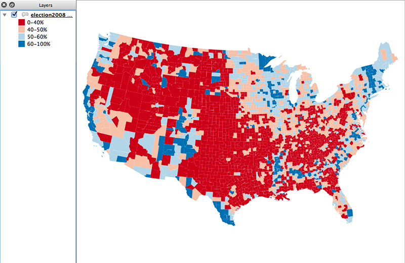
Don’t use too many classes. For a diverging color map like this, use at most four to six colors. For a sequential scheme, use two or three. When thinking about data classification, remember that a lot of the map will fade away in the final product. My first thought with this map was to limit the dark colors to more extreme values than this, but I found that the end map became a sea of meh and failed to tell much of a story, so I expanded those outer classes.
2. Duplicate the layer and make a grayscale map of the “equalizing variable”
The “equalizing variable” is the one that will be used to give more or less visual weight to units on the map. In this example it’s population—counties with more population are more significant in the election’s outcome than counties with few people. (Yeah, it really should be total votes, but population is a decent proxy for that.)
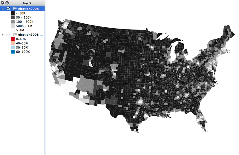
Brightness in this map will correspond to opacity in the final map. Don’t use a straight black-to-white scheme here. Bottom out at 10–15% brightness so that units don’t totally disappear from the map. On the other end, don’t let the gap between pure white and the second-brightest color be too large, or else the map may look like only a few points of color. The middle colors of my map differ in brightness by 30% and go up to 90% white, with the top color being pure white. It doesn’t sound like much of a difference between 90% and 100%, but the visible difference is more than you might expect.
Depending on the data, default classification schemes may not serve you well. County population is such a case; most defaults would group far too many counties into the low or high ends. In other cases, something like quantiles might work well. If you use a classification that groups too many units into similar ranges, you may as well stick with a standard univariate choropleth map.
3a. Export to vector and combine
tl;dr — use the grayscale layer as an opacity mask on the color layer
I exported my QGIS map to SVG with two choropleth layers. Here’s a procedure in Illustrator.
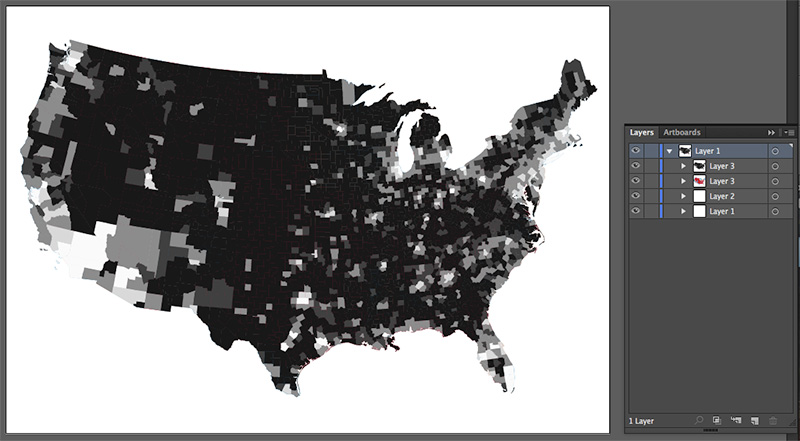
Select the grayscale layer, then cut it.
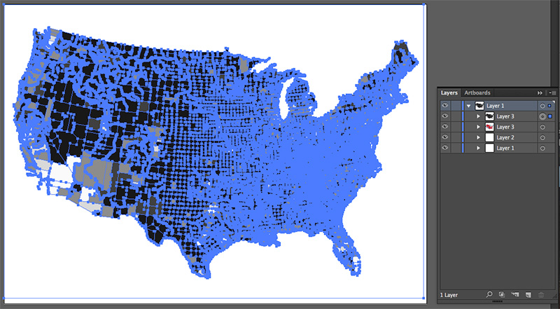
Select the color layer, find the ![]() transparency panel, and click the Make Mask button.
transparency panel, and click the Make Mask button.
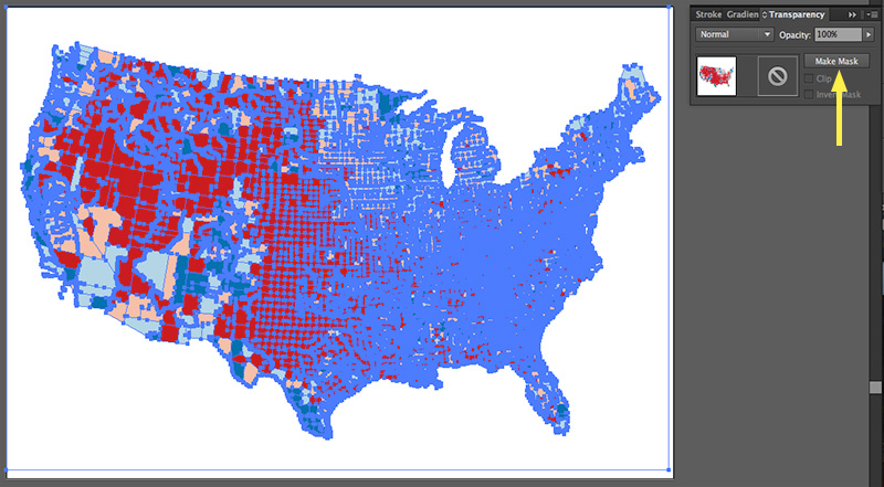
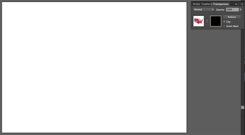
Activate the square on the right if it’s not already active. You’ll probably see a blank artboard at this point.
Now paste the grayscale map that you cut a minute ago. Use paste in front so that it stays in the right place. At this point you’ll see some colors again.
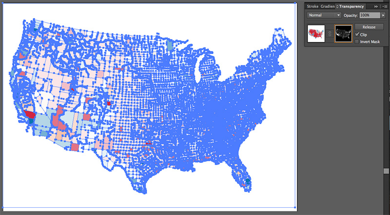
Click that left square in the transparency panel again, then deselect everything, and there you have it: a value-by-alpha map!
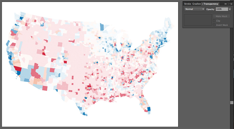
3b. Or do it as raster
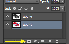
You could do the same thing with raster graphics using Photoshop or similar. Export your two map layers to images and put them into Photoshop layers. Again select and cut the grayscale one. Create an opacity mask on the color layer, and paste the grayscale map into the mask. Below is the button to click to create an opacity mask on a layer.
Web maps
If you’re a web mapper, it’s just as easy to make a value-by-alpha map in the browser as with desktop software. Here’s the same map from above done with D3, having exported the data to GeoJSON.
1. The typical D3 map setup.
Add an SVG element, create projection and path variables, blah blah blah.
var svg = d3.select("body")
  .append("svg")
  .attr("width",800)
  .attr("height",500);
var projection = d3.geo.albersUsa()
  .translate([400,250])
  .scale(1000);
var path = d3.geo.path()
  .projection( projection );
2. Make a scale for the color layer.
D3’s threshold scales work well for customized data classifications. Here we have a domain of the interior class breaks for the election data (40%, 50%, and 60%), and a range of the four colors that go in between and outside them.
var colorScale = d3.scale.threshold()
  .domain( [ .4, .5, .6 ] )
  .range( [ "#ca0020", "#f4a582", "#92c5de", "#0571b0" ] );
3. Make a scale for the grayscale layer.
With this scale, we don’t want to map the data classes to actual colors, but rather to numbers, because we’ll use these directly for opacity attributes. The numbers in the range below correspond to the brightness values of my grays (15%, 30%, etc.).
var grayScale = d3.scale.threshold()
  .domain( [ 50000, 100000, 500000, 1000000 ] )
  .range( [ .15, .30, .60, .90, 1 ] );
4. Load the geodata and assign color and opacity according to the two data properties.
d3.json( "election.geojson", function(json){
  svg.selectAll( "path" )
    .data( json.features )
    .enter()
    .append( "path" )
    .attr( "d", path )
    .attr( "fill", function(d){
      return colorScale( d.properties.Obama_pct);
    })
    .attr( "fill-opacity", function(d){
      return grayScale( d.properties.POP2010 );
    });
});
Run all that in a web page, and oh hey look at that, a value-by-alpha map!
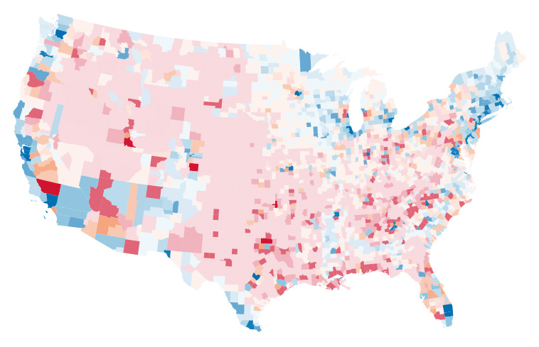
So there you have it, two ways to make value-by-alpha maps! Alternatively, you could use good ol’ indiemapper, which supports value-by-alpha and handful of ordinary and crazy multivariate symbols.

4 Comments