Flickr as a paintbrush
What color is Harvard?
Don’t say something like “white,” smartass. But don’t say “crimson” just yet, either.
This being a blog about maps, I of course mean Harvard not as a school but as a geographic entity. What color is the landscape, physical and cultural? When people look around at whatever interests them, what colors are they looking at?
I came up with one way of answering that. Here’s my logic, if it makes sense:
- People take photos of what interests them.
- Photos typically contain colors.
- Flickr has many thousands of geotagged photos in the vicinity of Harvard.
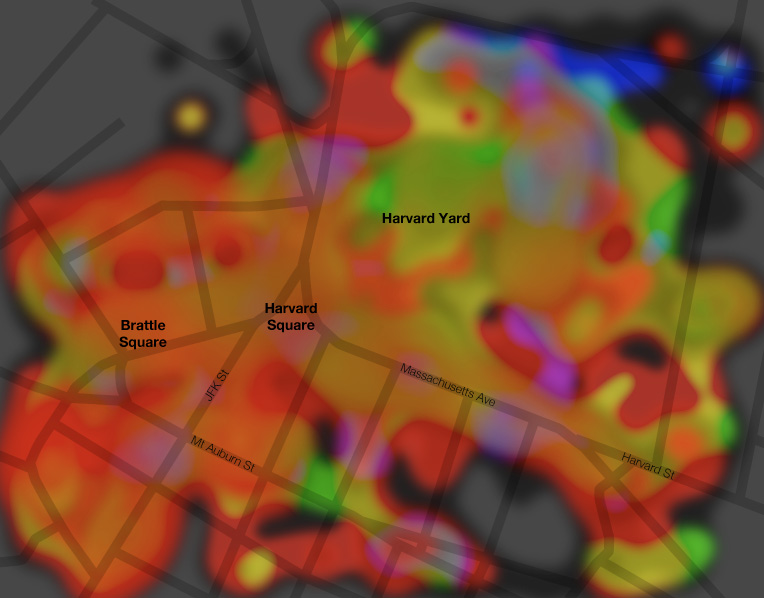
After a few API calls and some code and graphics work, I’ve got a map showing the colors of the physical-cultural landscape around Harvard Square. This is not simply a map of the colors on the ground, which you can get from an aerial photo or systematic documentation like Google Street View, but rather a map of the colors that people on the ground are looking at.

Turns out crimson may be about right, as there’s a lot of red here. But that has less to do with Harvard and more to do with the fact that there is a lot of brick around here. The grass and trees of Harvard Yard are doing all they can to turn the map green in that area and only coming up with something yellowish.
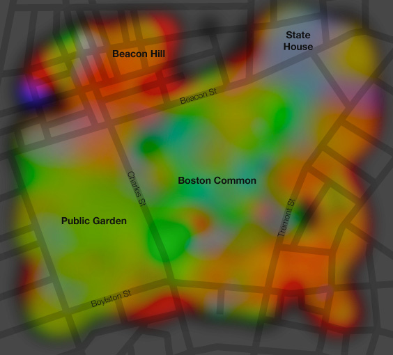
As with much of what I post here, Harvard Square is of course merely a convenient and familiar local cartographic test subject, being just up the street from my home. Here’s another one, Boston Common. Lots of green in the park areas, red and orange in the Beacon Hill neighborhood (bricks again), and kind of blue (sky?) around the state capitol building.

Anyway, WTF is going on here? Quite simply, I’ve grabbed about 2,000 photos in each location from Flickr, determined the dominant color in each, mapped those colors, and interpolated liberally. Here are some dirty details.
Flickr API
These maps are based on the most recent 2,000 or so photos uploaded to Flickr and geotagged within the specified bounding box. This is easily accomplished with the flickr.photos.search request. Now, it would be wonderful to make a silly little web app that draws these maps on the fly, but the next step makes it pretty impractical. That is downloading 2,000 images. Even at the “square” (75×75) size, it takes a while.
Dominant color
Here things are fudged a fair amount. I tried a number of ways of simplifying a photograph down to a single representative color. The most obvious option is to calculate the average color, that is, combine the average red, green, and blue values into one color. But too often that results in a dull grayish color because there is too much color variety in the image. Next I tried the color that appears most frequently. It was sometimes better but also frequently just some dark unsaturated color. Then I looked at histograms and combined the most common red, green, and blue values into a single color. That was hit-or-miss and often produced a color that was not representative of the image at all. After a few other attempts, I decided to simplify a lot: get the average color, but only be concerned with the hue; keep it saturated and fairly bright. As such the maps are showing much stronger colors than most photos actually contain, and they poorly represent the occasionally unsaturated photo, but this seemed like the best way to get a set of very general overall colors. Here’s an example of three basic color options, using one of my own photos of a lovely summer day in the Boston Common; the bottom green color seems most representative and is what I’m using on the map.

Mapping the colors
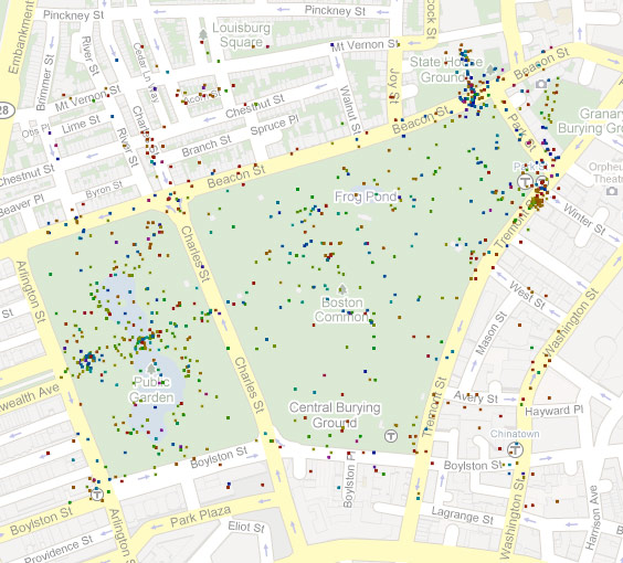
Easy. Just draw a little square at the location of each photo. Here’s the Boston Common.

Sometimes there are multiple photos tagged at the exact same location, however. This time I was lazy and did not take that into account, so the color displayed at such a point is simply that of the last photo to be loaded there. I decided it wasn’t too big a deal given the many other points on the map.
Interpolating
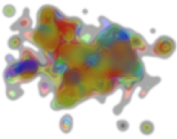
Both of these map extents have thousands upon thousands of geotagged photos within them, but the locations are not at all evenly distributed. To get something more than clustered dots, I employed an interpolation method known as “blurring the crap out of them in Photoshop.” Generally colors fade nicely into one another, but these maps do display some colors that are largely artifacts of the blurring. Still, it works pretty well. I’m sure everyone recognizes the image below as Boston, right? (A shiny nickel to anyone who can explain why Allston-Brighton is so strongly blue/purple, so that I don’t have to go over there and find out for myself.)

In conclusion, call this stuff a work in progress, as I’d like to pursue it further, maybe just because looking at trippy images is fun. There must be a lot of locations that would produce interesting maps. Suggestions?

41 Comments