
Composite election maps
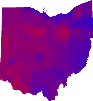
Since election season is nearly upon us again, I was reminded of a brief distraction of mine in 2006, namely the above map. It’s a composite map of Democrat vs. Republican election results in four races in Ohio, ostensibly giving an idea of how “Republican” or “Democrat” an area is.
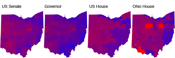
The process was, quite simply, to make maps (above) of each individual election in the style of the now popular “Purple America” maps by Robert Vanderbei, then overlay them on one another so that the color of each end pixel is the average of the red and blue values of the four component maps.* As the districts in the four elections are different, the shapes seen in the resulting map no longer correspond exactly to those in any of the original maps. (The data could of course be shown by different enumeration units, which would affect the appearance of the final map.)
Do people make maps like this? Is it stupid? When split-ticket voting is pretty common, and because of the different influences on different races, I don’t know how useful it is to try to broadly describe how much an area leans one way or the other based on election results. But hey, it’s always interesting to look at data in different ways. Might be cool to do this for the whole U.S. this year.
* Maybe I’m just an amateur, but I could not for the life of me find a way to do this in Photoshop, and instead spent precious** time writing some script to go through every pixel and calculate the average color.
** No, that’s not true; I would have wasted it anyway.
Tagged election maps
3 Comments