
A subterranean bird’s-eye view
I’m rather late to this party, but it’s worth another mention.
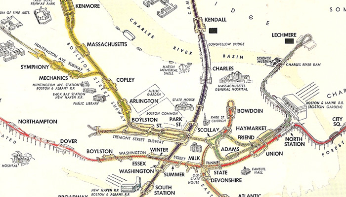
A while ago Vanshnookenraggen (a.k.a. Andrew Lynch) heroically pored over materials in the Massachusetts State Transportation Library and posted a bunch of images of old Boston transit maps to a Flickr set. (He’s got the future covered too with FutureMBTA, an excellent round-up of conceivable transit expansions in the Boston area, complete with system maps.) The most eye-catching of the historical maps is the one shown in part above: a map of the transit system, in what was determined to be 1954, drawn in something of a bird’s-eye perspective. Go to the Flickr image page and view it at its full extent and size. It’s worth looking even if you don’t care a whit about Boston and its transit system, which is fine because Boston doesn’t care about you either.
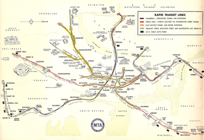
The map is of course interesting for historical reasons, showing the system as it existed fifty-five years ago before various expansions, severe realignments, station name changes, and new nomenclature and graphic standards. But any old map will show those things. This one is of a style that is unique among any subway maps I’ve encountered.
Pictorial bird’s-eye view maps have been around for a long time, most prominently as illustrations of cities and towns in the Renaissance era in Europe and the 19th century in North America. The Library of Congress has a phenomenal collection of the latter online, which, if you’re anything like me, is liable to consume you for hours and hours as you marvel at old depictions of the places you know today. I know a lot less about the history of these maps than I would like to, but some of the more accurately drawn ones must have represented an astounding amount of legwork on the ground.

Those maps, I gather, were valued for their artistic worth and as some sort of advertising of cities and towns. Given that history, infrastructure seems like an unusual subject for bird’s-eye views. A few minutes of Googling only turned up two transportation-themed bird’s-eye views from 1909 and 1906, both at the Osher Map Library at the University of Southern Maine, where they’re listed among other Bird’s Eye Views of Maine. Scroll about two-thirds of the way down on that page for the transportation maps. Conveniently for this post, one of them includes Boston.
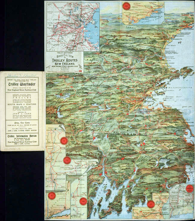
They are rather low-resolution scans, but at a glance the maps don’t appear to be designed wholly around the concept of a transportation map, but rather look more like traditional bird’s-eye views with transportation routes as an added theme. Note that the one posted above also contains insets from the vertical perspective, which presumably give a clearer picture of the network. Again my uneducated guess is that these bird’s-eye view maps were in some sense advertisements, making the systems look attractive to the trolley or railroad customers who might use them.
Back to the subway map. This map comes well after the era of popularity for city bird’s-eye views. Unlike the trolley and railroad maps above, and certainly unlike the whole-city maps, this one is clearly intended to be a map of the transit system only. I am curious what its exact purpose was. (And if anybody knows anybody who knows where some enthusiast has dedicated a web site to the history of Boston subway maps and graphics, hook me up with a link!) In my opinion this map is decent but not stellar as a usable system map, as it makes sacrifices on the two major (usually conflicting) points on which transit maps now seem to be judged: its geographic accuracy is not perfect and lacks enough detail to be of much use anyway, and its topology is discernible but hardly clear. It does sport an MTA (precursor to the modern MBTA) logo, but that doesn’t necessarily mean it was designed as the everyday system map. Its style reminds me of illustrated visitor maps of cities or tourist sites, which are usable but are meant as much for their image as for their use on—or here sometimes under—the ground. That said, the map does indicate parking lots and ignores most non-transit details, so it must have been intended for at least some practical use.
Useful or not, the map is a faded page of awesome. I especially get a kick out of the fact that the details of all the station and track layouts are illustrated. It’s more than I need to know—or not enough more, if that makes sense—as a rider, but I’m learning things from it that I haven’t yet from any wordy text. (“So that’s where that descending track goes at Boylston!”)
Tagged birds eye view, Boston, interesting maps, metro maps
2 Comments