A blizzard of purple
The blizzard of doom was impending. The French Toast Alert siren was blaring. But I wasn’t home in Boston to witness the fun. So, what else to do but look at all the snowfall prediction maps?
Meteorology is a bastion of the rainbow color scheme. The bigger the storm, the more maps. And the more maps, the more colors! It gets especially fun when sequential maps need to extend beyond their usual range. (Remember when Australia was so hot that they had to add a new color?) Perhaps that was a factor in this storm, since the amount of snow was predicted to be unusually high for the affected area.
That said, most maps I found weren’t too out of the ordinary. Here are a few examples.
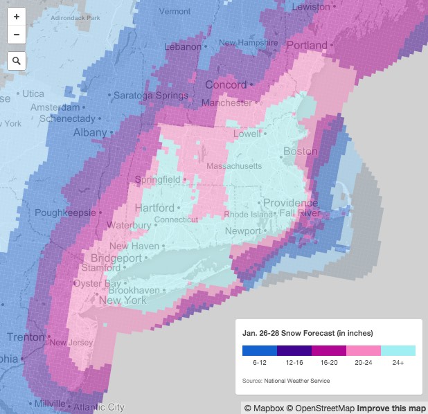
This one on nj.com had a classic looping color scheme. “Okay, we’ve got blue, then purple, then pink, then… crap, what comes after pink? Probably a different kind of blue.”
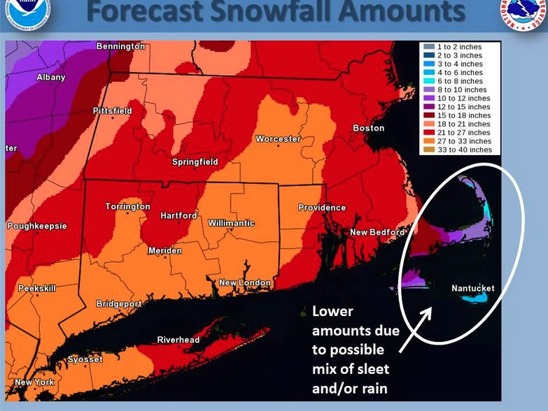
The National Weather Service put out maps like this one, with a gray-blue-purple scheme.
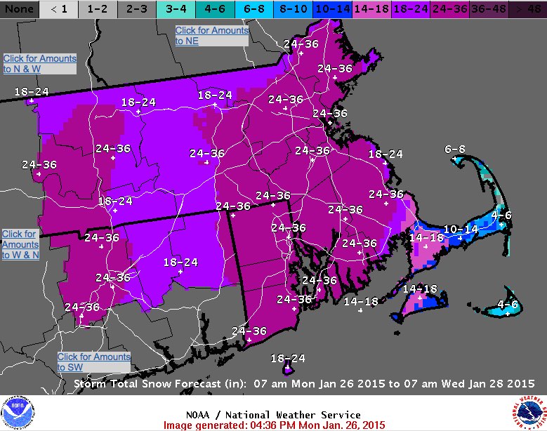
But there were also maps like this, grabbed from the Facebook page of the NWS office in Taunton, Mass. (Go ahead with the tauntaun jokes, nerds), where purple was not enough and red—the most dangerous color of all—was necessary.
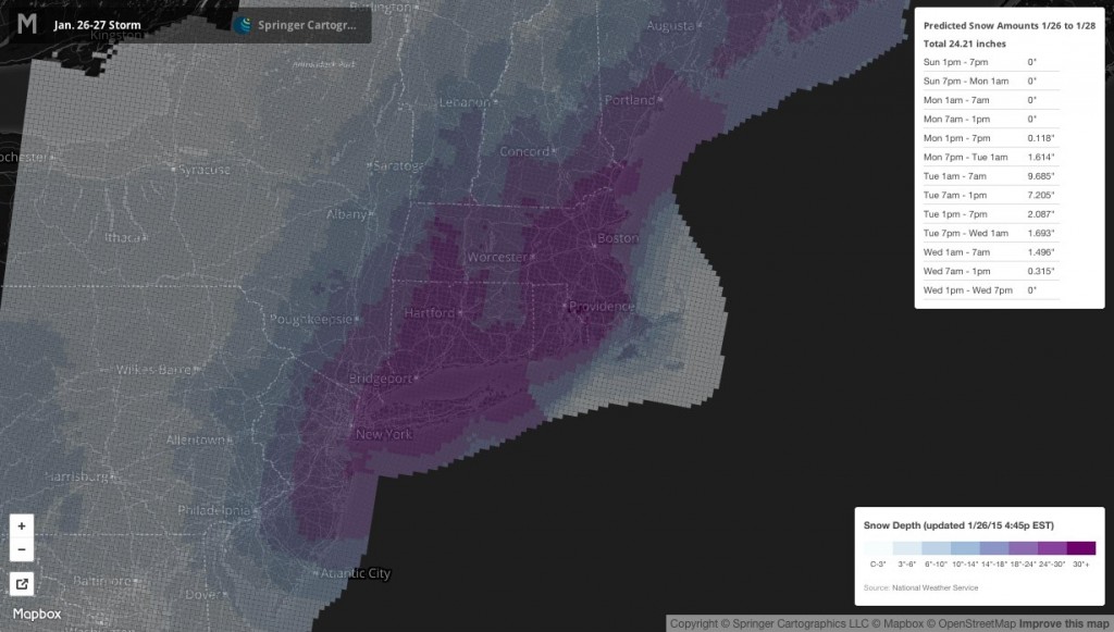
Springer Cartographics put this up on Mapbox. When an expert cartographer makes such a map, you get what appears to be a ColorBrewer scheme.
The Boston Globe was at first slinging NWS maps, but later replaced it with this, which appeared to come from the AP. Pretty simple, with wide class ranges.
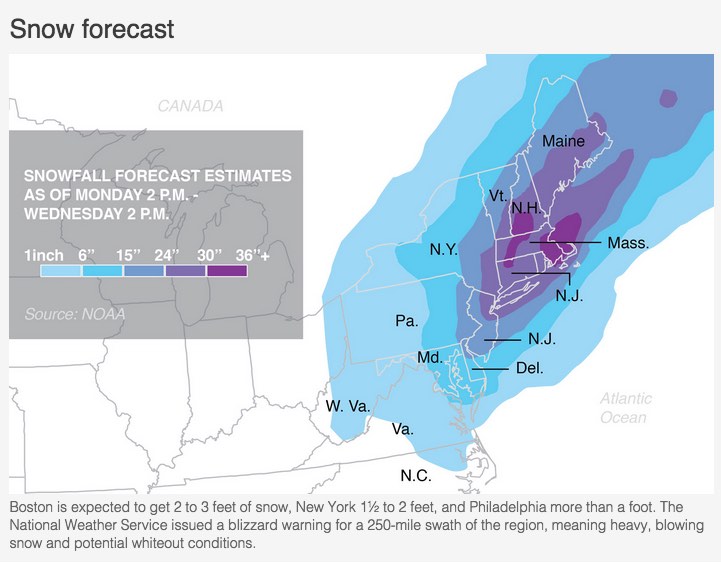
The New York Times also first had a map from the National Weather Service. This one threw green into the mix.
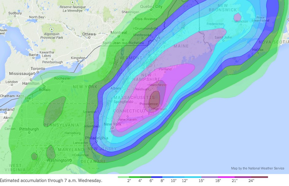
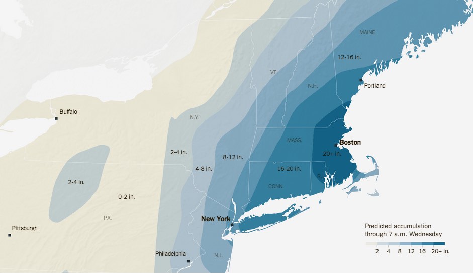
Later in the day, that map had been replaced by a much more NYT-ish map. This is a nice example of something Tim has explained in the past: when timeliness is paramount, put up something acceptable (in this case the NWS map), then later revisit it with refined design.
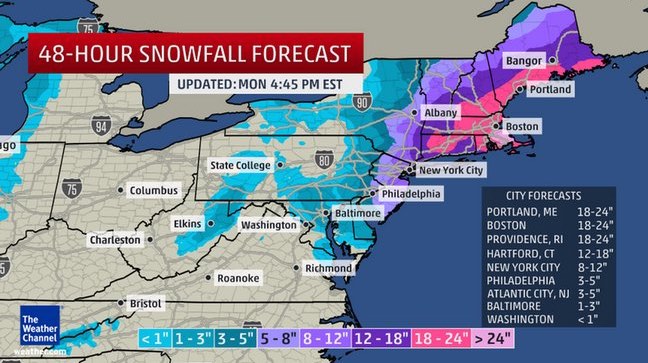
Finally, we musn’t forget the Weather Channel. This map is disappointingly not panic-inducing, considering the source. Imagine it within an overblown page containing annoying auto-playing video, though. And at least it’s oblique.
Happy sledding, everyone!

1 Comment