Same old story from me. Whenever I make a map "for fun" it's a map of the White Mountains in New Hampshire, a place of many fond memories and continued adventures. I've done stylized flowing feathery maps, a National Park style map, and others. Then, for some reason, I decided it was time to make a real map.
My side projects are often exercises in style, simply attempts to highlight natural beauty in the terrain. This time, I wanted something that is beautiful but also functions as a detailed reference map. Many of my cartographic peers have been doing this for years, and I salute them—detail takes a lot of time and effort!
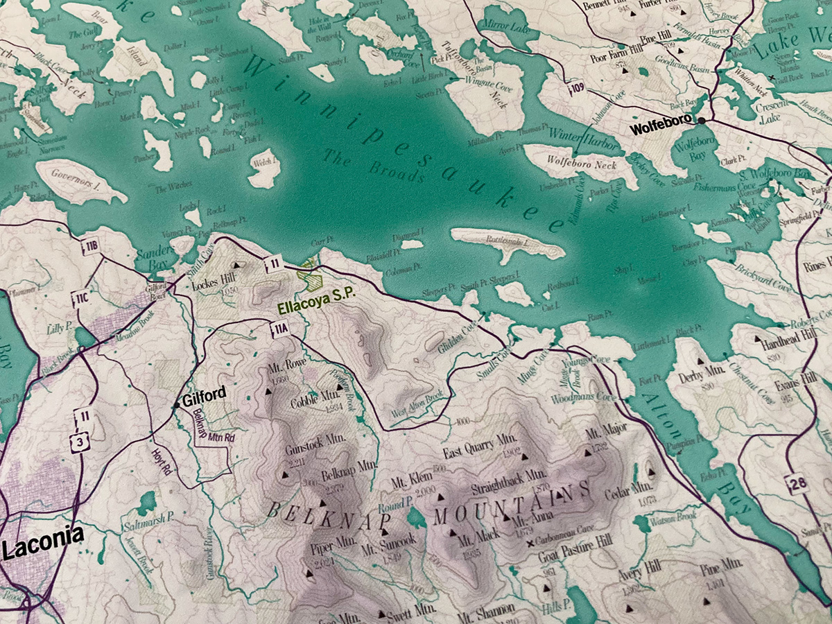
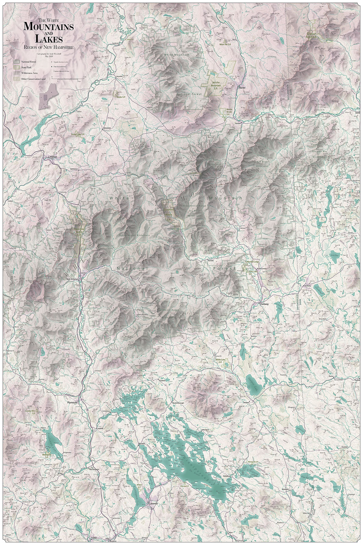
The extent of this map is more ambitious than my previous efforts. If I can figure out how to promote it in the right places, I hope that this map is something people would want on the walls of their vacation rental properties. (If that's you, buy a print!)And if we're going for the Airbnb crowd, it would be a shame to exclude the area next door to the Whites: the Lakes Region, anchored by Lake Winnipesaukee, is a hugely popular vacation area. I settled on an extent that just barely fits most of both regions in a 24 x 36 inch print, while allowing space for tons of labels.
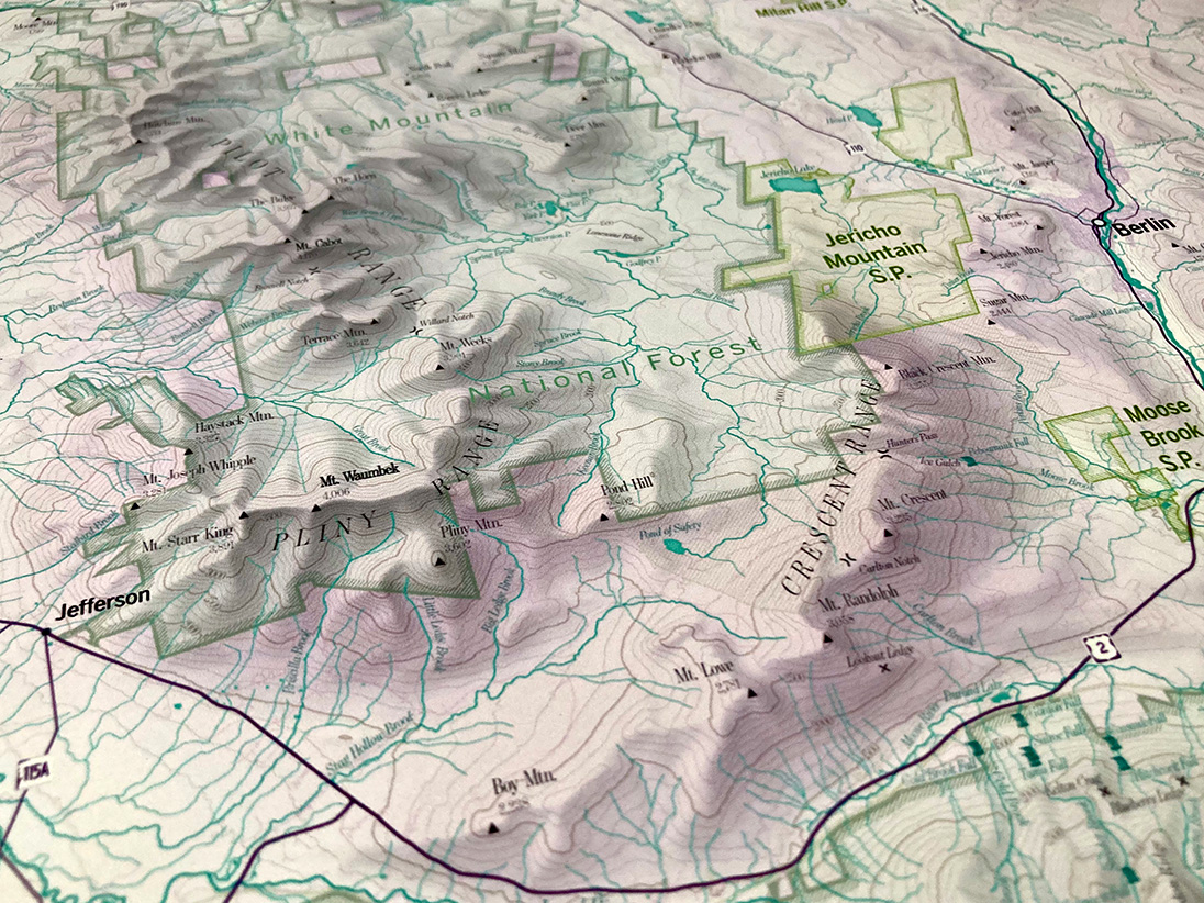
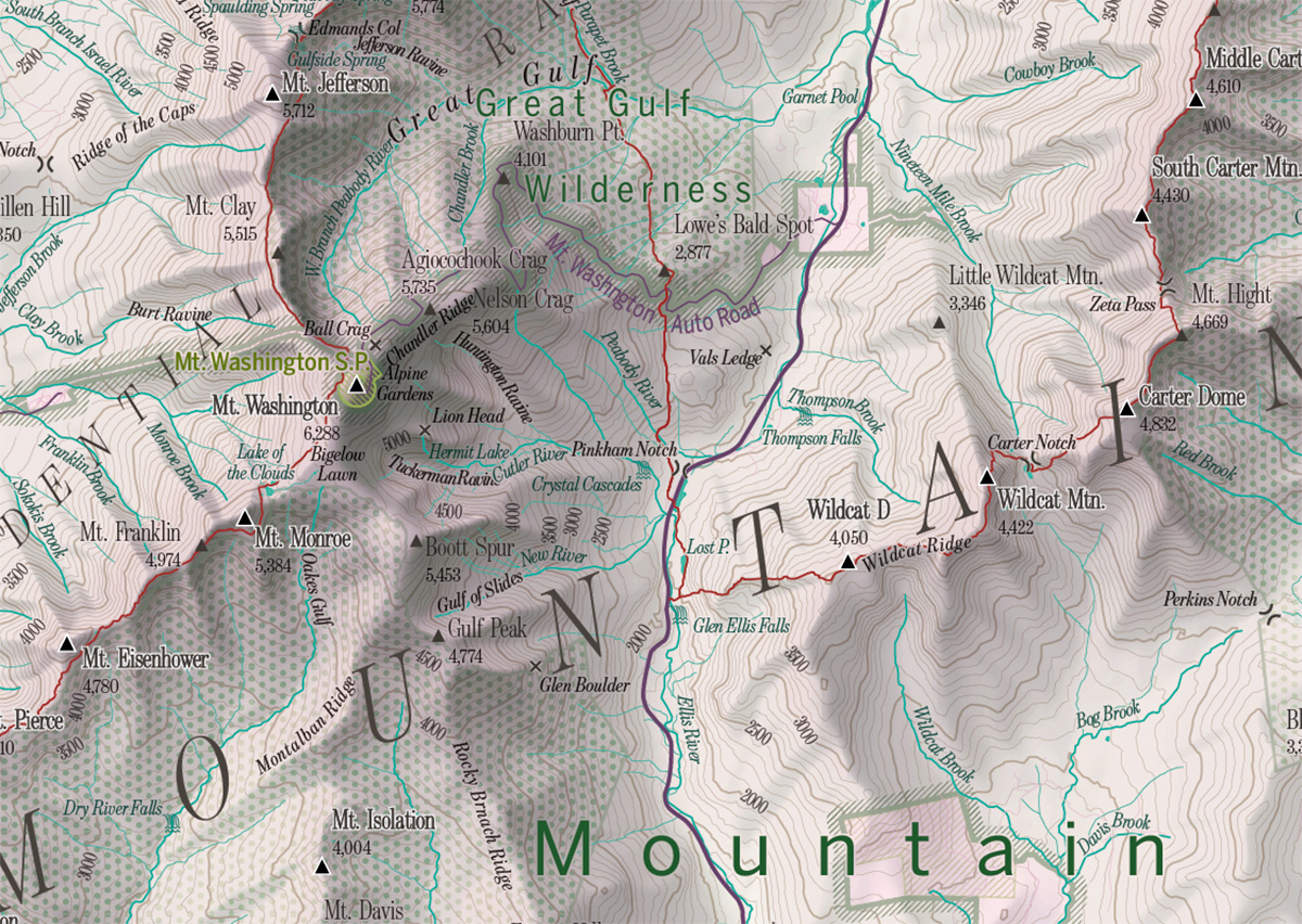
This map's first job is to be captivating from afar, to look good on a wall from across the room. The terrain and colors should grab one's attention. Accordingly, the first thing I did was spend a while working on shaded relief and color schemes. Shaded relief here, as in previous maps, was done with Eduard, which is a fantastic tool for generating Swiss-style relief shading. It's a style (and software) that doesn't lend itself to every type of terrain, but it does work well in the White Mountains, where mountains are, well, mountain-shaped with distinctive summits, ridges, and valleys.
For all my years in cartography, designing this kind of printed map is still a bit new to me. Once upon a time, I would have done a terrain layer by generating a hillshade and throwing it on the map with the multiply blend mode. I've since learned that the best digital terrain presentation is much more complex, often involving several tools on the GIS/hillshading end, as well as a lot of Photoshop layers. I won't try to give a detailed breakdown of this map (look to others like Daniel Huffman for solid practical advice), but will mention a couple of examples.
To help the terrain look decent when viewed from both afar and up close, this map essentially uses two hillshades blended together. One is detailed, so smaller features are clear when examined closely, and the other is much more generalized, applying broad soft shadows to mountain ranges. The effect of the generalized layer is subtle, but it does make a difference. When you stand back, the overall shapes of the mountain region stand out better than they would with only the detailed layer.
Far
Near
Another standard trick of good shaded relief is to separate shadows and highlights into their own layers, rather than using only a single image. This allows you to fine-tune things that you couldn't quite get right with the hillshading algorithm, but it also allows you to apply some different coloring to bright and dark areas, for example cool blue shadows and warm yellow highlights. I did not use that kind of coloring here, but I've often done it elsewhere.
Cool shadows and warmer sunlight on a Maine Woods Initiative ski map
I've also learned the importance of good hypsometric tinting. I had long associated hypsometric tints with garishly colored school maps, and saw no need for it in fine bespoke cartography. But it doesn't need to be garish! Good subtle hypsometric tinting can really help give a clear and elegant-looking picture of the terrain of an area. My colors here are slightly bold, using a shade of pink for high elevations, but again I want this to be striking.
The overall color scheme ends up being one of purplish pink to greenish blue, I think taking some influence from the beautiful cartography of Sarah Bell. It's different from the greens, blues, and browns you find in many physical maps, and I hope that helps it stand out.

With the base elements in place—terrain, water, contour lines, roads—it's all about text! This is where a cartographer often spends a lot of time, as almost every label needs to be adjusted with consideration for all the other labels around it. This map has close to 5,000 pieces of text, and I carefully nudged nearly all of them into place. It pushes the limit of legibility with a lot of 5-point text, but it just barely works!
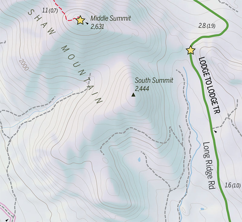
The map focuses on physical features: bodies of water, islands, mountains, valleys, ridges, cliffs, and more. The labels for those are primarily from the Geographic Names Information System (GNIS), supplemented by a few other sources. While GNIS includes tons of geographic names, as I filled in names on the map in as much detail as possible, it became clear that there are many, many more locally known names that aren't in the database. I found a few from other, sometimes older, maps, but I'm sure there are more. Despite the many labels here, the map is certainly not comprehensive (it would take me years to track down all the names!), and I tip my hat to those who do try to make super comprehensively labeled local maps.
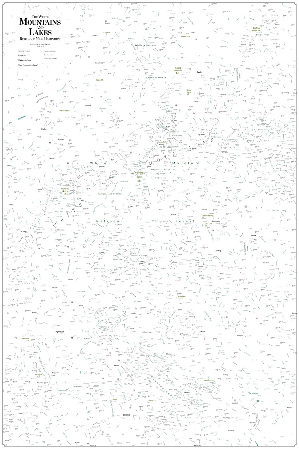
Label bonanza!
Get the map!
If you love the White Mountains or Lakes Region, or if you know someone who does, please consider buying a poster print of this map!