Maps and Animation Page
Andy Woodruff
Geography 353: Cartography and Visualization

| Population Change, Main Scheme | Population Change, Second Scheme | Dot Density | Graduated Symbols | Proportional Symbols |
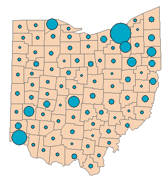
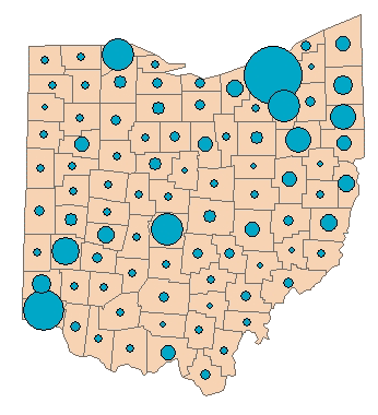
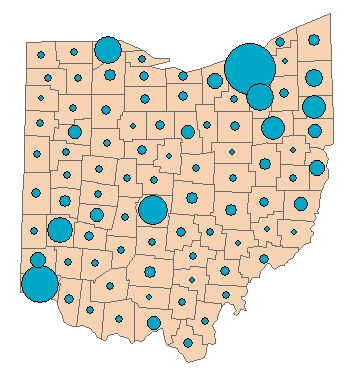
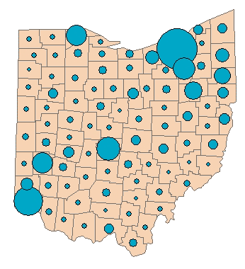
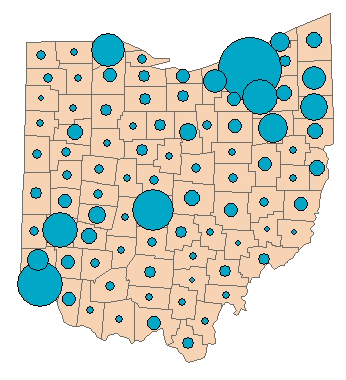
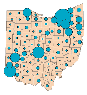
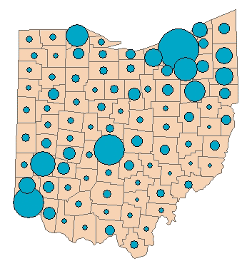
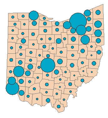
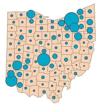
Proportional Symbol Maps
These maps show population totals in each county as proportionally-sized circles. Each circle is a different size based on the population of the county it represents. Since the size of each circle is relative to the other circles on a given map, there is no constant scale for all eleven maps, so these maps are not animated.1900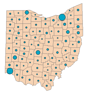
|
1910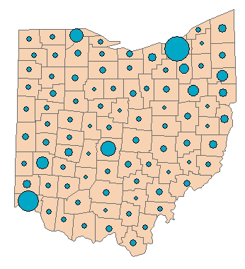
|
| 1920 |
1930 |
| 1940 |
1950 |
| 1960 |
1970 |
| 1980 |
1990 |
| 2000 |
|
Ohio counties and cities reference map
 Select a county from the list below to see a table and graph of its population data.
Also see a summary map and chart of change over the century for the whole state.
...to Main Page