Course Log Page
Andy Woodruff
Geography 353: Cartography and Visualization

Lab 1: Locating Digital Thematic Data on the WWW
Lab 2: HTML
Lab 3: Data Processing
Lab 4: Introduction to ArcView and ArcGIS
Lab 5: Data Processing Part 2
Lab 6: Data Classification and Mapping
Lab 7: Mid-Project Evaluation
Lab 8: ArcGIS Layouts and Graphic File Export
Lab 9: Cartographic Animation
Lab 1: Locating Digital Thematic Data on the WWW
8-17 September 2003
Keyword Search
Google also revealed some other web sites with the data I need. Two examples, the next two results on the list, are
a database called IPUMS-USA (the site cautions us to "Use it for GOOD -- never for EVIL"),
which is more difficult to navigate; and a "Historical Census Browser"
from the Geostat Center of the University of Virginia Library. It is easy to locate data on the latter site, and there is access to even more
detailed data than the Census Bureau site--at least the page that Google found--offers.
Overall there was virtually no difficulty in finding the data I need. Certainly this is because the data I seek
are quite simple; were I looking for something more complex (e.g. circus clowns per capita by county in 1910) a keyword
search would probably be less productive. It appears that finding census data is not too difficult because they are well-recorded
and meant for public use, but non-census data might be more elusive in this kind of search.
Index Search and Census Bureau Site
Once I figured out that "People" on the main Census Bureau page was a hyperlink, finding the data was easy. Clicking
on "Historical Census Data" led me to the same page that the Google search produced. Census 2000 is prominently advertised
on the main page, making it easy to find the latest data. Again, finding this data is easy because I am looking for something
simple. I tried browsing the Census web site to look for more complicated data, which I had difficulty findind save from the 1990
and 2000 census. I could not find anything on the Census web site about copyright issues, so I assume that anyone is free to use the data within.
Other Seraches
The Data
Web Sites with Ohio Information
Sites About Population Change in Ohio
Google's keyword search proved useful for finding the data I need. I searched on "historical census data,"
and the first result was the page on the U.S. Census Bureau site that links to various sets of historical data sets
ranging from the 1790 census to the 1990 census. One of these links leads to lists of county populations from 1900
to 1990. From this point it is not difficult to find the data from the 2000 census.
I found the Census Bureau site through the Yahoo categories:
Government>US Government>Executive Branch>Departments and Agencies>Department of Commerce>Census Bureau
As far as what I'm searching for is concerned, Dogpile and Ask Jeeves didn't seem to have any particular advantage over something like Google. They found basically the same sites as my previous searches.
Ohio Population of Counties by Decennial Census: 1900 to 1990
and Population, Housing Units, Area, and Density: 2000; Ohio--County
-Informaion about all things official in Ohio
-A tourism site with information on various natural and cultural features of Ohio
-Overview information on Ohio's geography, economy, government, and history
-An article with some informationa about Ohio's economy and transportation past and present, with additional details on some specific places
-Historical information on eleven territories that make up the present state
Books
-Some information about trends in Ohio's population change, mostly in the last decade
-Another page apparently from the same series with more informaiton of the same sort
Finding a good book is a little difficult because searching for it produces a list of either too many or too few choices, it seems.
Searching on a general phrase gives a lot of results, on a few of which are likely to be useful. On the other hand,
searching for something more specific seems to turn up hardly anything that looks useful, because apparently Ohio's demographic history
is a lot like circus clowns per capita (see Keyword Search above) when it comes to books. Physically looking
at the books is the best thing to do.
Two general Ohio history books ("Ohio and its People" and "History of the State of Ohio, Vol. VI") were the best I could come up with. They may provide some sort of clue about the change in population over the last century.
Lab 2: HTML
Doing my best to remember the HTML I learned several years ago...
I remember how to do most of the basics. Web sites like the
Complete HTML True Color Chart and the JavaScript Source are useful for
additional things.
Lab 3: Data Processing
22 September 2003
What fun.
This is actually not a whole lot of work when dealing with only Ohio as I am. I only had to cut and paste a few times. If I had to do the whole country, it would be a much bigger pain because cutting and pasting a few times for each state would take forever, and there would also be issues with new and disappearing counties in other states that are apparently just not as stable as Ohio. Couple that with the fact that Excel refuses to keep the text formatting of the FIPS column, and I'd have a recipe for insanity.
And speaking of the FIPS codes: Census Bureau page about FIPS codes
That page explains why the codes are important in keeping things standardized in the whole federal government, and it also
has links that lead to nearly all the FIPS codes in the universe (as well as additional information about the different sets
of codes).
Lab 4: Introduction to ArcView and ArcGIS
6 October 2003
The addition of interstate highways to the maps does assist somewhat in that it helps to easily identify where things are, since highways are included on a lot of the maps that people are used to seeing. They show where cities are (basically where bypass highways are), though the location of cities is pretty obvious without them, especially when population is being mapped.
ArcGIS seemed like it was easier to work with than ArcView because of the slightly more familiar layout. But ArcView wasn't hard to deal with and seemed like it could do what I need just as well as ArcGIS.
ArcView Definitions
- Project
- The whole thing, including views, themes, etc.
- View
- The working area, where map with various themes will be
- Table
- Contains the data that are linked to the map
- Theme
- A layer on the map, such as the census block group boundaries
- Shape file
- Basically the file that is the theme
- Identity
- If Indentify is the intended word, it's the tool by which the data for en entity on the map can be accessed.
- Legend Editor
- Where colors, data being mapped, etc. are edited
- Query
- Allows selection of certain elements of the theme to be made and added or removed
ArgGIS Definitions
- Map Document
- Like the Project in ArcView; all the work
- Table of Contents
- The area that shows all the data frames and map layers
- Data Frame
- Like the View in ArcView; contains the layers
- Map Layer
- The particular thing on the map, such as block groups, roads, etc.
- Attribute Table
- The table with the data linked to the layer
I found it interesting the obscure things that can be mapped using ArcGIS using the selection tool. For instance, by selecting certain parts of a layer, I can map out all the properties in Delaware County whose building has a full basement. I also had fun using graduated symbols and proportional symbols to map out attributes of U.S. cities- lots of big circles!
Lab 5: Data Processing Part 2
15 October 2003
Definitions
- DBF4
- The type of database file that ArcGIS uses for its data
- Select by Attributes
- Used to select certain parts of the data (in this case to single out my state)
- Query
- The actual tool used to make the selection
- Fields
- The columns of data, such as County Name or a certain year's population
- Records
- Individual cells in the table
- Attributes
- The pieces of data associated with the maps
- Relational database
- Databases about common things, matching up, for example by FIPS codes
- Join function
- The way to merge two databses into one
- Monitor fire
- Combustion of the display device in front of me(?)
- Calculate/Field Calculator
- The tool to create new numbers through calculations using the existing data
Lab 6: Data Classification and Mapping
30 October 2003
Comparing the ten maps
The maps. (Opens a new window)
Looking at the ten maps as classified by default, I can see in general which areas of the state had high growth and which had low growth (and in between) for each of the ten year periods. Five classes of data are for the most part enough to show the differences in growth among the counties, but in at least one case (1910-1920) where one county has a relatively extreme number, other "high" values are put in the next lowest class, making them look lower at first glance than they actually are. Overall these maps are not really comparable to one another because each has different data classes. Counties with similar growth rates to those in the above example will seem to have higher values on other maps than the 1910-1920 map because they will likely be in the highest class in the other maps. Because of the differences in class breaks, the maps can only really be looked at independently to compare parts of the state for a given time; they can't really be easily used to compare growth at different times.
Doing the same this with quantile classification has similar results, but is not entirely the same. For one thing, the problem with extreme values is eliminated because a quantile scheme ensures that even most astronomical value will have company in its data class. The quantile classification helps for comparing parts of the state because having the same number of counties in each class allows patterns to be easily visible (where the fifth of the counties that had the highest growth are, where the fifth that had the lowest are, etc.) Other than comparing general patterns among the maps, though, the quantile classification does not help to make different maps comparable because again the classes are different for each map.
My classification scheme
| -20% to -7% | -7% to 0% | 0% to 9% | 9% to 19% | 19% to 35% | 35% to 60% | 60% to 165% |
The placement of the breaks in the classes was mostly determined by breaks in the data. I used Excel to make histograms of the data to look for breaks. I put the histograms of each of the ten sets together into a chart (turning them into line graphs) and looked for places where many of them seemed to share a break. My eyes survived the ordeal, despite the fact that the chart looked like this:
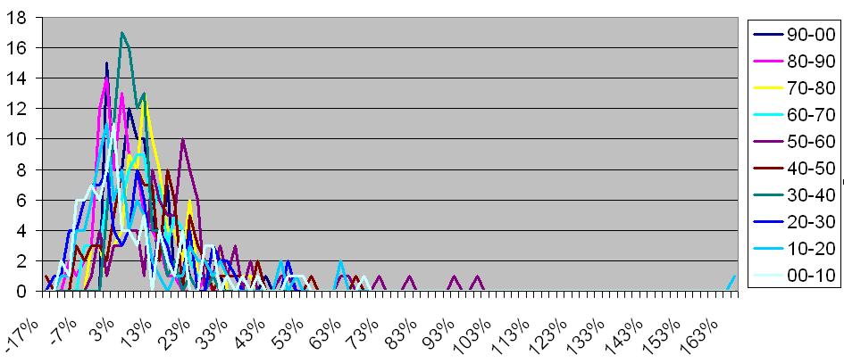
(I did enlarge it when I examined it.)
I also looked at a histogram that used the numbers from all ten sets together:
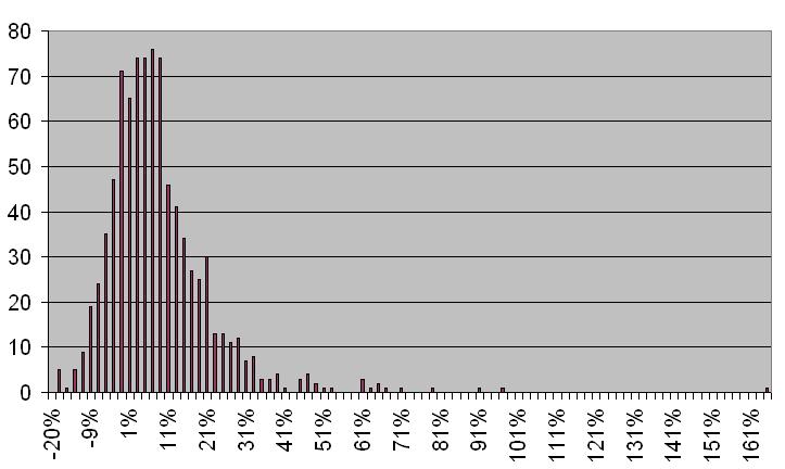
I used the breaks I saw in these two charts, but also considered what I would see on the map. For instance, in the second chart, a nice break after about 21% is visible (there is a significant drop after it), but I decided to make my break before that point because my experimenting produced maps with more counties falling in the same category than I wanted if the class went up to 21%. I think making the break lower helped to bring out the patterns of the two affected classes better. With the classification scheme I came up with, not all classes will be represented in all maps, so sometimes a map will seem somewhat uniform, but since the main purpose is to compare patterns over different years and not within one map, it is all right if a few maps don't use some of the classes.
Colors
I decided on a double-ended blue and orange (sort of) scheme for my chloropleth maps. The oranges are for negative values and the blues are for positive values.
The specific colors came from part of a scheme on the Color Brewer web site. I had originally planned to use blue and green
(green being for the negatives), but I decided that both blue and green seem "positive," so it might be confusing at first glance
which means gain and which means loss. I kept blue and decided that orange or red seemed more "negative" in comparison with blue.
I couldn't come up with shades of red that looked good to me, so I used the beginning of a scale of red colors on the Color Brewer web site,
which on their own are more orange. That's close enough to red for me.
For the other types of maps, I just used whatever random colors ArcGIS chose when creating them, so long as they weren't blinding and the features could easily be seen. I just applied the colors from the fist map of each type created to the subsequent ones.
Graduated Symbols
For this I stuck with good ol' circles as the symbols. I made six different classes, using a vaguely quantile-like scheme. I picked
convenient places for breaks such that overall (among all the maps) there would be roughly the same number of counties in each class. I tried
to give the sizes of the cicles a fairly large range so that it would be easier to tell the difference between different-sized circles.
Proportional Symbols
Here again I used circles. I made the smallest size relatively large because I found that when it was small, the differences between
the circles was harder to notice. The result is a few counties with circles that are larger than the counties themselves, but it seems
to me that they don't make the maps any more difficult to interpret.
Dot Density
For the population value of one dot I used 10,000 for each map. This is good for the more recent years, when populations range from less than
20,000 to over a million. Some counties have only a couple dots while others have a lot. The maps of earlier years have many more counties
with low populations, so the dots are sparse over much of the maps. This set of maps is therfore good for comparing the population patterns over the whole century
(which I think is what is the main thing to compare), but not so good for seeing clear patterns in each individual year.
Lab 8: ArcGIS Layouts and Graphic File Export
This process was annoying at times because I would export the pictures and then discover something I forgot to put on one or all of them, forcing me to go back and export them again or go through some awful process in Photoshop. In two cases, one or two maps of a given set ended up being smaller than the rest for some reason. Going back and exporting those couple of maps wouldn't have worked because I had since changed the layout while working on a different map. So I either had to redo all ten or try to change the size in Photoshop. I opted for the latter option, and the results were fairly good, though not perfect, so a slight shift during the animation may be noticeable.
I decided to export the legend separately from the maps, since for each set only one legend is necessary. I wanted to break up the parts of the legend and put them in a table on the web page so that the text and background colors would match the colors on the web page (something I didn't figure out how to make happen in ArcGIS). The titles (year numbers) I added in Photoshop.
I didn't want to put additional data on the maps, since they are not too big and would look crowded with more things on them. Instead, I created a separate, somewhat larger map of Ohio showing the county names and the locations of the state's major cities. I think adding roads to that map would have made it too crowded, and I decided that they didn't provide all that much of a reference given that the cities were already on there.
One issue that came up in exporting the maps had to do with the dot density maps. When the maps are exported, they look a bit different from how they appear in ArcGIS. In the case of the dot density maps, the dots appeared much smaller and more sparse. I changed the maps so that one dot represented 3,000 people instead of 10,000. I think this change gives a better sense of population distribution than increasing the size of the dots would have.
Lab 9: Cartographic Animation
Once all the maps were exported, animating them was simple. I used the wizard thing in GIF Animator to put together each animation. One thing I noticed after experimenting is that I needed to change the "removal method" (or something like that) to "to background color" in order to avoid having the pictures piling up on top of each other, which made the year labels unreadable one the animation got past the first couple of frames. For the delay between each frame I chose 150 (1.5 seconds). The animation is relatively fast, but I think that speed is good for seeing the changes in patterns from year to year. I also made animations that were much slower (with 6-second delays) so that viewers can more closely examine the maps or have time to locate a certain county to follow, etc.
As for other ways to animate the maps, I didn't think anything other than chronological sequence was in order. My intended purpose with these maps is to display changes over time and not to compare any specific years to each other. I also think that a viewer of animation would expect that it goes forward as time does, and that some other way might be disconcerting, at least to the type of viewer I am creating these for. Thus I decided not to create any animations other than chronological ones that encompassed the whole century. Since I also don't mean to highlight any one year of a map set over any other, the animation on each map set is uniform: all years, all with the same timing. However, I did make each of the static maps available on the web pages so that people can look at individual maps or compare specific maps of their own choosing, not mine. For even more non-animated information, I will provide a page for each of Ohio's 88 counties. These pages will show a small map with the county's location highlighted, the actual data for the county--populations for each census year and percent change between them--and a graph showing the population over the century.