Maps and Animation Page
Andy Woodruff
Geography 353: Cartography and Visualization

| Population Change, Main Scheme | Population Change, Second Scheme | Dot Density | Graduated Symbols | Proportional Symbols |
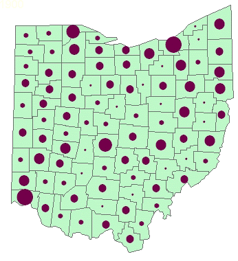
Graduated Symbol Maps
The Graduated Symbol maps show the total population for each county in each census year. The populations are divided into classes, each of which is represented by a different-sized circle.
 (If the animation stops, refresh the page) |
|
||||||||||||||||
| 1900 | 1910 | 1920 | 1930 | 1940 | 1950 | 1960 | 1970 | 1980 | 1990 | 2000 |
Ohio counties and cities reference map
 Select a county from the list below to see a table and graph of its population data.
Also see a summary map and chart of change over the century for the whole state.
...to Main Page