Maps and Animation Page
Andy Woodruff
Geography 353: Cartography and Visualization

| Population Change, Main Scheme | Population Change, Second Scheme | Dot Density | Graduated Symbols | Proportional Symbols |
Dot Density Maps
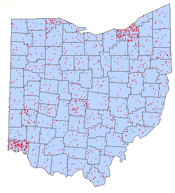
The Dot Density maps show the approximate distribution of population for each census year. The dots do not represent the exact locations of people, but rather are placed randomly within each county, hence the apparent shifts within the counties from year to year. I don't expect anyone to be able to actually count the dots on these maps, since they do not appear sharply, but the maps provide a general sense of the population distribution in Ohio.
 (If the animation stops, refresh the page) |
One dot = 3,000 people Detailed county data and a reference map of Ohio counties and major cities appears below. |
| 1900 | 1910 | 1920 | 1930 | 1940 | 1950 | 1960 | 1970 | 1980 | 1990 | 2000 |
Ohio counties and cities reference map
 Select a county from the list below to see a table and graph of its population data.
Also see a summary map and chart of change over the century for the whole state.
...to Main Page