Maps and Animation Page
Andy Woodruff
Geography 353: Cartography and Visualization

| Population Change, Main Scheme | Population Change, Second Scheme | Dot Density | Graduated Symbols | Proportional Symbols |
Population Change Maps
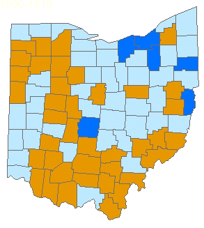
(Second Classification Scheme)These chloropleth maps show population change by county for each decade from 1900 to 2000, using a second, more simplified classification scheme to show general patterns.
 (If the animation stops, refresh the page) |
|
||||||||||
Click here to see a more slowly animated version (opens a new window), or choose a static map from below:
| 1900-1910 | 1910-1920 | 1920-1930 | 1930-1940 | 1940-1950 | 1950-1960 | 1960-1970 | 1970-1980 | 1980-1990 | 1990-2000 |
Ohio counties and cities reference map
 Select a county from the list below to see a table and graph of its population data.
Also see a summary map and chart of change over the century for the whole state.
...to Main Page