Travel poster maps

I was thumbing through the Boston Public Library’s Flickr photos the other day and revisited their set of old travel posters, some of which had been on display in a nice exhibit at the main library recently. BPL has some 350 of them, and they’re pretty great. I usually leave the sharing of interesting map links to other more reliable bloggers, but these were shiny and distracting, and I just wanted to make sure we all knew to look at travel posters for our carto-fix.

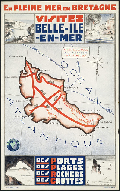
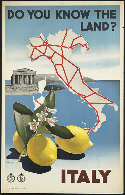
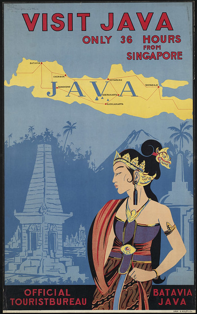
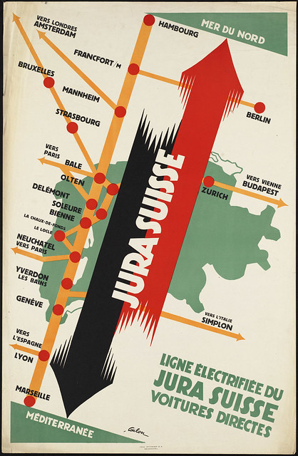
Here are most (but not all) of the map-based travel posters from the Flickr set. Click them to visit their respective photo pages, where you can see them in larger sizes.

Visitez Belle-Ile-en-Mer. En pleine mer en Bretagne

Italy. Do you know the land?

Visit Java. Only 36 hours from Singapore

India. The land of Lord Buddha

Great Britain. Her natural and industrial resources

Jura Suisse. Ligne lectrifie du Jura Suisse voitures directes

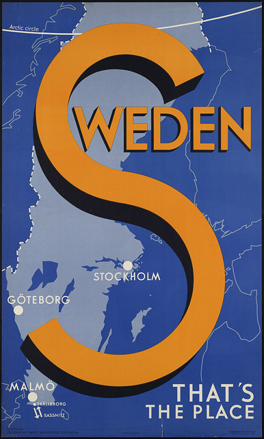
Sweden. That's the place

A beautifully engrossed map of summer play land

Bonus: produce crate labels!

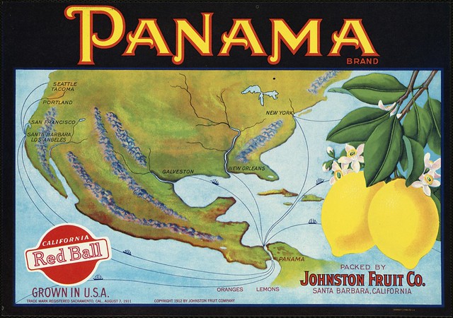
Panama Brand: Packed by Johnston Fruit Co., Santa Barbara, California

Incidentally, as the true map geeks out there surely know, BPL also has an excellent map collection, with many maps viewable online through their own site as well as Flickr.

Tagged , ,

5 Comments

  1. Interesting how big of a role transit networks play on some of these posters, and the extent to which some have simplified the networks into cartograms. Reminds me of some other maps I’ve seen lately…

    Daniel
    11 January 2011 @ 1:58pm

  2. Heh, I’d use the winking emoticon right now if I were an emoticon-using kind of guy, Daniel.

    Regarding transit networks, many travel posters were of course from railway companies and other transportation organizations themselves, so transportation in some way or other often figures into the designs. The simplified, cartogram-like style is interesting. I guess some of these are from around the time when that was starting to become popular?

    Andy Woodruff
    11 January 2011 @ 2:19pm

  3. Makes sense to me. Not sure when linear cartograms started coming into vogue — all I can find on cartogram history are the posts by John Krygier and Zach, but they both deal with area cartograms instead. The area ones get all the press, it seems.

    Daniel
    11 January 2011 @ 2:38pm

  4. oh wow i really like that first one. thanks for sharing andy!

    Eliana
    11 January 2011 @ 5:19pm