The election at night
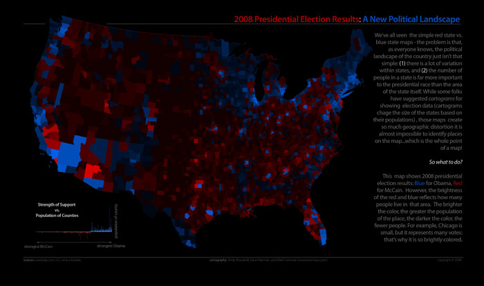
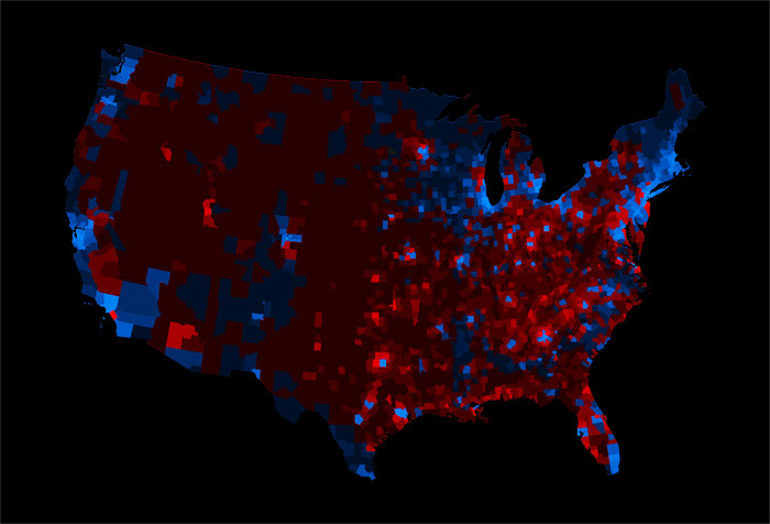
We’re working on putting together a few election maps and and graphs at Axis Maps, and above is one that we’ve come up with so far.
It’s a standard red-blue map indicating the winner of each county in the lower 48 states, where the transparency indicates the population of a county. The many counties with low population fade into the background, diminishing their visual prominence. This is meant to accomplish something similar to a cartogram, where sizes are distorted to show the actual distribution of votes. It’s step one of trying out alternatives to the cartograms that I complained about earlier this week. I won’t claim yet that it’s better… just different.
Tagged axis maps, election maps, map projects


9 Comments