#tbt: My first map
On a recent dull evening, I went digging for forgotten treasures on an old laptop. This is always good for a laugh and a tear (the latter because my a-hole younger self left photos right on the desktop seemingly to say, hey future self, you loser, remember when you had all this hair?), but the real mission was, as always… maps!
The computer is from my grad school days in Wisconsin, 2005–2007, but it also has files from my undergraduate days at Ohio Wesleyan University, 2001–2005. Here’s a grab bag of a few treasures found. Let’s begin at the end.
Treasure 1: Master’s thesis, 2007.
Oh god.
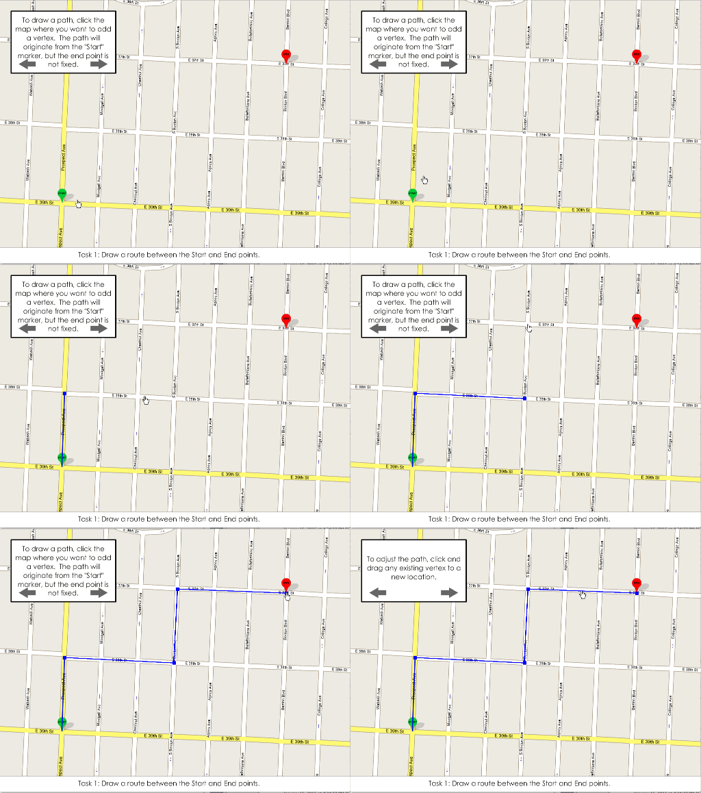
This thesis will not go near the internet, because it’s terrible. If you want to see it, I can provide directions to Science Hall in Madison, where you can find it wasting space—actual, physical atoms that deserved better—on a shelf in the Geography Library. The premise of the thesis still sits well with me: it aimed to study how people use street maps and aerial images differently (think “map” vs “satellite” in Google Maps). But the execution wasn’t great.
What was kind of cool, though, was the little interactive user study itself, which was a Flash thing that had people drawing paths on top of random maps. You could even edit the paths. Somehow it was wired up to send me an email full of coordinates when a user finished. It’s just a fun reminder of things that I forgot I could once do in Flash.
Look at the IRB-approved torture if you want. Enter any random number on the first screen, and be patient when it asks you to answer a question on a survey that you don’t have; the “Next” button does appear after a short delay.
Treasure 2: Cartography, 2007.
I don’t really know what this is. There was a folder simply titled “Cartography” as though my early-career digital organizational plan was shove all the files from this day until retirement into this folder. But it turned out to be a slide show of images. Hard to say why it exists, but it’s a neat glimpse at UW-Madison cartography 8 or 10 years ago.
Credits for the maps therein include: Heather Francisco, Ben Sheesley, Jeff Stone, Aaron Erkenswick, Jamon Van Den Hoek, Eve McGlynn, Rob Roth, Joel Przybylowski, Dave Heyman, Zach Johnson, Matthew Bloch, and me. But I almost certainly missed a few, not to mention the couple of slides of commercial maps.
Treasure 3: A study on spatial context in interactive maps, 2007.
In a very grad-schoolesque episode, two fellow students and I embarked on a small research project for no reason other than to learn, and to present it at a conference. It had something to do with guaging people’s understanding of spatial context and overall landscapes based on using paper maps versus interactive maps, the hypothesis being that when you can search and zoom right to a point of interest, you don’t gain much spatial understanding. We had no strong conclusions, though.
We presented this at the AAG conference in San Francisco. After the talk, a professor I can’t remember from a university I can’t remember told us that one of his students had done pretty much the same study before. Oh well. (The same student’s name came up at the next year’s conference, as apparently she had also studied my thesis topic, only better. I never met this enemy of mine, but maybe she never really existed and was only a story that professors use to make people look like idiots at conferences.)
Treasure 4: My first AAG conference registration, 2006.
LOLOLOLOL I used to think going to AAG conferences was a good idea.

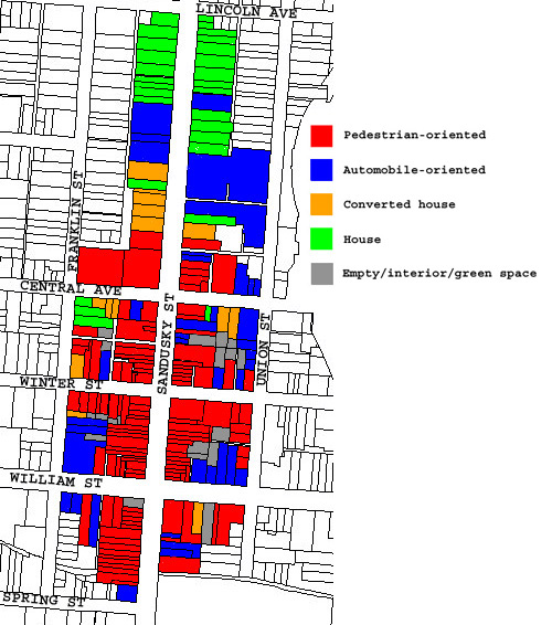
Treasure 5: Categorizing buildings of Delaware, Ohio, 2004
Warning: you’ll want sunglasses for this one.
It’s a simple color-coded map that categorized buildings in downtown Delaware, Ohio, mainly commercial buildings oriented toward pedestrians or automobiles, and residential buildings. Delaware is the town where I went to college. It’s mildly frustrating to live in a town called Delaware. Even within Ohio, telling people “I’m heading back to Delaware” would elicit some confused questions. To be mixed up with a state that consists solely of an I-95 toll booth… sigh. Anyway, it’s a pretty nice small town, despite the Columbus sprawl that has now swallowed it.
This map was part of something or other that I did for an urban geography class. I loved those classes. It was vintage geography, studying the forms of cities, the kind of stuff that would eventually draw me to things like Kevin Lynch and Bostonography. Not the social theory stuff that would end up driving me away from urban geography in grad school.

Treasure 6: My first map, 2003.
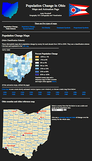
Not really. I don’t know what my first map was. Probably some crayon doodle or macaroni art. What we have here is perhaps my first map as a cartographer. It comes from late in college, my junior year, and was my classs project in John Krygier’s Geography 353 course at Ohio Wesleyan. True to how my career would turn out, the whole dang thing is a web page. Way to stay the course, Woodruff.
So here it is, a series of chloropleth [sic] maps of a century of population change in Ohio.
Click and behold:
![]()
ANIMATED
![]()
GIFS
![]()
It’s thrilling to remember this. I was just writing some setInterval thing in JavaScript to animate something on a map. To think that I’ve been animating maps since practically day one!
These maps aren’t beautiful, being mostly straight ArcGIS exports and even Excel charts. But it’s nice that there is no evidence that I ever made maps before learning about ColorBrewer, despite some later aberrations like the Delaware map above. (How fun to note that some years later, fortune would hand us keys to the ColorBrewer site itself. Fear me, for I am now the thing standing between your students and godawful rainbow color schemes.)
Treasure 7: THE MEMORIES!
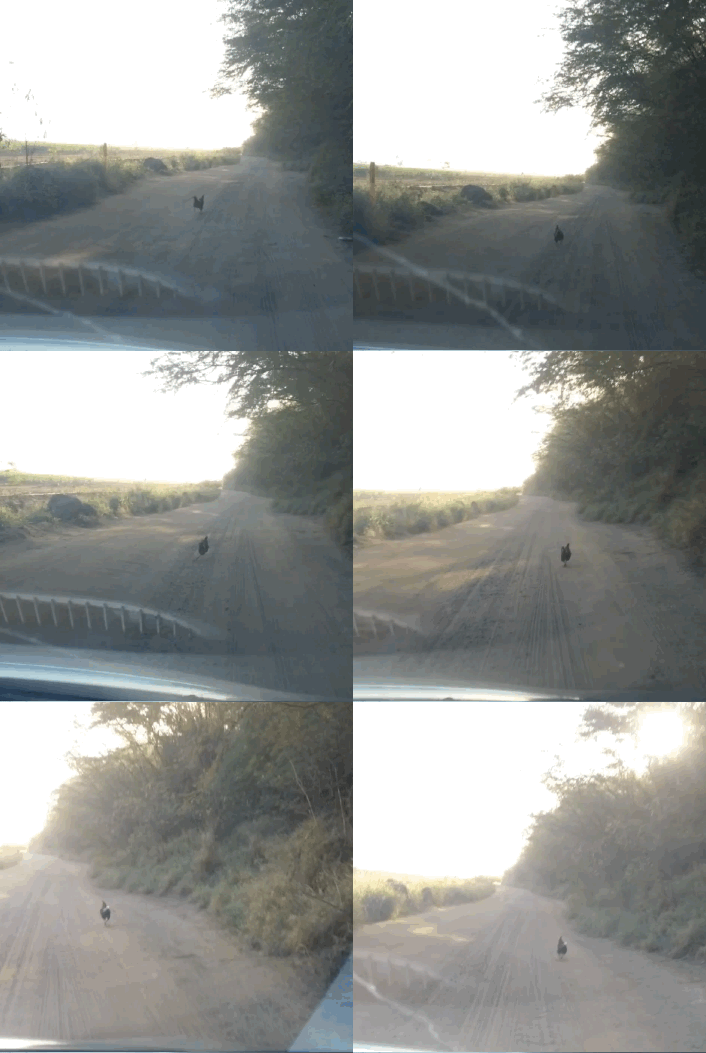
Now, I am no old timer in cartography. My first maps were not only digital maps; they were web maps. But I’m no spring chicken either. Perhaps an early autumn chicken. No, wait, this chicken, seen recently on Kauai:

Always running to stay just enough ahead of the car(tography)’s advances to avoid being overtaken and crushed. And too stupid to jump out of the way and live in peace on a beach. (The rental car in this analogy represents cartographic technology, although in reality your average map tile is far more sophisticated than a Nissan Versa.)
Anyway, the point is that there have been plenty of advances and changes in how maps get made during the past dozen years. My own basic “make a map” workflow has changed enough that I’ve already lost some earlier skills. (You know how sometimes people claim that we lost all that 60s technology to put people on the moon? It’s like that, except instead of human beings walking on a celestial body, it’s a garish MS Paint map.) It’s fun to remember what we used to do, and admire old works, but not to miss it all and lament change—even when old maps were good, the experience always led to something better.


2 Comments