Seasonal relief
Just a map for fun, made without writing any code, which is a nice change of pace.
I finally spent a bit of time catching up with the great Daniel Huffman’s excellent tutorial on creating shaded relief maps with Blender. Do try it out if you haven’t; he’s written it up thoroughly and helpfully, showing and explaining why Blender is good for this purpose. I’ll wait here while you read through it.
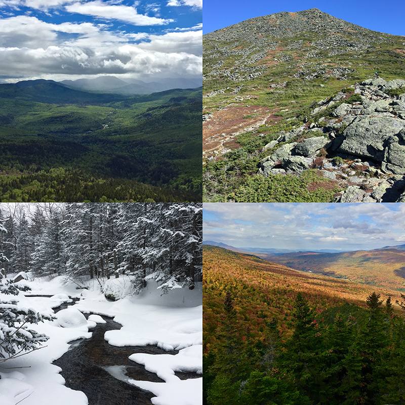
The White Mountains of New Hampshire provide the setting for my attempts. This is where we go from Boston for good hiking and other outdoor activities. My significant other has gotten me into enjoying the area in all seasons. Mostly we do big hikes up various mountains, but she’s even persuaded me to try skiing for the first time in my life soon.
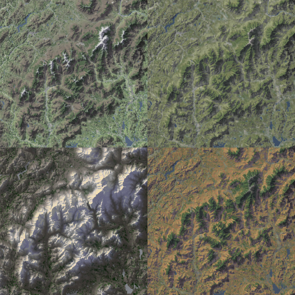
Anyway, an idea came up of making a shaded relief map of the White Mountains in each of the four seasons. Here’s what I’ve got so far. (Click/tap for big version that’s like 27 MB.)
This is a combination of elevation and blurred land cover data, plus TIGER/Line water polygons. Spring, summer, and autumn all use the same hillshade, but winter’s different, having a lower and weaker sun. Besides that, it’s a bunch of Photoshopping to try to evoke the look and feel of each season.
Summer (top right) is probably the most straightforward, with the land cover layer mostly left alone. Green areas are a bit yellow, an attempt at a kind of warm, dry look. Spring (top left) colors are little cooler and brighter, but only at lower elevations. Deciduous forests up higher are still bare, and there’s even still some snow on the higher peaks. Later, in autumn (bottom right), I made a splotchy texture of greens, yellows, oranges, reds, and browns to suggest the lovely fall colors of the region. In winter (bottom left) I really went for it on the lighting. As mentioned earlier, the rendered relief has a low sun. Shadows have a lot more blue than the other seasons, and highlights are warmer, as though the sun were setting. And, of course, there’s snow. In reality the whole region would be snowy, but I liked having some variety, so the lower parts are bare, except evergreen forests. Evergreens, of course are the only thing that’s green across all four maps—not that I was consistent in their color.
Technical tricks are probably not really worth getting into here because I’m not much of an expert. Most of the things I’ve tried involve Photoshop adjustment layers and layer masks based on elevation and/or the shaded relief itself. When the shadow and highlight layers are cranked up to 11 on the winter map, for instance, you can see how the areas to which they apply are based on both lighting and elevation. Daniel Huffman also has some related tips (and many more) in his article on terrain in Photoshop.
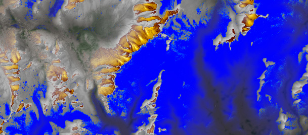
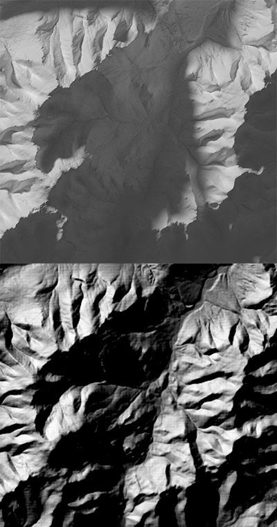
The winter map especially showed me how nice Blender is for shaded relief. As you’ll hear from Daniel, it’s 3D modeling software that renders realistic lighting and shadows. When the light source is low, as in my winter map, you can really see how shadows behave like actual shadows. For example, notice how the Presidential Range (left, below) casts a shadow onto the other side of the valley. A more typical hillshade doesn’t really model shadows but rather shades the left side the of valley (facing away from the light source) dark and the right side light.
Anyway, I’ll probably keep messing around with these maps forever, and try to make a real map with labels and everything. Meanwhile, I’ll also keep visiting the White Mountains frequently!


