By Andy Woodruff on 8 June 2010
The latest issue of the The Cartographic Journal (of the British Cartographic Society) contains a paper written by Robert Roth, me, and Zachary Johnson entitled “Value-by-alpha Maps: An Alternative Technique to the Cartogram.” The value-by-alpha map is something I have touched on here several times over the past year and a half (as has Zach on his blog), and about which I spoke at last year’s NACIS conference in Sacramento. With the publication of this paper, it’s high time I explained what it’s all about.
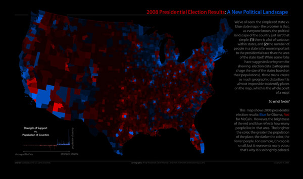
Value-by-alpha maps (hereafter shortened to VBA), like everything noble and good, have their roots in somebody complaining about something on the internet—me, about election cartograms. Seeking an alternative to what I think are ugly and unreadable election results cartograms, I worked with my Axis Maps dudes to create a 2008 U.S. election map that used transparency rather than size to vary the visual impact of map units, thinking that avoiding the distortion of these units into unrecognizable sizes and shapes would make the map easier to read.
Rob Roth, a stellar Ph.D. candidate and shameless county collector at Penn State (studying under The Beard himself, the illustrious Alan MacEachren) became interested in further developing the idea academically and enlisted my Axis Maps partner and radical raw milk zealot Zach Johnson (who wrote his master’s thesis on cartograms) and I to collaborate on the now-published Cartographic Journal article. We were all graduate students at Madison together once upon a time, and we make a good team—striking a perfect balance between study, practice, and chili-eating.
Enough backstory. I’ll summarize at moderate length the idea and what we wrote.
WTF is a value-by-alpha map?
First things first: value-by-alpha is essentially a bivariate choropleth technique that “equalizes” a base map so that the visual weight of a map unit corresponds to some data value. Whereas cartograms accomplish this by varying size, VBA modifies the alpha channel (transparency, basically) of map units overlain on a neutral color background. Thus shapes and sizes are not distorted (except necessarily by the map projection, of course), but the lower-impact units with lower alpha values fade into the background and make for a map that is visually equalized by the data.
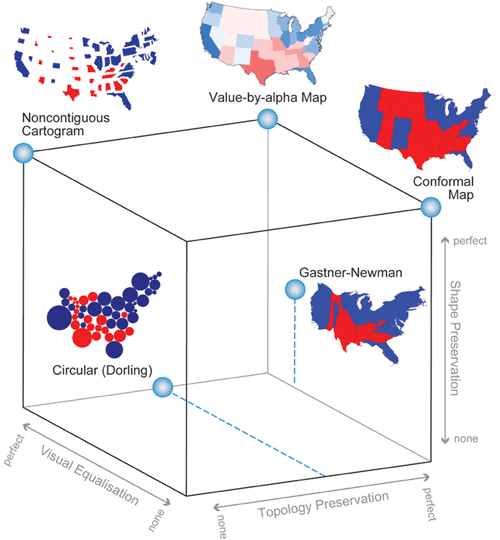
Solving Johnny’s Cube
To make a case for the limitations of cartograms, we point to Zach’s graduate work that compares several different types of cartogram designs. Zach developed a typology that describes cartograms in terms of three characteristics: shape preservation, topology preservation, and density equalization (basically a measure of how accurately the area corresponds to the data value; we’ve modified this to visual equalization to include more than just size variation). Depicted as a stylish and highly respectable cube, his typology reveals a back corner that is unattainable for cartograms, as none can be perfect in all three regards. Value-by-alpha, by leaving size and topology alone, allows us to nearly “solve” Johnson’s cube.
VBA works by wordplay
We must note that although creating VBA maps involves modification of transparency, the maps do not in the end symbolize via MacEachren’s visual variable transparency, which is more like a masking of one layer by another that is not aligned to it. Rather it’s two color variables, one of the late Jacques Bertin’s original graphic variables and a later addition—color value and saturation. In the end it is as though each map unit’s color was adjusted in value and saturation. “Value-by-alpha,” then, is an infinitely clever name (chosen by Rob) that refers to both numeric value (as in “value by area,” a term for cartograms) and color value.
Design considerations
On to the practical advice. There are basically three components to consider in the design of VBA maps: the modifying color, the equalizing variable, and the variable of interest.
The modifying color is the color that modifies the original unit color as its alpha value changes, i.e., basically the map’s background color. White or black are the only colors that make much sense here, as anything else will confuse hues and muddle the value and saturation too much. There is some difference in the way white and black affect value and saturation, but they both essentially map an overall “lightness” to the data (just in opposite directions). Black tends to make for a more striking map, I think.
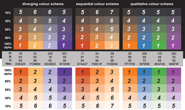
The equalizing variable is the one that is symbolized by alpha and thus visually equalizes the map. First of all, this variable needs to be one of consequence to the variable of interest in order for the visual weighting and VBA altogether to make sense (e.g., counties with more voters are of more consequence to election results). With that out of the way, we recommend classifying the variable into five to seven classes. That number is pushing the limits of what can be visually distinguished, but we are suggesting some compromise for an improvement in aesthetics. To avoid units that are completely invisible, the lowest class shouldn’t have an alpha value of zero, but rather something in the 10–15% vicinity, from there stepping up to 100%. To assist with geographic context, we also suggest adding an outer boundary to the map units taken together.
The variable of interest is the variable being mapped with color and weighted by the equalizing variable. Because the alpha modifications introduce a lot of subtle variations in color, we advise a fairly limited number of data classes (unmodified colors) in this variable, specifically only two or three variants of each hue. For a sequential scheme that generally means two or three classes, and for a diverging scheme it means four to six. As always, ColorBrewer is the place to look for color schemes, a few of which are ideal for avoiding inherent lightness differences in hues that could upset the map’s intended visual hierarchy.
Below are some example color and alpha schemes, taken from ColorBrewer specs. Each is labeled with numbers that correspond to the intended visual hierarchy, where 1 should stand out the most, 2 the next highest in the hierarchy, and so on. Note that several colors may be meant to exist at the same level.
For the faint of heart
Cartograms are good for shock value. They’re an in-your-face radical perspective on a world you thought you knew, and they can really make a point. As a carto-curmudgeon, I remain meta-amazed by the amazement with which cartograms are received. We think that VBA can be a good choice when you want to show similar information but also want to be able to recognize what the hell you’re looking at. So when no shock is required, or it would hinder the intended map-use tasks, perhaps value-by-alpha can be your friend.
Limitations
Let’s be real—even I’m not convinced that VBA is broadly useful. We are proposing it and providing some theoretical support, but it is untested and carries important known limitations. It cannot be a universal replacement for cartograms, and we don’t want to imply that it is.
First, color value and saturation are not the most effective visual variables for encoding numerical data, certainly less so than size, which is what cartograms use. Furthermore they can’t as easily be tied to direct mathematical scaling as cartograms might. What all that means is that we can’t expect users of VBA maps to extract numerical estimations with much success, so the technique is best reserved for big-picture purposes, not precise comparisons.
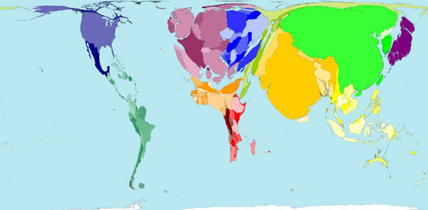
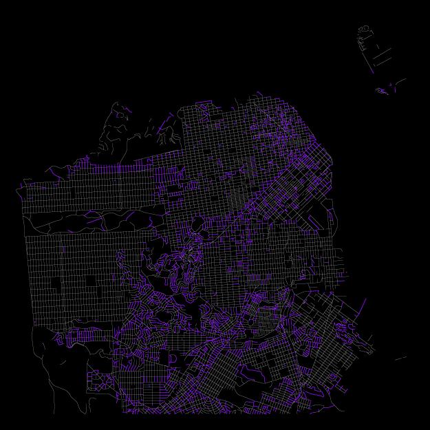
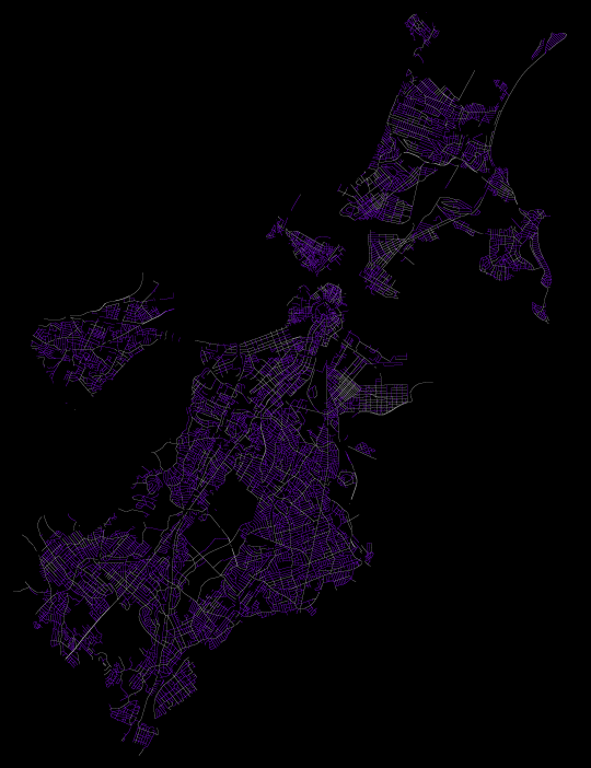
Second, VBA is incapable of an important use of cartograms, which is to emphasize units that are small in area but thematically important, for example some of the European countries in the population cartogram below. VBA can only reduce the visual presence of a map unit, emphasizing the important ones only by diminishing the surroundings. Small geographic units may remain difficult to interpret.
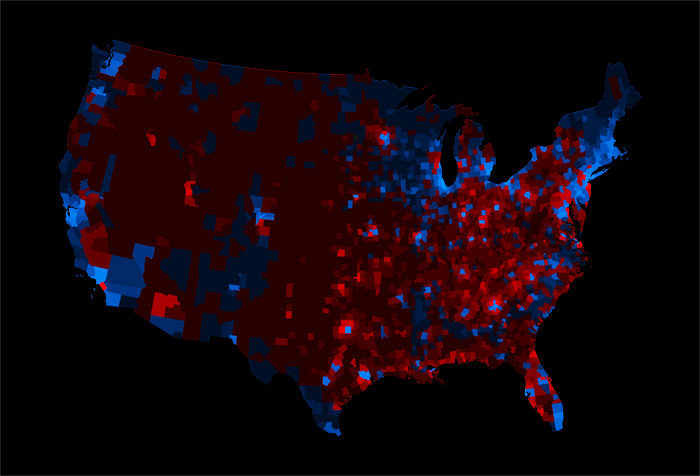
Third, we can’t ignore varied unit sizes in a VBA map, just as in any choropleth map. Larger areal units carry a higher visual impact even if they are thematically less important, which is why some sort of standardization is generally encouraged on choropleth maps (e.g., mapping population per square mile instead of total population). Cartograms don’t have this problem, of course, because unit size represents thematic data, not geographic area. We didn’t really explore standardizing by area in VBA maps, but it may result in a more appropriately equalized map. However, standardization of the equalizing variable further hinders user estimation of data values in the map. For example in the election map equalized by population density below, it’s correctly visually equalized, but it’s not easy to compare one county’s impact to another’s because it requires calculating some combination of color and size.
Finally, there are display media issues that don’t exist with size variation in cartograms. The subtle variations in brightness and saturation in VBA are very difficult or impossible to hold constant in digital media. A map can look perfect on one screen and completely black on another. We got some feedback along those lines on the original election map. When you can’t control the display medium, a cartogram might be a better bet.
In action
Here I am obliged to point out that we’ve built value-by-alpha functionality into indiemapper, the Axis Maps web-based cartography application. Zach programmed most of that feature about an hour before my NACIS talk last fall. Otherwise, making a VBA map is simple: either programatically adjust alpha values of enumeration units or in a more graphical approach create layers for both the variable of interest and the equalizing variable, and use the latter to mask the former.

To close, it is worth providing an example of the value-by-alpha technique besides the election theme of everything posted so far. Below is a version of a map made by Rob Roth and Jin Chen at Penn State for some research they’re involved with. With a diverging color scheme it shows cervical cancer mortality rates by US county, above and below the national rate. Instead of using a VBA map to equalize by some variable of magnitude, this map uses it to display a measure of statistical reliability. A county’s alpha value corresponds to a score that indicates how reliably it lies in a cluster of elevated cervical cancer mortality, resulting in the spotlight effect on those important regions. Before I do more injustice to this work, check out the fully detailed poster (PDF) available on Rob’s ludicrously thorough online CV.

Paper citation
Roth RE, AW Woodruff, and ZF Johnson. 2010. Value-by-alpha Maps: An alternative technique to the cartogram. The Cartographic Journal. 47(2).
It is probably not permissible for me to post the paper online, but anybody who has read this far is probably an academic with access to the journal.
Tagged Academic, vlaue by alpha | 13 comments
By Andy Woodruff on 1 June 2010
A couple of weeks ago Nathaniel Kelso tweeted a link to an interesting Bolivian land use pattern seen in Google Maps. First thing that popped into my nerd brain: polar area diagram!
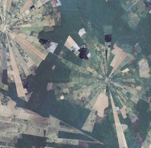
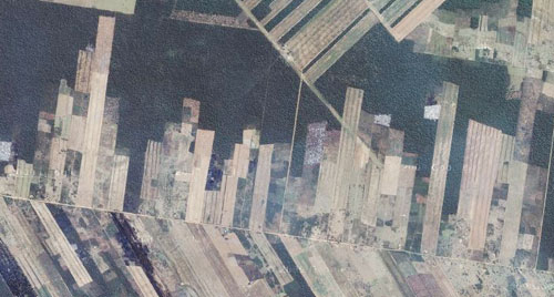
There are also some (possibly stacked) bar charts nearby.
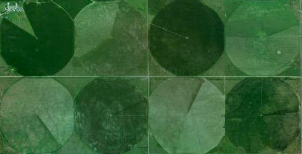
Over in the United States are some ordinary pie charts. Poor contrast among those colors, though!
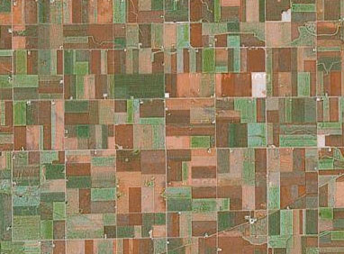
Much of the rural U.S. is a big treemap, of course.
There must be a whole world of statistical graphics out there. Anybody have more examples?
Tagged aerial, charts, google maps | 7 comments
By Andy Woodruff on 24 May 2010
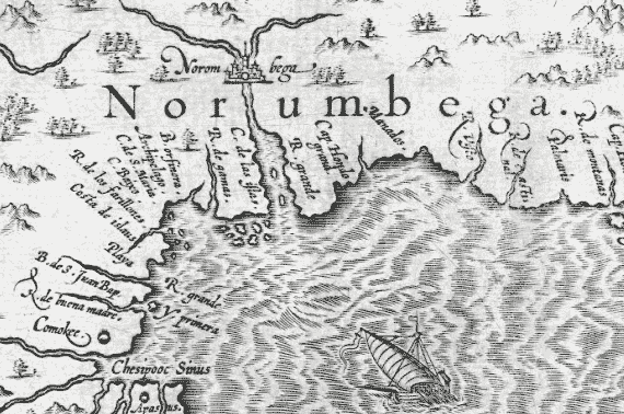
“Here, at modern Watertown, was the ancient CITY OF NORUMBEGA.”
While preparing data for another spare time local interest map (forthcoming), I ran across a tiny bit of information (“Horsford’s Norse exploration theory”) that ended up captivating me for the weekend. It is the story of Norumbega, at various points a regional name applied to New England, a legendary city of riches, and thanks to a baking powder magnate, an 11th-century Viking city established by Leif Erikson in the modern-day Boston area.
Now, having been aware of this for no more than two days, and knowing little about historical cartography, I won’t claim any expertise or even to have all my facts straight, but let me summarize as best as I can.
In the 16th Century, not long after the European “discovery” of the Americas, Norumbega (with varied spellings and an uncertain etymology) began to appear on maps as the name for roughly what is now New England. It would come to refer to a region, a river, and a city, variously. As a city, it was apparently from the beginning legend—a place that was said to exist (no doubt along with other cities) but which had not been located. More than that, it came to be a downright mythical place, a city of endless riches—something like a northern El Dorado. The story of David Ingram, a shipwrecked English sailor who trekked all the way from the Gulf of Mexico to New England, made the rounds:
He saw kings decorated with rubies six inches long; and they were borne on chairs of silver and crystal, adorned with precious stones. He saw pearls as common as pebbles, and the natives were laden down by their ornaments of gold and silver. The city of Bega was three-quarters of a mile long and had many streets wider than those of London. Some houses had massive pillars of crystal and silver
Somehow Norumbega became associated more specifically with the Penobscot River in present-day Maine, with the city being around where Bangor is now. Samuel de Champlain explored the area in 1605, apparently looking for the city, but found no evidence of civilization. It seems that this quieted the myths of Norumbega’s fabulous wealth. But the name didn’t disappear and will still be encountered today in that area.
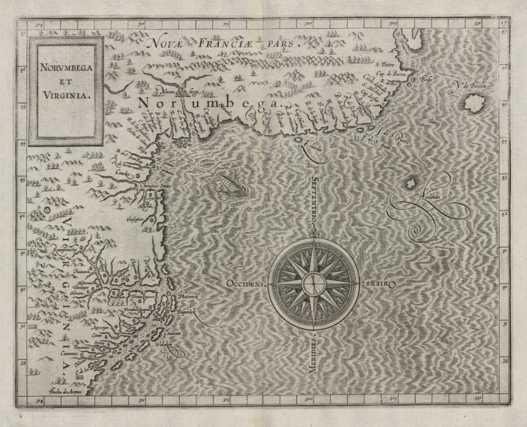
Many maps show the Norumbega region, and I can’t hope to do justice to that cartographic history, but Cornelius Wytfliet’s 1597 map, shown in detail at the top of this post and in full below (see a zoomable high-res version here) is a good example, and its Norumbega does bear some resemblance to the Penobscot River and Bangor.
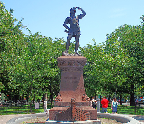
Let’s fast-forward about 270 years to the dealings of high society in Boston, for the twist that makes Norumbega different from typical cartographic legend. In the 1870s a committee formed to back the erection of a statue of Leif Erikson, the famous Norse explorer. Proposing this was the renowned Norwegian violinist Ole Bull, with support from some others like the prominent American poet Henry Wadsworth Longfellow. Although proof would not be uncovered for another ninety years in Newfoundland, by this time the theory of Viking discovery of North America was somewhat popular. Furthermore some people had a notion that this Viking settlement had occurred in New England, i.e., that Vinland was or included New England. Gloria Polizzotti Greis of the Needham (Massachusetts) Historical Society explains why the idea of Norse discovery had traction with the Protestant elite of Boston:
So, Boston’s elite in their well-heeled gathering places, began to identify themselves with, of all people, Leif Eriksson. Why? Because of Christopher Columbus.
Columbus personified the growing political and social power of Boston’s Catholic immigrants. Even though the Irish and Italians maintained distinct communities themselves, to the old-line Protestant establishment they represented a significant threat to the status quo.
[…]
For the Protestant elite of Boston then, Leif Eriksson was the anti-Columbus. They saw him as fair and Nordic, where Columbus was Italian; Columbus brought (as they thought) superstition and slavery to the New World, Leif brought progress and commerce; if the possibility had existed in his day, Leif was the kind of man who would certainly have been, well – Protestant, like them.
Anyway, as time wore on, and as backers like Longfellow died, there emerged a Leif Erikson champion in Eben Horsford, a chemist and Science professor at Harvard. Horsford was best known for his formulation of baking powder but was also a strong proponent of the New England-as-Vinland theory in his spare time. Beyond that, he was convinced that the legendary Norumbega was actually Vinland. Using his baking powder fortune, he devoted much effort to uncovering evidence.
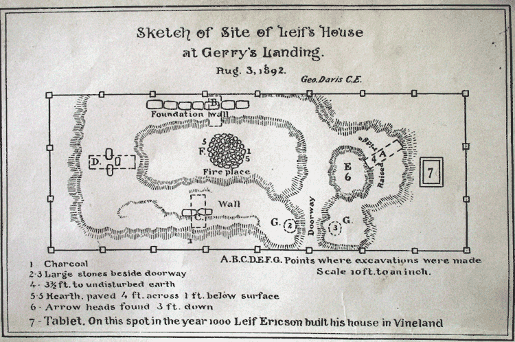
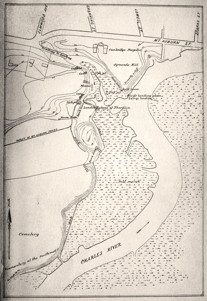
By 1890 or so, after a bit of digging near his home in Cambridge, Massachusetts, Horsford claimed to have found the site of Leif Erikson’s house at Gerry’s Landing on the Charles River near what is now Mt. Auburn Hospital (which is the last known site of my appendix, by the way). There he placed a plaque that remains today. Then he proclaimed that he had discovered a Viking settlement and the famous Norumbega itself farther west on the Charles River. He had a stone tower built to commemorate his first discoveries at the confluence of the Charles and Stony Brook in Weston, across from the soon-to-be-established Norumbega Park in Newton; the city of Norumbega was, as my opening quotation says, downstream at modern Watertown.
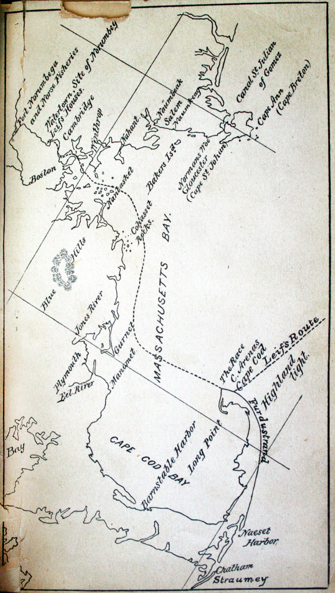
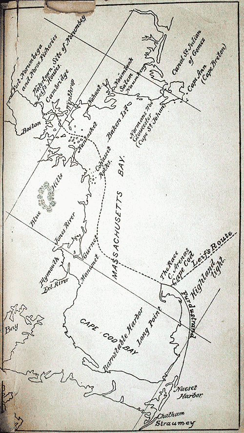
Leif, it seems, had hit Cape Cod and then entered Massachusetts Bay, sailing into Boston Harbor and up the Charles. The disastrously difficult-to-read map below (some shading to distinguish land from water, please!), from A guide-book to Norumbega, shows Leif’s route as the dashed line. In the upper left are indicated some of Horsford’s Norumbega sites. This book, written in 1893 by Elizabeth Shepard, directs visitors to Horsford’s supposed archaeological sites (even providing some directions via streetcar) while placing them within the context of the Icelandic sagas that tell of Vinland.
Another map shows the landing site of the Norsemen in present-day Cambridge. See also its location on a modern map.
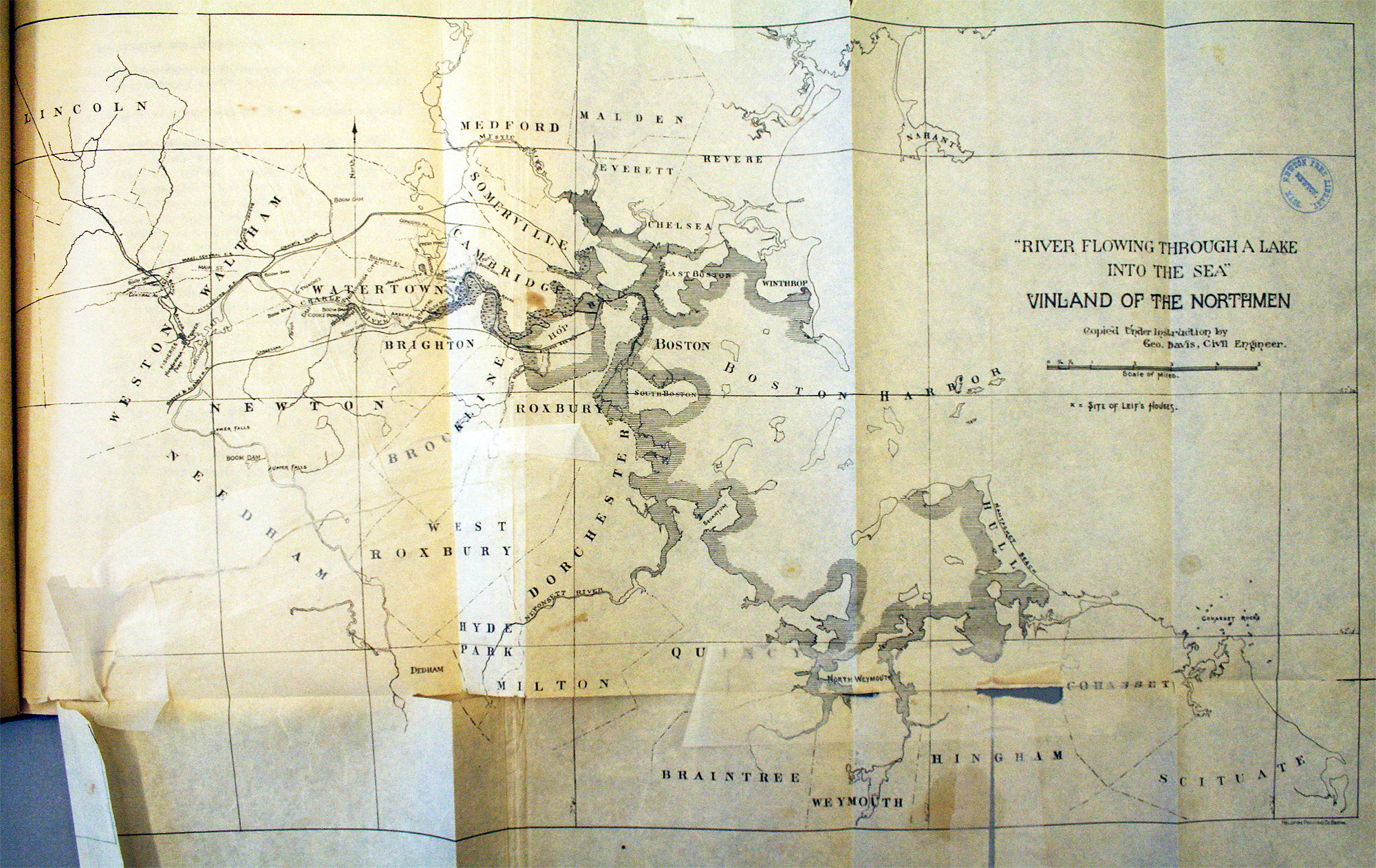
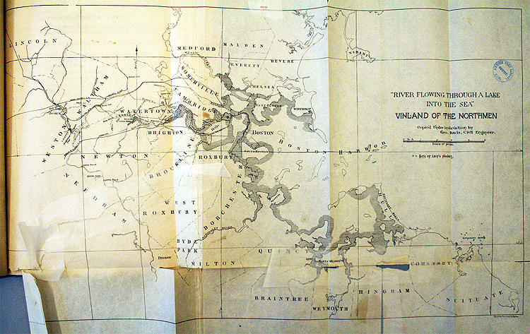
Professor Horsford himself had of course published his discoveries, first briefly in The Discovery of the Ancient City of Norumbega and then with more detail in The Defences of Norumbega (among a number of works on the subject). Both of them include the Charles-as-Norumbega map below. I’m not entirely certain what the coastal shading indicates, but it seems to show the coastal area in Leif’s time. (Click the image to enlarge.)
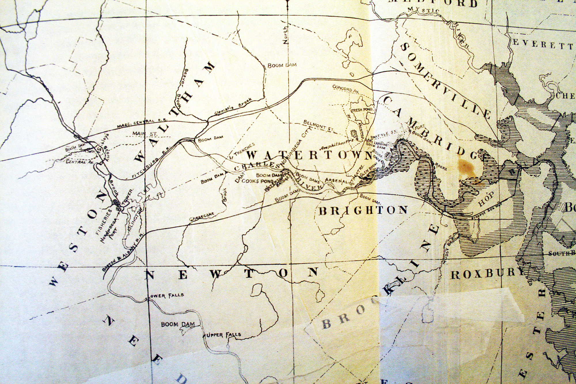
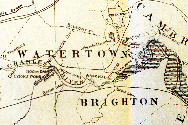
Here’s a detail showing the sites—trenches, dams, etc.—along the Charles. Clicky for an expanded view. Three streets in western Cambridge—Norman, Norumbega, and Thingvalla Streets—commemorate Horsford’s theory and were laid out around the turn of the century at the Amphitheatre (one of the Norse sites) marked on this map just above the second W in Watertown.
The Leif Erikson statue was erected in 1887 and now stands (with a decidedly classical, non-barbaric appearance) as the westernmost of many statues lining Commonwealth Avenue in Boston. Although the Vinland theory that Horsford advocated enjoyed some popular support at the time, his claims have been dismissed for the lack of convincing evidence, not that he didn’t try to provide any. Nevertheless, in some local names and landmarks is preserved the idea that not only was legendary Norumbega a real place, it was a inhabited by people who sailed across the Atlantic some one thousand years ago.
Sources and further reading
- My two block quotes and much of the overview here comes from Gloria Greis’s fascinating article on the subject. It is probably the best source for learning this whole story.
- Professor Horsford’s report, available on Google Books, provides the opening quotation in this post and some additional information, but I only skimmed it and the subsequent Defences of Norumbega, instead trusting secondary sources like the one above.
- Elizabeth Shepard’s A guide-book to Norumbega and Vineland: or, The archæological treasures along Charles River is a nice summary and interesting approach to Horsford’s sites, and is also a fairly concise recap of how these mesh with the Icelandic sagas.
- The maps from Shepard’s and Horsford’s books are presented here as photographs, as you can tell. Those from the latter are poorly reproduced (if at all) in the digitized version on Goolge Books, so in both cases I consulted local libraries and brought a camera. Very few of the pages in Shepard’s book remain bound in the copy at the Boston Public Library, but at least they were all still present!
- Horsford’s address at the statue’s unveiling is also on Google Books. I’m not sure if it mentions his “discoveries” on the Charles, as it predates the other works, but I didn’t easily find references to it. It’s also dreadfully long, and I’m glad I wasn’t there to hear him.
- A second-hand account of Horsford’s work, and some cartographic history of Norumbega (though sans images), is provided by Rasmus B. Anderson in a chapter the 1906 book The Norsemen in America.
- I did little more than fan the pages of an edited volume called American Beginnings: Exploration, Culture, and Cartography in the Land of Norumbega, but it contains much more detailed history (cartographic and otherwise) of the region.
- Norumbega Reconsidered (PDF) is yet another work I didn’t really take time to read, but there is a section called “The Myths of Norumbega” that nicely summarizes the various things that Norumbega has meant.
Tagged Boston, cartography myth, history, vikings | 13 comments
By Andy Woodruff on 13 May 2010
Here’s something from the “Mildly Interesting” files. Address numbering schemes can vary a lot from place to place in the United States. In some cities the system is straightforward enough that by knowing a street number you can know approximately, if not exactly, the location of that address. In some other places… well, luckily addresses are all geocoded and easy to search for these days.
Beyond knowing the system or finding addresses, I was curious to see complete house numbering systems. I had ideas of colorful city maps representing street numbers from low to high, but my attempts failed to produce anything worthwhile because the range of numbers tends to be so great that it’s difficult to show patterns of any intricacy.
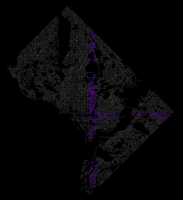
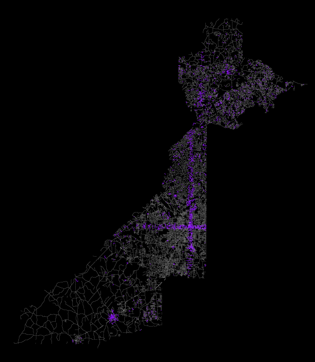
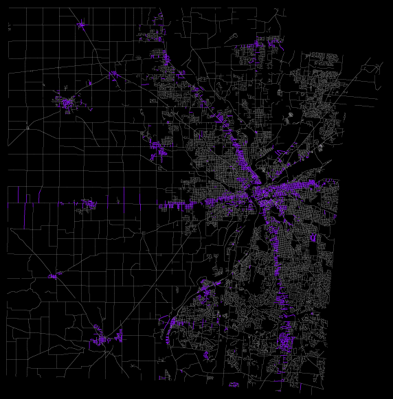
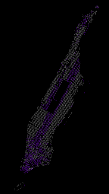
Instead, one can still get a sense of the house numbering scheme by looking at where the numbers begin. So I made a few maps to show that, based on the Census Bureau’s TIGER/Line files. Here are seven cities (the counties that contain them, actually, because that’s how the Census rolls), obviously not an extensive set nor likely representative, but showing a bit of variety. Purple blocks are those containing any numbers from 1 to 100.
Washington, DC: A perfect example of a system where numbers increase in north, south, east, and west directions from two central axes, in this case extending from the Capitol. In Washington’s case, the city is divided into quadrants. Chicago is another very orderly big city, but my computer is too weak to handle a map of all the streets in Cook County.
Atlanta: Atlanta is similarly divided into quadrants, but here streets are not as geometrically perfect, and I’m not sure if the axes always follow particular streets (or other features).
Dayton, Ohio: Had to check out my place of origin. Dayton bases its numbers not strictly on cardinal directions but (mostly) on the main north-south and east-west streets, which bend a bit. Meanwhile, the rural parts of Montgomery County appear to follow the same pattern, while individual towns do their own thing.
New Orleans: I can’t really tell what’s going on here. There is the north-south divide on Canal Street, but I can’t discern what the baseline for other streets might be. Any locals out there who can explain?

Manhattan: Another well-organized system, with numbers counting upward from 5th Avenue (and Central Park, it looks like) and from downtown. Unlike many other places with gridded, numbered streets, the addresses don’t match the cross street number, not that you can see that in this map. I vaguely recall once seeing some kind of formula for determining which block a given address is on. Any links or confirmation would be wonderful!
San Francisco: What the hell? Wikipedia says there are different numbering systems within the city. You wacky left-coasters.
Boston: I’m not saying things are so much neater over here. Boston and presumably much of New England keep it simple. Numbers just count upward from the beginning of the street, wherever that may be. (I’m not actually sure which end of the street is favored for the beginning; I know my street in Cambridge starts from the north.) Being the jumbled mess that it is, Boston doesn’t have a whole lot of streets that are longer than a couple of blocks, hence a mostly purple map.
Is this what taxi drivers’ brains look like?
Tagged street numbers | 18 comments
By Andy Woodruff on 2 May 2010
In 2008 I moved from one notoriously left-wing town, Madison, Wisconsin, to another, Cambridge, Massachusetts. In reference to its politics, the former is sometimes called “76(ish) square miles surrounded by reality” and the latter is nicknamed the “People’s Republic of Cambridge.” But now Cambridge is more like “7 square miles surrounded by undrinkable water.”

Until further notice, 2 million people in greater Boston must boil tap water before it’s safe to drink. But right there in the middle, we happily continue to drink cool, clean water in Cambridge, which has its own separate water supply.
This is all due to Saturday’s break in a massive pipe that carries water into the Boston area, prompting the use of emergency non-potable supplies from reservoirs and triggering aquapocalypse as people raided stores for bottled water, made endless jokes about drinking beer instead or brushing teeth with a bottle of Jack, and found themselves without their Dunkin’ Donuts coffee. (Seems some people freaked out instead of just boiling their water. But maybe it still tastes nasty after boiling. I wouldn’t know here in Cambridge, suckers!)
Directions Magazine’s Adena Schutzberg, who also lives in the area, has written a bit about the geography lessons of the incident and current situation.
The map above was, naturally, born in indiemapper.
Tagged Boston, water | Comments Off on The island of refreshment
By Andy Woodruff on 26 April 2010
Two weeks ago our five-man team/jug band at Axis Maps finally launched indiemapper, the fabulous web-based thematic mapping application. Born more than two years ago, it’s come a long way. Have a gander at Zachary Johnson’s blog for the story of how it came to be and how it was made. (And yes, the “indiemapper” name is originally derived from the name of Zach’s site.)
The best way to get to know indiemapper is to head over to indiemapper.io, sign up, and try it for yourself. Nevertheless, in the interest of spreading the gospel of indiemapper, I present here a basic tour of its cartographic features.
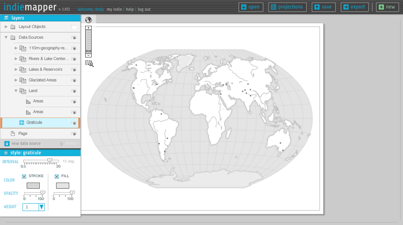
Indiemapper is in part a reaction to the frustration, confusion, and difficulty we (as cartography students, teachers, and practitioners) have encountered in using GIS for thematic mapping. Our most important principle, which I hope is visible in the image above, is simple clarity—being easy to learn, easy to understand, and easy to use. Ben Sheesley and Mark Harrower have worked tirelessly to design an interface that fits that bill. Notice that the whole thing consists of only a half dozen or so components, the most complicated of which is the layers panel on the left side (which is a real feat of Flex/AS3 wizardry by Zach, I must add), and even that can be mastered with minimal effort.
GEOGRAPHIC DATA
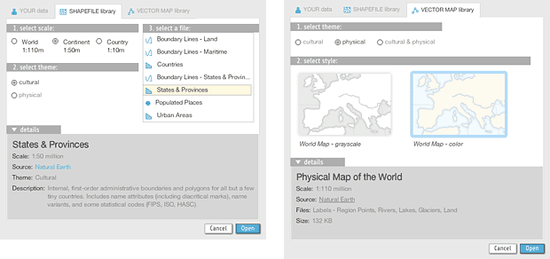
We expect that most people want to map their own data, which can be uploaded from shapefiles, KML, and GPX files. To help you get started or to augment your own data, indiemapper is also stocked with reference data from Natural Earth vector and some pre-styled world reference base maps designed by Ben in indiemapper itself.
MAP PROJECTIONS
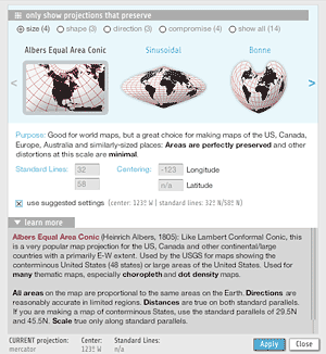
Map projections. Such pain they have caused me. But that’s a tale for another day. We ended up with fourteen projections that are a good selection of map projections suitable for most purposes. You have control over centering and standard parallels, and importantly the options are presented along with guidance and detailed information on what geometric properties each projection preserves and for what purposes the projection is appropriate.
MAP TYPES
Indiemapper has twelve basic types of thematic and reference map types, with more to come in the future. Here’s a quick rundown.
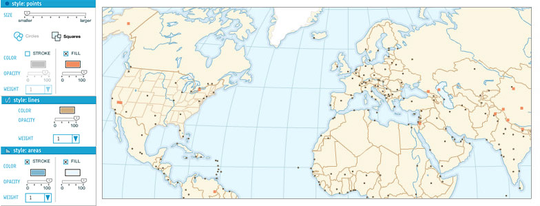
Reference points, lines, and areas. Any data source can have one or more layers depicting the base geography, and these can be combined to make some pretty nice reference maps, as you can see above in one of Ben’s base maps.
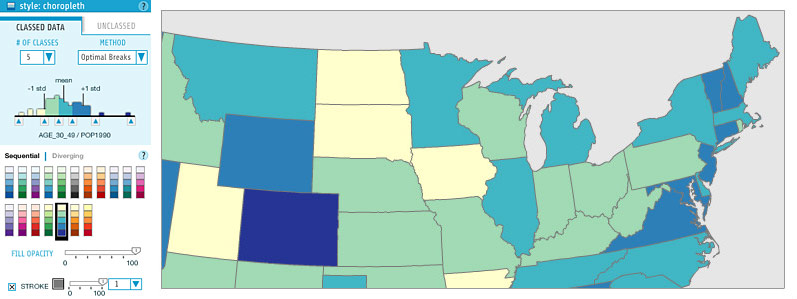
Choropleth. The bread and butter of thematic cartography. Indiemapper provides the excellent ColorBrewer color schemes and equal interval, quantile, and optimal breaks classification presets (or unclassed maps!).
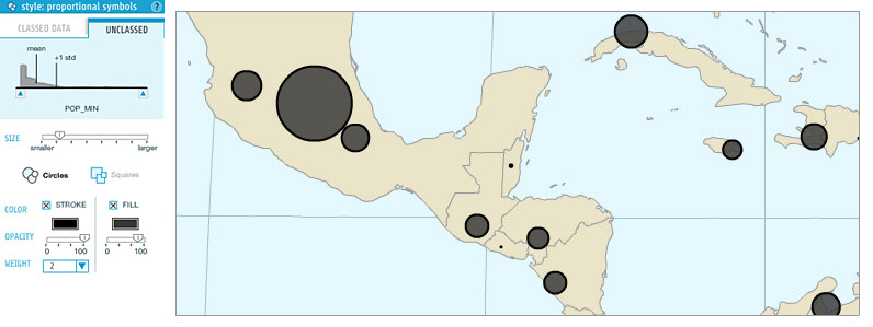
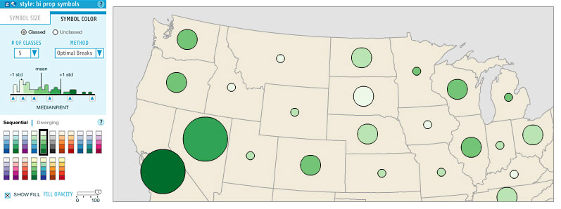
Proportional symbols. These can be created for point features or on area feature centroids. They can either be unclassed (i.e. truly proportional), or classed, a.k.a. “range-graded” or “graduated.” Proportional symbol maps can get messy, but don’t worry, you can move the symbols around on the map so they don’t overlap.
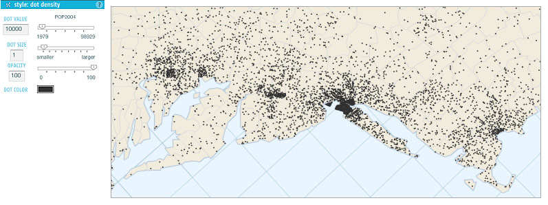
Dot density. Our dot density maps simply place dots at random within polygons. Be careful with dot density maps—they’re not effective with all arrangements of enumeration units, and remember to always use an equal-area map projection!
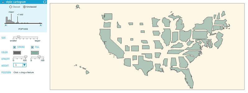
Cartogram. Here we get into pretty interesting territory. Zach built in his code for non-contiguous cartograms, and I’m not aware of any similarly easy implementation of cartograms in mapping software. Contiguous cartograms are a challenge we may take on some day, but you can make some pretty sweet (and easier to read, I’d say) maps with non-contiguous cartograms. As with proportional symbols, you can move the cartogram polygons around, and usually you’ll want to do so. Zach has gone experimental and allowed for classed cartograms here, too.
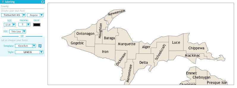
Map labels. Any cartographer will agree that labeling is a huge part of the work that goes into a map and that automated label placement is a beast that has only recently been tamed. Indiemapper gets you started with basic labeling using any attribute you choose, and then allows you to move and rotate labels as desired. You have access to all the fonts installed on your computer, as well as a selection of embedded free fonts. Ben, whose PhD is practically in map typography, has made some templates based on his TypeBrewer work, making it easy to select effective and harmonious styles.
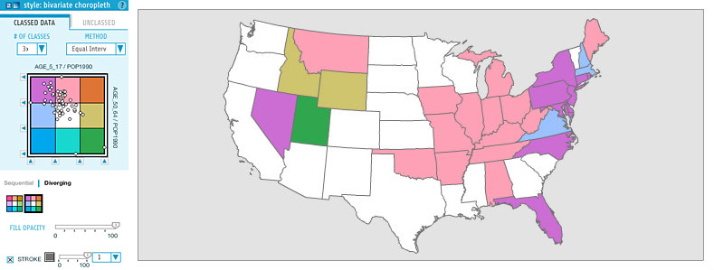
Bivariate choropleth. This is kind of a big deal. As far as I know, indiemapper makes creating bivariate choropleth way easier than ever before. It offers several sequential and diverging color schemes, automatic or manual (or no) classification, and a scatterplot to view the relationship between attributes.
Bivariate proportional symbols. Thanks to the flexible architecture that Zach programmed, it is very easy for us to combine symbology types, so a bivariate proportional symbol map is as simple as combining a proportional symbols with a choropleth-like color scheme. Note that the styling panel essentially places the two individual style panels into two tabs.
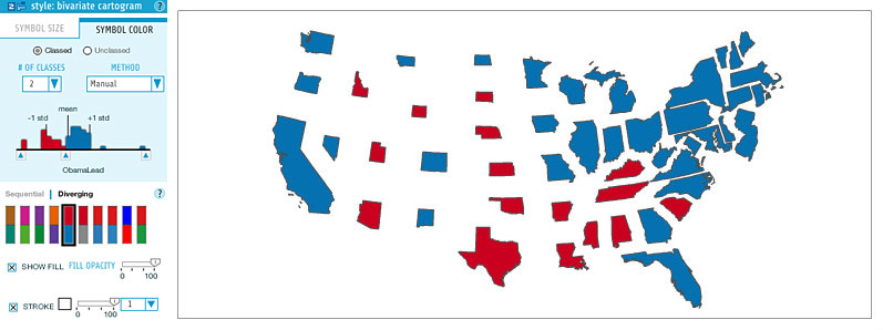
Bivariate cartograms. Again, we just combine two existing symbologies. These colored cartograms are really the best use of cartograms, showing some attribute on a perfectly equalized base map. We’ve all seen them following elections.

Value-by-alpha. This is an Axis Maps original. It’s a bivariate technique that I kind of made up in reaction to election cartograms, that was presented in our alternative election map, and was more fully developed by Robert Roth, me, and Zach in a forthcoming paper in the Cartographic Journal. One attribute is displayed by color, and another standardizing attribute by transparency. Some day I’ll finally write a post describing our work on the value-by-alpha technique.
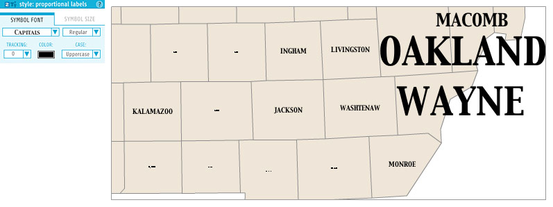
Proportional labels. You see this kind of map occasionally, where labels are scaled according to some attribute value, a bit like in a word cloud. It was easy to implement, so why not?
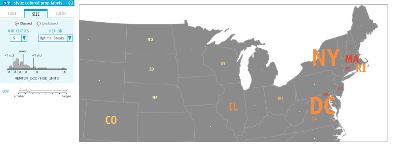
Colored proportional labels. That’s right, we have a trivariate map symbology! It says one thing, is scaled by another thing, and colored by a third.
MAP LAYOUT
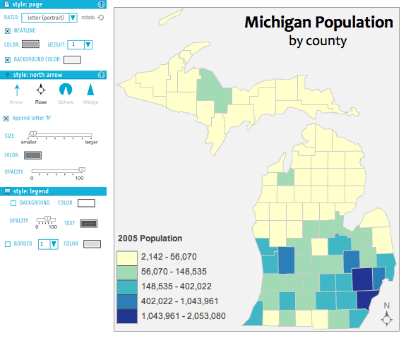
The goal of using indiemapper is to generate some sort of output image such as this Cartography 101-style map of Michigan (as vector SVG or raster JPEG and PNG), so layout controls are always available. At the center of the stage is a page that contains what will be exported in the end, and which has some style options of its own. On top of the map are several layers in a “Layout Objects” group: legends, north arrow, and annotations. Legends are generated automatically when you create a thematic layer, and they can be toggled on or off. North arrow options are, I’m sad to say, lacking dozens of garish styles. The annotation layer allows you to manually enter text for titles, labels, or what have you.
EXPERT GUIDANCE
As with the map above, there is additional information behind “learn more” buttons all over the place in indiemapper. There’s more to learn about every map type and many other features. Mark Harrower, building on his experience teaching and studying cartography as a professor at the University of Wisconsin-Madison, has written an extensive set of these “learn more” articles that teach users about cartography topics while providing guidance on best practices and how to achieve them in indiemapper. Among other things, this is one reason we think that indiemapper can be a very useful tool for students and teachers.
MAP MANAGEMENT
Save your maps online (unlimited storage), roll back to previous versions so you don’t have to worry about accidentally destroying your work, share your maps with other indiemapper users if you want to collaborate, and attach comments to map versions. Dave Heyman has built a fantastic web site and database back end to indiemapper that allows all this and so much more. It’s easy to manage all your maps from the “My Indie” page. Mark has recorded a nice video tour of all these features.
GET YOUR FACE IN THERE
Indiemapper.io. Get in there! You’ll get a 30 day free trial, and then it’s $30/month ($20 if you’re a student) with no lengthier commitments. Or you can stick to a weaker free version like a loser. You’re not a loser, are you?
Tagged axis maps, indiemapper | 1 comment