By Andy Woodruff on 5 January 2011
Robert Roth—PhD candidate at Penn State, incoming faculty at the UW-Madison Department of Geography, and infamous county collector—recently alerted me to a nice interactive, animated map that he worked on with a couple of his students, Matt Murdock and Nick Maziekas. It’s called BOOMsys and it shows the location and number of IED attacks in Iraq over the course of a year. Get into it with the GeoVISTA Center news article.
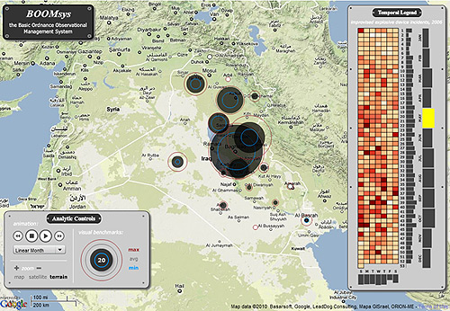
Apart from the subject matter, there are several interesting things about the controls and functionality, but what caught my attention most was the temporal legend, shown in a bit more detail below.
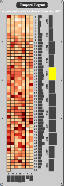
It shows the number of incidents for every day (colored squares), week (first column of bars), and month (second column of bars) of the year, as well as composite totals for each day of the week (at the bottom). So much data in a single, relatively simple display!
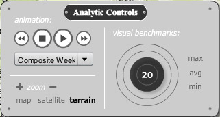
It’s not merely a chart, of course. It’s fully interactive, allowing the user to probe for number values and click on any part of it to make the map display data for a particular day, week, or month. You can also play the animation across any of the units. Playing through a composite week is an example of temporal re-expression (about two-thirds of the way down the page in that link), a powerful way of viewing temporal data in composite slices instead of normal linear time.
The legend here is an adaptation of the “Reruns” view from former GeoVISTA researcher Chris Weaver’s Improvise software, in this case designed specifically for a year of daily data. In a more open visualization environment, it would allow for user-defined views of cyclical time.

I don’t know exactly how revolutionary this kind of control is in high-end visualization, but it’s really nice to see it accomplished so clearly in a more accessible interactive web map meant for public consumption.
Tagged animation, geovista, legends, temporal data | 1 comment
By Andy Woodruff on 2 January 2011

A number of year-end retrospective blog posts in map-related fields have appeared in the last week or so, and it’s been interesting to take stock of all the excellent work people did during 2010. I of course didn’t do anything worth mentioning; I just went places and mapped it all.
Like I did last year, I have collected all my travels within the immediate local area (Boston) into a series of maps categorized by the mode of transportation for each trip. These are not GPS tracks; I remain low-tech and manually record each trip on a map. Any given segment has a line drawn once per day per mode of transportation. So, for example, if I walked one direction along a street and then later returned on the same street, I recorded only one line there for the day; but if I walked down the street and then returned on the subway running underneath the street, I recorded two lines. So the following neon map that ostensibly uses color intensity to show frequency of travel (blue = less, yellow = more) is really more of a compiled daily log than an accurate record of my presence at every location.
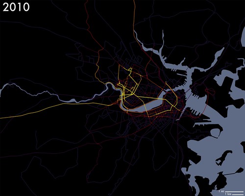
Maps for the various modes of transportation are in a small Flickr set. Those are foot, car, train, bike, and bus. No animation this time; that’s too much work.
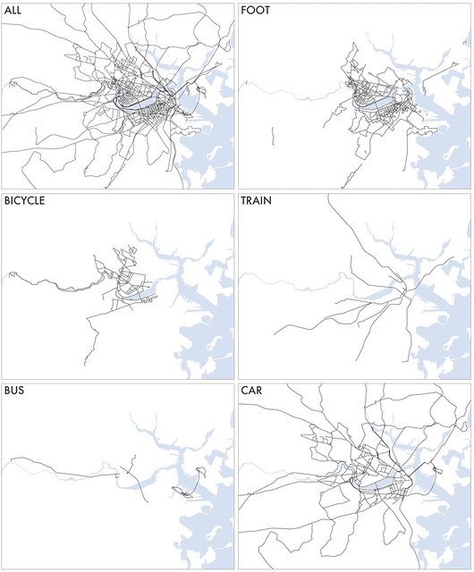
As usual there is no real purpose to this hobby, but it is an interesting exercise in personal geography. For me, relatively little movement around the city is governed by routine because I work at home. I had a once-a-week job during the fall and had my usual grocery stores and such, but otherwise it’s almost all personal choices. I can look at the map and ask myself why I went where I did or why I didn’t go to the empty spaces on the map. I can identify the paths that indicate patterns in my life where I thought there were none. And of course I can look for signs of things like Kevin Lynch-style mental mapping concepts.
The most valuable thing about this habit, though, is not the post-mapping analysis but rather the motivation it generates to get out and explore and get to know new parts of the city. I’m sure you can imagine the thrill of getting to draw a line on a new part of the map. Doing all this without GPS keeps my mind sharp, too, because I must always be aware of exactly where I am so that I can later mark it on the map. My local expertise in transportation and geography is skyrocketing because of this little project. I highly recommend that everyone live cartographically!
Resolution for 2011: ride a boat.
Tagged Boston, gps, map projects | 14 comments
By Andy Woodruff on 13 December 2010
Boy, it’s been quiet around here. Haven’t had much to say lately. Nothing that hasn’t been already been well covered by the rest of the internet, anyway.
Meanwhile, though, I’ve started another blogging venture. You may have noticed a fair number of Boston-themed posts here over the past year or two. I’ve become very interested in the unique geography of this place and maps thereof. In part to remove the local-interest clutter from this blog, the topic seemed like it could sustain its own site. With the partnership of UW-Madison Geography PhD candidate Tim Wallace (Boston-area native), I have established the mappish, graphic-ish, geography-ish site Bostonography.
Bostonography. Enjoy or ignore it as you please! Actual content coming soon. Bear with us as figure out the best way to trick out the default WordPress theme. (Not that it isn’t a nice theme!)
Tagged Boston | Comments Off on So I made a website about Boston
By Andy Woodruff on 3 November 2010
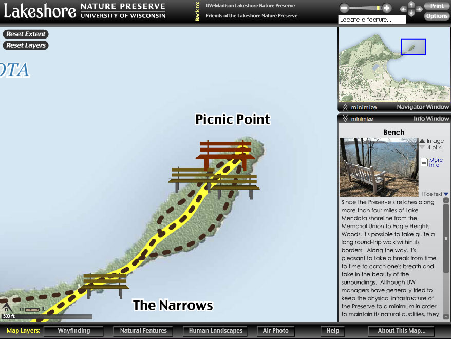
While sauntering down Memory Lane (i.e. file archives) this evening, I was amused by this presentation of several design alternatives for a bench icon on the University of Wisconsin Lakeshore Nature Preserve interactive map, so I thought I’d tell the internet.
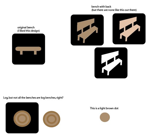
Light brown dot and badly drawn perspective aside, we were clearly going for a National Park Service look. So of course instead of anything like that we ended up with something else entirely.
Why this happened is beyond memory, but I kind of recall having something to do with benches and will take the blame. Believe, though, that we spent as much time on each of the zillion other features on the map, sometimes with better results. And this is how map design goes: endless scrutiny of every tiny detail.
Check out the map to enjoy some fine 2006 Flash cartography. The project was completed in the University of Wisconsin Cartography Lab that summer. A paper (PDF from the Cartographic Perspectives archives)by Robert Roth and Mark Harrower contains a couple more fun design materials from the process, as well as (primarily) some usability lessons learned.
Tagged cart lab, icons, lakeshore nature preserve | Comments Off on This is a light brown dot
By Andy Woodruff on 30 September 2010
Well. There’s nothing like a 20-month side project.

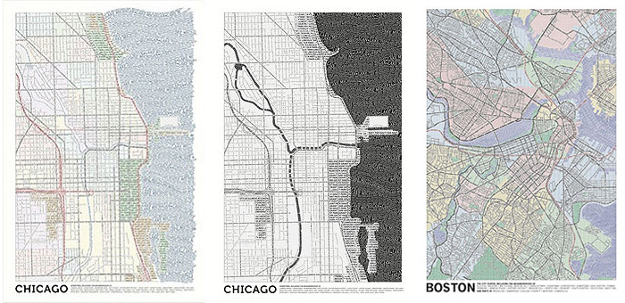
We at Axis Maps are presenting a couple of typographic maps—that is, maps made entirely of typography—that we’ve slowly been working on for a while. One is a map of the central Boston area, and the other (other two, actually) is a map of central Chicago. Let me mention now, because I am a greedy, greedy person, that prints of each are available for purchase. See more detailed images and information at http://typographic.axismaps.com.
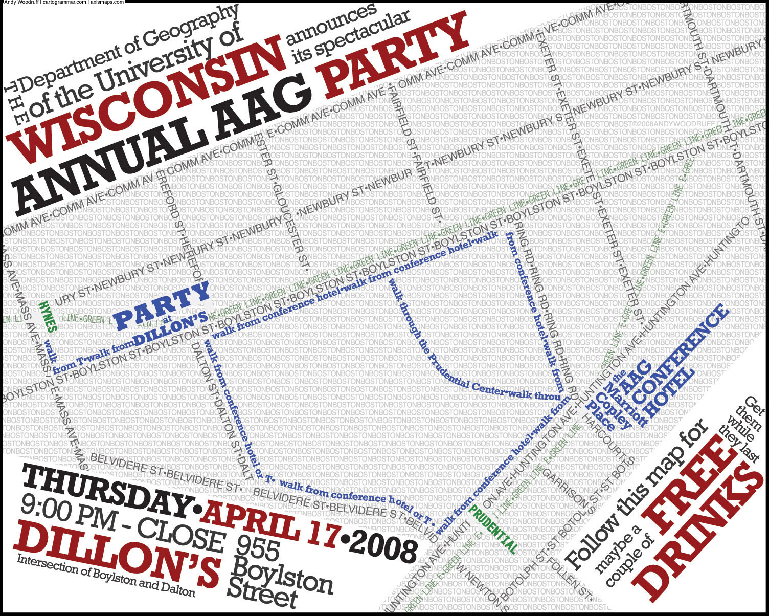
A few people out there may remember that I dig typographic maps, having written two posts on the topic in the past (one | two). In fact, the first of those was my first blog post, apart from the obligatory “OMG WTF I have a blog now LOL” post. This project has its origin in the map I presented there. Having been tasked with producing a small flier for a party during a geography conference in Boston, I produced a typographic map showing the way from the conference venue to the party venue. About five months later I found myself living in the Boston area, and not long after that I decided it would be fun to expand the idea to a larger part of the city.
I presented my progress (above) to my Axis Maps partners a few weeks later. Ben Sheesley and Mark Harrower liked the idea enough to establish a version for Chicago, a city to which they’re both attached in one way or another. Ben led the charge on that one, and we both picked at our respective maps for well over a year and half, until finally with a tear we launched them into the wild today.
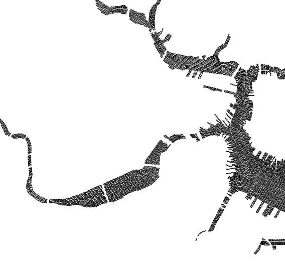
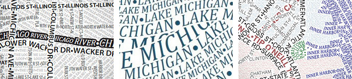
Our maps don’t quite have the same flair that you might see in other typography maps; instead, with the exception of a couple of things like Ben’s Lake Michigan pattern, we have a fairly conservative, systematically detailed style that amounts to a nice reference map. But one that’s made of type.
We have both spent a ton of time on these maps, which, given that they are done digitally, instills a new respect for hand-made efforts. Nearly every line of text in these maps was laid out manually. And after that, nearly every line was edited manually to create effects such as the appearance of woven streets. It was all done in Illustrator, beginning with images from OpenStreetMap. We traced streets, filled in areas like water and parks, and then revisited every detail. In this process I think we’ve learned a few things that will help us generate maps of some other cities without taking two years to do it.
I can’t speak to Ben’s maps as much, but most of the Boston map is based on OpenStreetMap, that is, the road hierarchy, names, and locations of parks large enough to show up. It uses two typefaces (is that the right word?), News Gothic and Gentium, not chosen for any particular reasons but because they seemed to look okay. There are four levels of streets, a single style for each of water and parks, and a background “fill” of neighborhood names in 5 point type using a four-color scheme. The only real cheating is the occasional use of bullets to fill in white space that is too small for letters. Ben’s approach was pretty similar, using Myriad Pro and Cambria. There are styles for three levels of streets, major parks, areas of interest, and water. The black and white version of Chicago isn’t simply a desaturated version of the color map, but rather employs style that end up emphasizing water features over roads, somewhat the opposite of the color map. Where colors distinguish neighborhoods from one another in the other version (and the Boston map), black and white Chicago relies on different orientations of text.
A few Boston people may find their way to this post, so let me confirm that no, mine is not a map of Boston city proper. The city has too strange a shape (consider the Allston-Brighton appendage or disconnected Charlestown and East Boston) and extends too far from downtown to make it feasible for this level of detail. Plus I have to stand up for my side of the river as well as my principles of city definition: some places outside the city are more “city” than some places inside the city. And the Mystic River to the north just looks more interesting than additional land to the south. So apologies if you live in West Roxbury and are disappointed that your house isn’t on this map entitled “Boston,” but sacrifices had to be made. Let me also make a disclaimer about neighborhood boundaries within the city proper. No two sources seem to agree on a lot of these boundaries, so in uncertain areas I have drawn the line somewhere in the middle. They can be equally disagreed upon by all, at least.
BRB, waiting on the stoop for UPS to arrive with my typographic map posters.
(P.S. – Next stops, San Francisco, New York, and Washginton, D.C. Stay tuned!)
Tagged axis maps, Boston, chicago, posters, typography | 13 comments
By Andy Woodruff on 25 September 2010

Are you a student who has made an interactive or animated map ? Do you like fame and money? If yes, consider submitting your map to the 2010 NACIS Student Web Mapping Competition. The winner of each category (interactive and animated) walks away with a cool $500 prize. The winning maps will be presented in a couple of weeks at the NACIS annual meeting in St. Petersburg, Florida, and usually are featured on the NACIS web site until the next year. I had the honor of winning this prize a few years ago, but like a fool I blew all the money on sandwiches for my friends.
These were supposed to be due about a week ago, but the deadline has now been extended to October 1. (That is official, although the website may not reflect the update.) So students, hurry and send in your best! It’s a good place to have your work recognized, and we all like to look at cool maps. Check the NACIS site for details on who and what is eligible and how to submit your entry.
NACIS (the North American Cartographic Information Society) is a professional/academic association of cartographers, and it comes highly recommended as a community of people whose careers and studies are dedicated to maps. If you might call yourself a cartographer, consider joining NACIS and attending the annual meeting sometime.
Tagged nacis | 2 comments
