By Andy Woodruff on 17 August 2015
INT. APARTMENT IN CAMBRIDGE MASS
Andy is being yelled at by someone less familiar with the region for never mentioning (apparently in an act of deliberate deception) that the area across the river from his home is part of Boston. You see, he always refers to it by its neighborhood name, Allston, which made it sound like a separate town.
The scene above got me thinking about the geography of place name hierarchies. I speak of locations in Boston almost exclusively according to particular neighborhood names because from my perspective “Boston” is too broad and unhelpful. It might mean a thousand feet away over a bridge, or it might mean something ten miles away; it might mean somewhere west of here or it might mean somewhere east. But to someone farther away, neighborhood-level specificity seems less necessary when speaking about the place.

At what distance away does casual reference break down from whole-city to individual neighborhoods? The question feeds into some of my thinking about about what a “city” is irrespective of municipal boundaries: if there’s a point outside the official city where most of the time it makes sense to speak of the city in terms of its sub-units, it may be reasonable to think of that point as part of the city, unofficially. What would a map of those points looks like? In a related and perhaps a more familiar scenario, how far away before a town near City X is absorbed into the “City X” name in casual conversation?
I hopped on Twitter to think aloud and got into some interesting conversations with the late night and/or west coast crowd. (Follow the threads here if you care.) A common theme was the notion that this is not strictly a geographical question, and it certainly does have to do with knowledge and identities and all that. (I take issue with anyone who ignores that those are related to geography, though.) In any case, it remains an intriguing and perhaps answerable question, but just for a lark I wanted to pursue one potential spatial measure that Mike Migurski tossed out:
I think bearing has something to do with it: distance + scale, and are all the parts in the same direction? Then it’s the whole.
Maybe subtended angle?
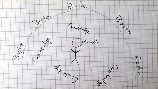
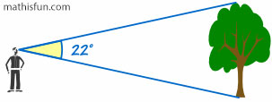
Subtended angle in this case means, more or less, how much of your 360º view contains the city in question. For example, where I live (artfully illustrated above), Boston occupies something like 270º—in other words, if I walk in a random direction from home, I’ve got a 75% chance of hitting Boston.

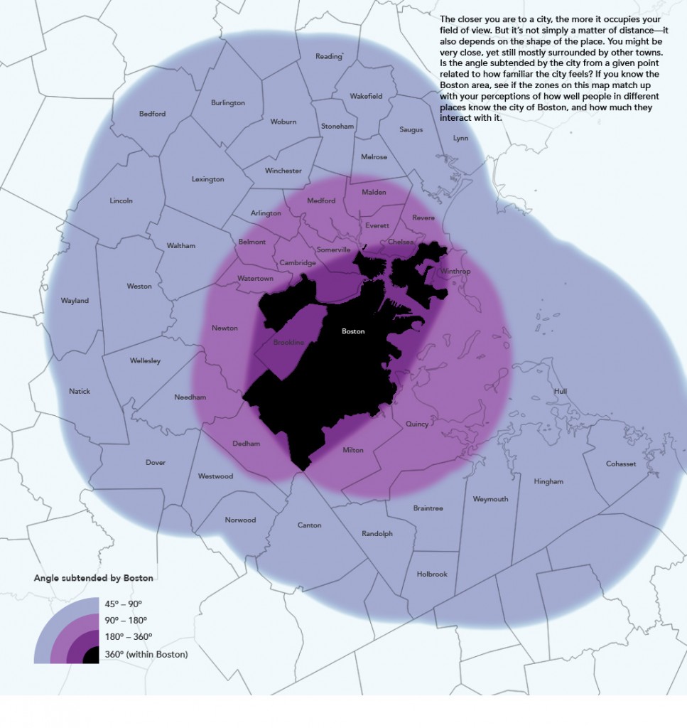
Subtended angle is in large part a function of distance, but it decays more quickly and then kind of levels out into a long tail. Furthermore, with an irregular shape it also depends on what side you’re on. Boston, for example, is longer in one direction than another, so it takes up more of the view from the east and west than from the north or south. The weird shape also means that some places near (but outside) the city are almost surrounded by it, while other places the same distance away are not even close to surrounded. I did some ugly raster math to make a map of this for Boston just to compare it to my perceptions of place (and place name usage) in the area.

Maybe Mike is onto something! In some ways the pink/purple areas match my idea of the “city” here better than a simple distance map would, and are areas where it might make sense to use sub-city place names when referring to Boston. Then again, most people probably have little idea of where the city limits are, so if subtended angle has any relation to how they think of and speak about the city, it’s probably all subconscious and dependent on which parts of the city they ever actually visit. And the whole thing is complicated by cultural barriers and peculiarities, at least around here where crossing the Charles River is often seen as journeying into the unknown, and where you’ll see plenty of signs pointing to “Boston” even within Boston.
Still, a fun thought/map exercise!
| 2 comments
By Andy Woodruff on 25 February 2015
Last week, Josh Stevens published a superb how-to guide for making bivariate choropleth maps, something not directly supported in most GIS applications. Go read it. I’ll wait here.
Josh included a mention of value-by-alpha maps, a pet technique of some colleagues and me. It boils down to a specific type of bivariate choropleth map, in which one variable is intended as a weight for the other and is symbolized by opacity. The idea is offered as an alternative to cartograms—a way to give more visual weight to more significant entities, and suppress less significant ones. Recent examples of the technique include wind energy mapping and midterm election maps.
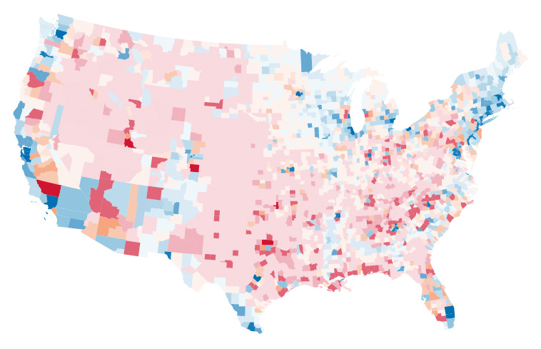
Anyway, Josh’s post inspired me to write a quick and dirty how-to for value-by-alpha maps. (Dirty because I’m skipping nice things like legends and labels.) So here are a couple of ways to make one. I’m making a map of 2008 US presidential election results, just like our first attempt at this. (Example data here.)
Using GIS and graphics software
First, a method for making static maps using GIS (QGIS in this example) and graphics programs like Illustrator and Photoshop.
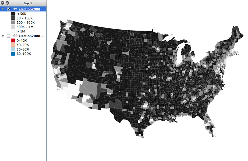
1. Make a choropleth map of the “variable of interest”
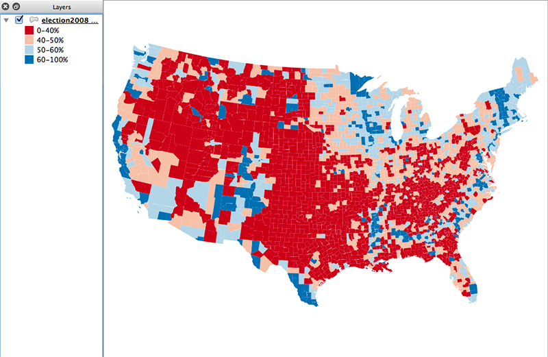
Here, it’s the percent of votes won by Obama.

Don’t use too many classes. For a diverging color map like this, use at most four to six colors. For a sequential scheme, use two or three. When thinking about data classification, remember that a lot of the map will fade away in the final product. My first thought with this map was to limit the dark colors to more extreme values than this, but I found that the end map became a sea of meh and failed to tell much of a story, so I expanded those outer classes.
2. Duplicate the layer and make a grayscale map of the “equalizing variable”
The “equalizing variable” is the one that will be used to give more or less visual weight to units on the map. In this example it’s population—counties with more population are more significant in the election’s outcome than counties with few people. (Yeah, it really should be total votes, but population is a decent proxy for that.)

Brightness in this map will correspond to opacity in the final map. Don’t use a straight black-to-white scheme here. Bottom out at 10–15% brightness so that units don’t totally disappear from the map. On the other end, don’t let the gap between pure white and the second-brightest color be too large, or else the map may look like only a few points of color. The middle colors of my map differ in brightness by 30% and go up to 90% white, with the top color being pure white. It doesn’t sound like much of a difference between 90% and 100%, but the visible difference is more than you might expect.
Depending on the data, default classification schemes may not serve you well. County population is such a case; most defaults would group far too many counties into the low or high ends. In other cases, something like quantiles might work well. If you use a classification that groups too many units into similar ranges, you may as well stick with a standard univariate choropleth map.
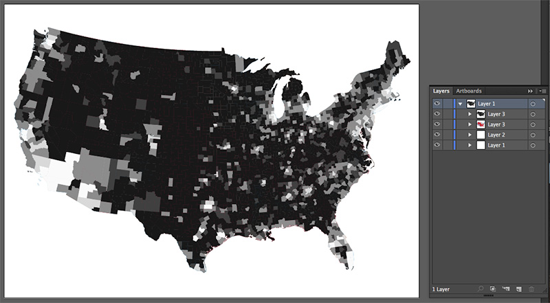
3a. Export to vector and combine
tl;dr — use the grayscale layer as an opacity mask on the color layer
I exported my QGIS map to SVG with two choropleth layers. Here’s a procedure in Illustrator.

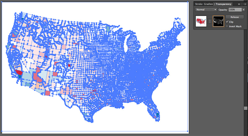
Select the grayscale layer, then cut it.

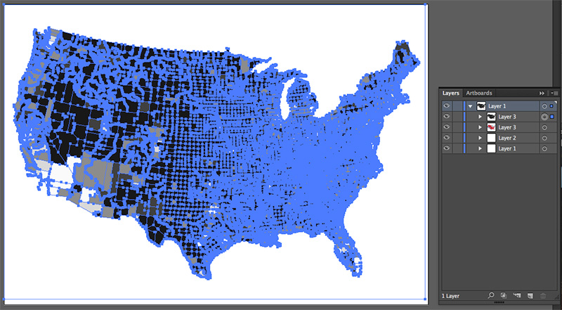
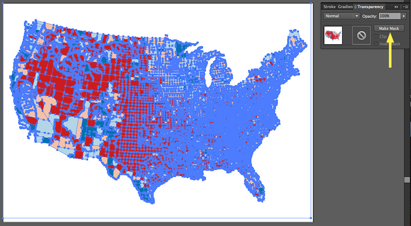
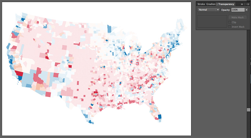
Select the color layer, find the  transparency panel, and click the Make Mask button.

Activate the square on the right if it’s not already active. You’ll probably see a blank artboard at this point.

Now paste the grayscale map that you cut a minute ago. Use paste in front so that it stays in the right place. At this point you’ll see some colors again.

Click that left square in the transparency panel again, then deselect everything, and there you have it: a value-by-alpha map!

3b. Or do it as raster
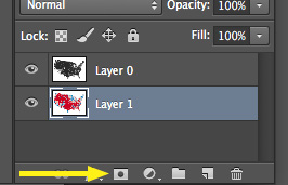
You could do the same thing with raster graphics using Photoshop or similar. Export your two map layers to images and put them into Photoshop layers. Again select and cut the grayscale one. Create an opacity mask on the color layer, and paste the grayscale map into the mask. Below is the button to click to create an opacity mask on a layer.

Web maps
If you’re a web mapper, it’s just as easy to make a value-by-alpha map in the browser as with desktop software. Here’s the same map from above done with D3, having exported the data to GeoJSON.
1. The typical D3 map setup.
Add an SVG element, create projection and path variables, blah blah blah.
var svg = d3.select("body")
  .append("svg")
  .attr("width",800)
  .attr("height",500);
var projection = d3.geo.albersUsa()
  .translate([400,250])
  .scale(1000);
var path = d3.geo.path()
  .projection( projection );
2. Make a scale for the color layer.
D3’s threshold scales work well for customized data classifications. Here we have a domain of the interior class breaks for the election data (40%, 50%, and 60%), and a range of the four colors that go in between and outside them.
var colorScale = d3.scale.threshold()
  .domain( [ .4, .5, .6 ] )
  .range( [ "#ca0020", "#f4a582", "#92c5de", "#0571b0" ] );
3. Make a scale for the grayscale layer.
With this scale, we don’t want to map the data classes to actual colors, but rather to numbers, because we’ll use these directly for opacity attributes. The numbers in the range below correspond to the brightness values of my grays (15%, 30%, etc.).
var grayScale = d3.scale.threshold()
  .domain( [ 50000, 100000, 500000, 1000000 ] )
  .range( [ .15, .30, .60, .90, 1 ] );
4. Load the geodata and assign color and opacity according to the two data properties.
d3.json( "election.geojson", function(json){
  svg.selectAll( "path" )
    .data( json.features )
    .enter()
    .append( "path" )
    .attr( "d", path )
    .attr( "fill", function(d){
      return colorScale( d.properties.Obama_pct);
    })
    .attr( "fill-opacity", function(d){
      return grayScale( d.properties.POP2010 );
    });
});
Run all that in a web page, and oh hey look at that, a value-by-alpha map!

So there you have it, two ways to make value-by-alpha maps! Alternatively, you could use good ol’ indiemapper, which supports value-by-alpha and handful of ordinary and crazy multivariate symbols.
| 4 comments
By Andy Woodruff on 5 February 2015
On a recent dull evening, I went digging for forgotten treasures on an old laptop. This is always good for a laugh and a tear (the latter because my a-hole younger self left photos right on the desktop seemingly to say, hey future self, you loser, remember when you had all this hair?), but the real mission was, as always… maps!
The computer is from my grad school days in Wisconsin, 2005–2007, but it also has files from my undergraduate days at Ohio Wesleyan University, 2001–2005. Here’s a grab bag of a few treasures found. Let’s begin at the end.
Treasure 1: Master’s thesis, 2007.
Oh god.
This thesis will not go near the internet, because it’s terrible. If you want to see it, I can provide directions to Science Hall in Madison, where you can find it wasting space—actual, physical atoms that deserved better—on a shelf in the Geography Library. The premise of the thesis still sits well with me: it aimed to study how people use street maps and aerial images differently (think “map” vs “satellite” in Google Maps). But the execution wasn’t great.
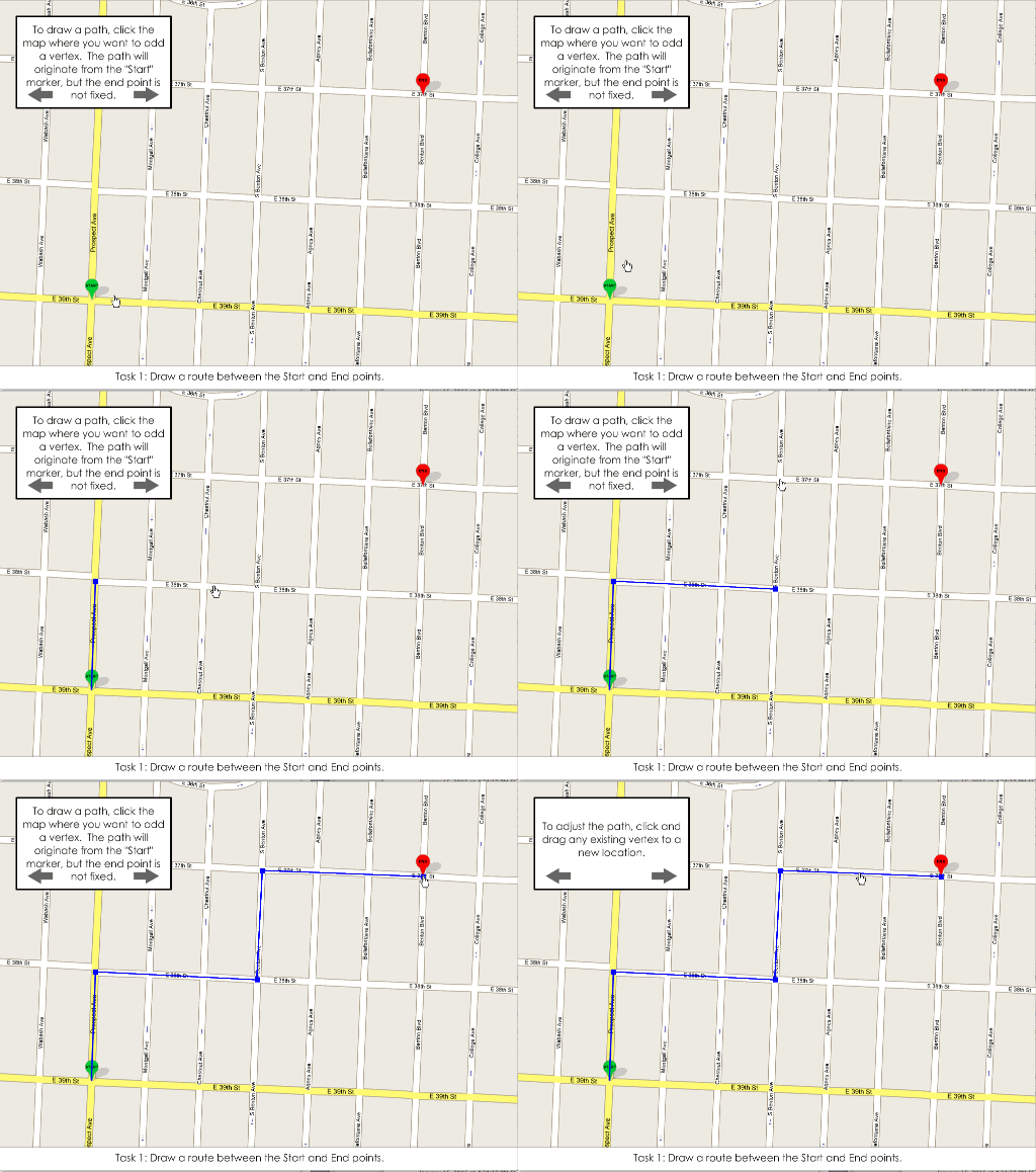
What was kind of cool, though, was the little interactive user study itself, which was a Flash thing that had people drawing paths on top of random maps. You could even edit the paths. Somehow it was wired up to send me an email full of coordinates when a user finished. It’s just a fun reminder of things that I forgot I could once do in Flash.
Look at the IRB-approved torture if you want. Enter any random number on the first screen, and be patient when it asks you to answer a question on a survey that you don’t have; the “Next” button does appear after a short delay.

Treasure 2: Cartography, 2007.
I don’t really know what this is. There was a folder simply titled “Cartography” as though my early-career digital organizational plan was shove all the files from this day until retirement into this folder. But it turned out to be a slide show of images. Hard to say why it exists, but it’s a neat glimpse at UW-Madison cartography 8 or 10 years ago.
Credits for the maps therein include: Heather Francisco, Ben Sheesley, Jeff Stone, Aaron Erkenswick, Jamon Van Den Hoek, Eve McGlynn, Rob Roth, Joel Przybylowski, Dave Heyman, Zach Johnson, Matthew Bloch, and me. But I almost certainly missed a few, not to mention the couple of slides of commercial maps.
Treasure 3: A study on spatial context in interactive maps, 2007.
In a very grad-schoolesque episode, two fellow students and I embarked on a small research project for no reason other than to learn, and to present it at a conference. It had something to do with guaging people’s understanding of spatial context and overall landscapes based on using paper maps versus interactive maps, the hypothesis being that when you can search and zoom right to a point of interest, you don’t gain much spatial understanding. We had no strong conclusions, though.
We presented this at the AAG conference in San Francisco. After the talk, a professor I can’t remember from a university I can’t remember told us that one of his students had done pretty much the same study before. Oh well. (The same student’s name came up at the next year’s conference, as apparently she had also studied my thesis topic, only better. I never met this enemy of mine, but maybe she never really existed and was only a story that professors use to make people look like idiots at conferences.)
Treasure 4: My first AAG conference registration, 2006.
LOLOLOLOL I used to think going to AAG conferences was a good idea.

Treasure 5: Categorizing buildings of Delaware, Ohio, 2004
Warning: you’ll want sunglasses for this one.
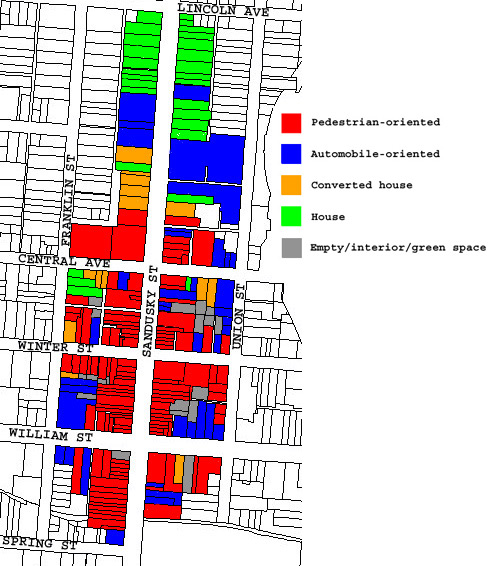
It’s a simple color-coded map that categorized buildings in downtown Delaware, Ohio, mainly commercial buildings oriented toward pedestrians or automobiles, and residential buildings. Delaware is the town where I went to college. It’s mildly frustrating to live in a town called Delaware. Even within Ohio, telling people “I’m heading back to Delaware” would elicit some confused questions. To be mixed up with a state that consists solely of an I-95 toll booth… sigh. Anyway, it’s a pretty nice small town, despite the Columbus sprawl that has now swallowed it.
This map was part of something or other that I did for an urban geography class. I loved those classes. It was vintage geography, studying the forms of cities, the kind of stuff that would eventually draw me to things like Kevin Lynch and Bostonography. Not the social theory stuff that would end up driving me away from urban geography in grad school.

Treasure 6: My first map, 2003.
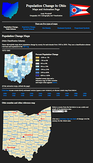
Not really. I don’t know what my first map was. Probably some crayon doodle or macaroni art. What we have here is perhaps my first map as a cartographer. It comes from late in college, my junior year, and was my classs project in John Krygier’s Geography 353 course at Ohio Wesleyan. True to how my career would turn out, the whole dang thing is a web page. Way to stay the course, Woodruff.
So here it is, a series of chloropleth [sic] maps of a century of population change in Ohio.

Click and behold:

ANIMATED

GIFS

It’s thrilling to remember this. I was just writing some setInterval thing in JavaScript to animate something on a map. To think that I’ve been animating maps since practically day one!
These maps aren’t beautiful, being mostly straight ArcGIS exports and even Excel charts. But it’s nice that there is no evidence that I ever made maps before learning about ColorBrewer, despite some later aberrations like the Delaware map above. (How fun to note that some years later, fortune would hand us keys to the ColorBrewer site itself. Fear me, for I am now the thing standing between your students and godawful rainbow color schemes.)
Treasure 7: THE MEMORIES!
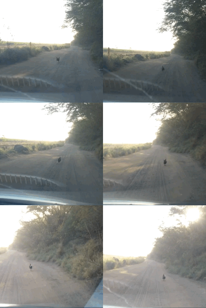
Now, I am no old timer in cartography. My first maps were not only digital maps; they were web maps. But I’m no spring chicken either. Perhaps an early autumn chicken. No, wait, this chicken, seen recently on Kauai:

Always running to stay just enough ahead of the car(tography)’s advances to avoid being overtaken and crushed. And too stupid to jump out of the way and live in peace on a beach. (The rental car in this analogy represents cartographic technology, although in reality your average map tile is far more sophisticated than a Nissan Versa.)
Anyway, the point is that there have been plenty of advances and changes in how maps get made during the past dozen years. My own basic “make a map” workflow has changed enough that I’ve already lost some earlier skills. (You know how sometimes people claim that we lost all that 60s technology to put people on the moon? It’s like that, except instead of human beings walking on a celestial body, it’s a garish MS Paint map.) It’s fun to remember what we used to do, and admire old works, but not to miss it all and lament change—even when old maps were good, the experience always led to something better.
| 2 comments
By Andy Woodruff on 27 January 2015
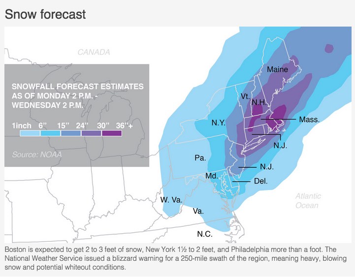
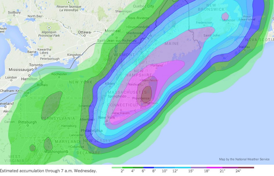
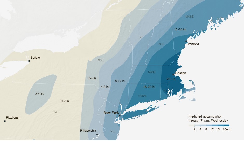
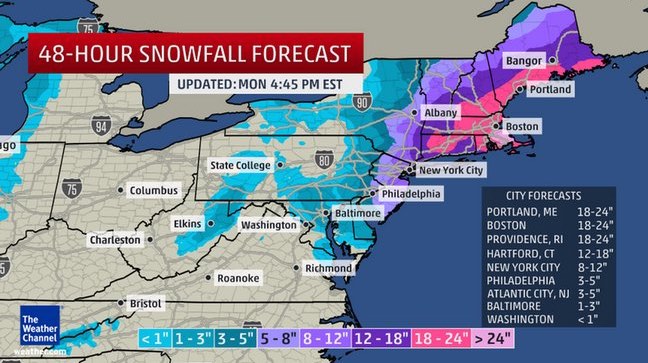
The blizzard of doom was impending. The French Toast Alert siren was blaring. But I wasn’t home in Boston to witness the fun. So, what else to do but look at all the snowfall prediction maps?
Meteorology is a bastion of the rainbow color scheme. The bigger the storm, the more maps. And the more maps, the more colors! It gets especially fun when sequential maps need to extend beyond their usual range. (Remember when Australia was so hot that they had to add a new color?) Perhaps that was a factor in this storm, since the amount of snow was predicted to be unusually high for the affected area.
That said, most maps I found weren’t too out of the ordinary. Here are a few examples.
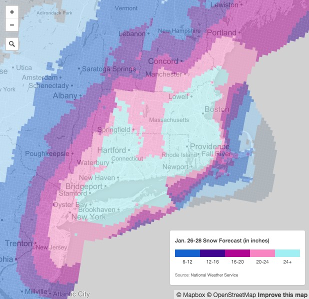
This one on nj.com had a classic looping color scheme. “Okay, we’ve got blue, then purple, then pink, then… crap, what comes after pink? Probably a different kind of blue.”

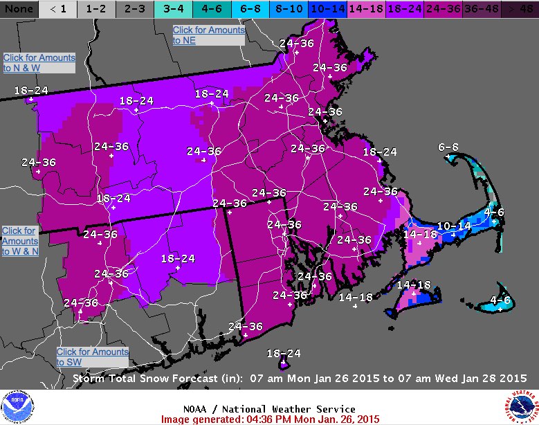
The National Weather Service put out maps like this one, with a gray-blue-purple scheme.

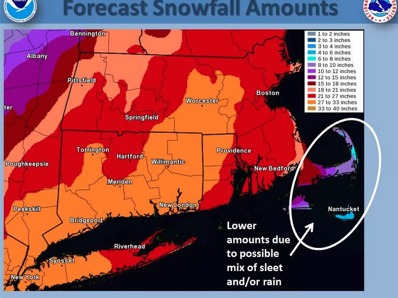
But there were also maps like this, grabbed from the Facebook page of the NWS office in Taunton, Mass. (Go ahead with the tauntaun jokes, nerds), where purple was not enough and red—the most dangerous color of all—was necessary.

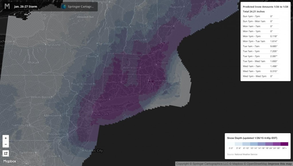
Springer Cartographics put this up on Mapbox. When an expert cartographer makes such a map, you get what appears to be a ColorBrewer scheme.

The Boston Globe was at first slinging NWS maps, but later replaced it with this, which appeared to come from the AP. Pretty simple, with wide class ranges.

The New York Times also first had a map from the National Weather Service. This one threw green into the mix.

Later in the day, that map had been replaced by a much more NYT-ish map. This is a nice example of something Tim has explained in the past: when timeliness is paramount, put up something acceptable (in this case the NWS map), then later revisit it with refined design.

Finally, we musn’t forget the Weather Channel. This map is disappointingly not panic-inducing, considering the source. Imagine it within an overblown page containing annoying auto-playing video, though. And at least it’s oblique.

Happy sledding, everyone!
Tagged blizzard, colors, snow | 1 comment
By Andy Woodruff on 28 October 2014
Another carto-year has come to a close. A carto-year is measured from October to October, or more specifically, between NACIS conferences. If you’re not a NACIS regular, come to a few meetings and you’ll understand. It’s the New Year’s Eve of cartography—an intellectual, visual, and social celebration of mapping that at once exhausts you and leaves you excited for things to come.
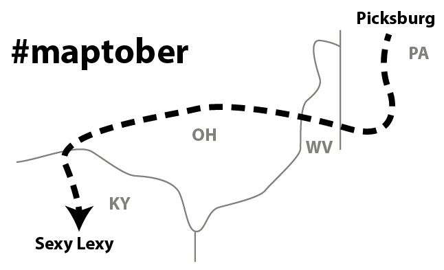
 Maptober road trip. “Map selfie” by Mike Foster.
It seems that the theme of my carto-year was practical cartography: those everyday details of working with data, using software, writing code, and so on. The how of cartography.
For a second year I co-organized Practical Cartography Day at NACIS (this time with Rosemary Wardley of National Geographic), a pre-conference day of presentations focused on tips and tricks of everyday mapping, as opposed to less hands-on topics like theory, map use, or even design. We had twenty presentations, from bite-sized tips to software demos to behind-the-scenes looks at how some cool maps were made. PCD drew a crowd of 150, about half the size of the main conference. Most of the talks have slides or other material online, so check out the links in the schedule: parts 1, 2, 3, and 4.
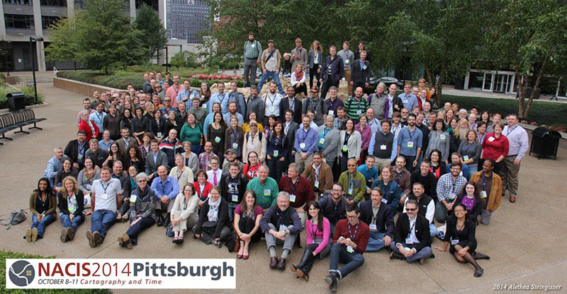
 NACIS group photo by Alethea Steingisser. Scores of smiles, plus Matt Wilson looking at his phone. #notmattwilson
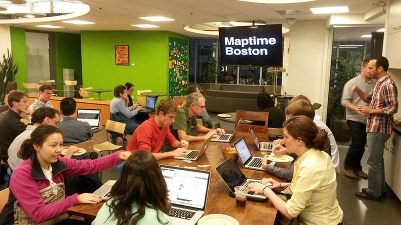
Back home, a few of us jumped on the Maptime train and established a Boston chapter. Jake Wasserman, Mike Foster, and I shared the goals and frustrations that gave rise to the original Maptime: there’s a ton happening in mapping right now, and it’s hard for newcomers to find a friendly and supportive learning environment. We’ve held five Maptime Boston meetups so far, mostly focused on tutorial exercises. It’s been so nice to see people learn something new, then come back and share a map they’ve made with those new skills. Meanwhile, veteran mappers also show up and happily share their know-how. See some Maptime Boston stuff on GitHub, and if you’re anywhere near here, be sure to join the Meetup group.
 Maptime Boston, or for Ryan and me, Snacktime Boston.
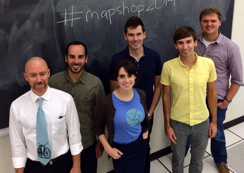
Another event was a short “mapshop” at the University of Kentucky immediately following NACIS, hosted by Matt Wilson and Rich Donohue. This involved Rich and four of us guests (John Czaplewski, Mike Foster, Carolyn Fish, and I) sharing perspectives on different aspects of “new maps,” which mostly meant showing some demos of various tasks and tools. That’s in spite of a critical bent at UK Geography—I was described as the “capitalist” among the guests, which I guess means the only one who has a normal job outside a state university.
 Rich, me, Carolyn, Matt, John, and Mike, temporarily not on a bourbon distillery tour.
That’s all to say that I’ve been increasingly interested in “how?” as the primary question of cartography, at least in a learning process. This may be in contrast to some things I’ve rambled about in the past. I still believe in thoughtful mapmaking and asking questions beyond the technical, but most of those questions are secondary—not in the sense of being less important, but simply in the sense of coming later. Learn to make a map before learning to make a good map. If you don’t start with the how, you’re going to struggle.
The state of cartography is strong thanks mostly to those who ask “how?” before anything else. It’s interesting to revisit a Denis Wood rant against academic cartography from 2003, Cartography is Dead (Thank God!), taking it to mean that cartography—sorry, mapmaking—has always been about the doing. If Wood was to be believed a decade ago, it’s all even more true today, as web mapping grows explosively under the leadership of technical people who may scarcely be aware that any other level of cartography even exists.
 Cartographic technology.
On the other side, academic cartography still appears reluctant to embrace modern technical skill in education, saying something like “cartography isn’t about the tools” even though modern tools have thoroughly transformed the practice. I always attend cartographic education panels at conferences (NACIS and FOSS4G this year) and listen to educators discuss—to no avail, generally—their struggles with teaching concepts and not just button-pushing… or code. From the sound of it, the usual result is an awkward lecture/lab split in which students receive barely enough technical instruction to make a map, never mind actually realizing most of the concepts they learn in lecture.
I’m not close enough to academia these days to say much more about it. Suffice it to say that how is the hardest part of mapping, and is a vital part of cartographic education. It’s not enough to know what a good map is; it’s necessary to know how to make it. A failure to grasp lecture material might keep one from being a stellar cartographer, but a failure to grasp lab material will keep one from being a cartographer at all. Don’t push aside technical skill for fear of neglecting theory and design concepts. Participation, not pedantry, is the means for formally educated cartographers to affect the current technology-driven cartographic progress. Make room in a curriculum to teach the technology right. When it’s done well, technical skills are extensible, not just an exercise in button-pushing.
Continue to ask “how?”. Learn the technical skills, or teach them if you are an educator. Don’t seek perfection in design until you actually know how to build it. But don’t ever be intimidated; remember that learning how to make even the simplest map, just a pushpin on your house, is an amazing accomplishment. From there, you can go anywhere.
Tagged maptime, nacis, practical cartography | 2 comments
By Andy Woodruff on 21 February 2014
Thou shalt not take xkcd 1138 in vain.
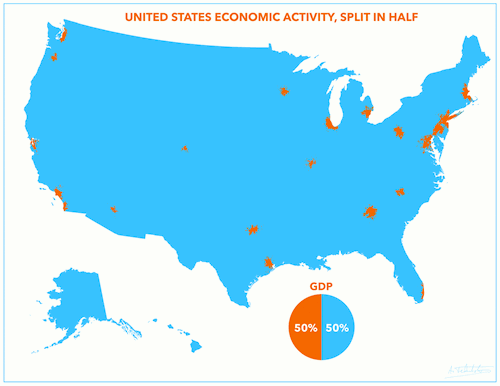
It’s nice that xkcd provides the occasional popular exposure of cartographic topics, but unfortunate that it makes critics’ jobs easier. The comic linked above has been invoked often since it first appeared, including in response to everyone’s latest favorite map to hate, US GDP Split in Half.

If you’re a map person you’ve already seen this a thousand times, often accompanied by hyperbolic words like “incredible,” and you’ve also seen a thousand complaints about how it’s meaningless and simply a map of population density. (Indeed, I was not about to let an opportunity for snark slip by, despite my stated support for bad maps.) The argument is that most people in the US live in metropolitan areas, so of course that’s where most of the economic activity will come from.
Is that true? There are reasons why the map doesn’t say anything significant about economic activity—one of them being that it’s totally arbitrary and there are infinite ways to divide GDP in half geographically—but “just a population map” is a cheap and thoughtless dismissal. The only thing that is actually a population map is a population map.
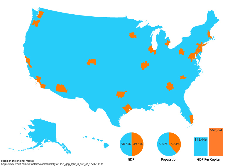
In this case, the numbers show that it’s not quite a population map. The 23 metropolitan areas account for half the GDP but only 39% of the population, and, by extension, their per capita gross metropolitan product is 50% higher than the remainder of the country. There’s wide variation among the metro areas, too: San Jose’s per capita GMP is nearly twice that of Phoenix. Here’s a version of the map with a little extra information based on 2012 source data and population estimates (corrected to show metropolitan areas, not urbanized areas).

That’s not to say the original map did a good job of highlighting contrasts between population and economic activity, or really anything at all—it doesn’t expose any population information, and the arbitrary grouping means that these 23 metros are not necessarily more special than any others—but the point only is that the contrasts do exist and the map is not simply a population map.
So, friends, let’s not be hasty to drop xkcd links and the categorical “just a population map” criticism. There’s nuance to every map, even if we have to go looking for it.
| 3 comments

