By Andy Woodruff on 7 May 2009
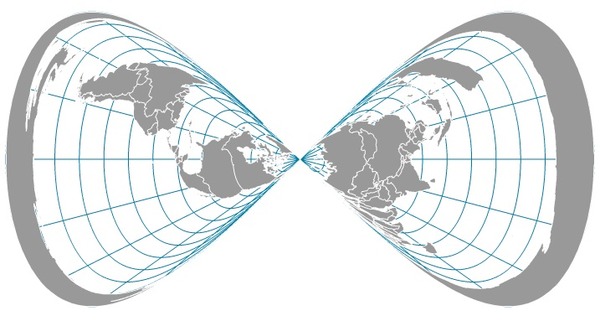
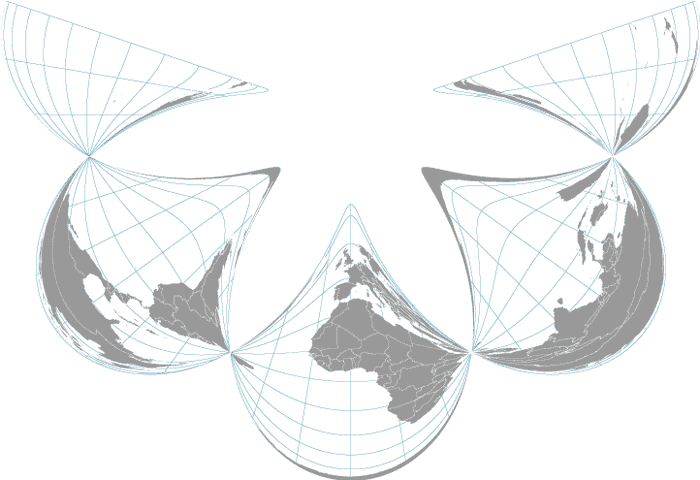
Oops, this isn’t what an azimuthal equidistant map projection is supposed to look like.

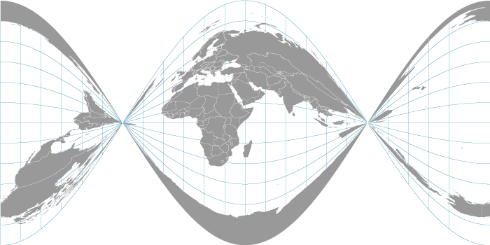
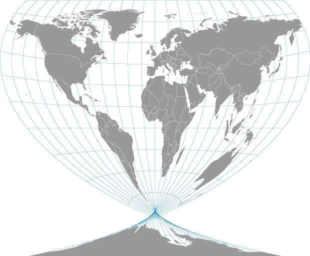
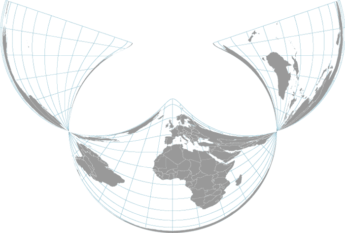
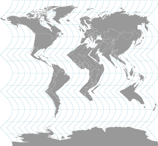
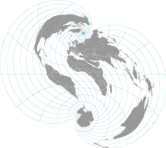
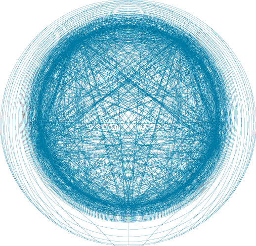
I’ve been working (occasionally fighting) with map projections a lot recently, pumping latitude and longitude coordinates through equations that mathemagically shape the world. Occasionally a small error in a projection equation results in an incorrect but fascinating map. So why not try deliberately introducing some errors and see what happens? Here are some maps I created by tossing random modifications into ordinary map projection equations.
Take a simple plate carrée projection, and give it a couple of twists.

Winkel Tripel becomes some sort of beverage vessel.

There’s a certain elegance to this one, an Albers equal area conic projection, also with a couple of twists.

We can also take that a bit further.

Put some ripples in this (very modified) sinusoidal map projection.

My favorite, a warped polyconic projection.

But most of the time, messing with a projection just breaks the world.

Tagged math, projections | 10 comments
By Andy Woodruff on 23 April 2009
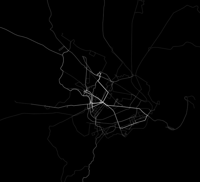
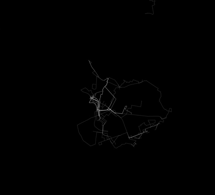
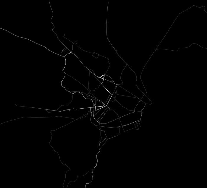
Just for kicks, here’s everywhere I have been in my local area since the first of the year. Yeah, I know every nerd with a GPS receiver records their tracks around town, but I outnerd them by breaking it down by mode of transportation (and by doing it without GPS).
All movements, all modes of transit. Brighter means more frequent travel over a given path.

By foot. Same map extent.

By car.

By bus.

By train.

Sweet animation to come following more months of data collection.
Tagged Boston, map projects | 12 comments
By Andy Woodruff on 16 March 2009
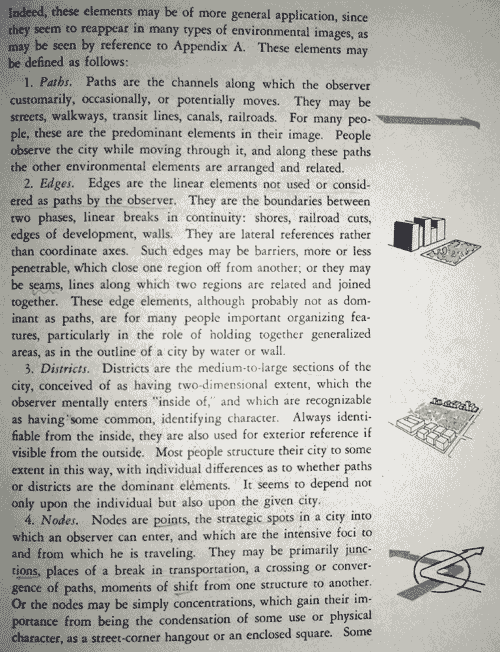
I’m catching up on some of the reading I meant to do a couple of years ago, when I was a geography/cartography student, beginning with the original intersection of urban geography, planning, and mental maps: Kevin Lynch’s The Image of the City (1960). The subject of the book aside, something cool here is what’s going on in the margins.

Lynch made use of many sketches and diagrams in the margins of the book. These are small, about an inch or less, and appear beside the section of text with which they are associated. They don’t break up the text, and the text doesn’t even include any references to them; they’re just right there next to the words you’re reading. Above, for example, are the paragraphs defining paths, edges, districts, and nodes, which along with landmarks (next page) are Lynch’s elements of the city image. Next to each paragraph is a little illustration of the concept described within. I really like this idea. Naturally, most interesting to me are the occasions where the margin diagrams are actually maps of real places.


Tiny, non-intrusive supplemental maps bring to mind the Tufte-championed sparklines, hence the post title. (I don’t care if “spark map” refers to something else; I make my own rules around here.) Most maps, unless they are linear and horizontal, are substantially more difficult to insert directly into text than is the archetypical sparkline, of course, but I think the spirit is at least similar. As a sparkline provides at a glance a reasonably clear picture of numerical data, so can a small map provide context and clarify otherwise confusing or vague text. For example, in the image below Lynch mentions Boston Common’s “peculiar shape, difficult to remember: a five-sided, right-angled figure.” Peculiar and difficult? What better way to give that sentence meaning than to include a little sketch map right beside the text, toward which your eyes will be moving anyway?

The interactive interweb equivalent, it would seem, might be some map—Google or what have you—embedded in a small pop-up revealed on mouse over of the text. I’m sure I’ve seen something like this, but handy examples escape me at the moment. This suggestion, however, can surely be much less effective than the old-fashioned marginalia approach, because any automated map is likely to contain too much detail for the purpose and because the effort of interaction can easily break the narrative just as well as a big image that breaks up the text. Other interactive suggestions and examples are welcome, but as far as I’m concerned these little maps in the margins are as good an idea on the web as they are in books.
Tagged books, interesting maps, sparklines | 2 comments
By Andy Woodruff on 4 March 2009
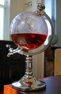
I’ve done maps as logos, maps as pipe cleaner art, and now this, which was a good gift from my sister:

It’s a globe! That dispenses booze! It’s perfect storage for carto-fuel for those late-night side projects. I wish we’d had this in the office back in grad school; we’d at least have looked a little stylish while imbibing all the liquor we kept there (either that or looked way more like alcoholics).
Tagged frivolous | 2 comments
By Andy Woodruff on 22 February 2009
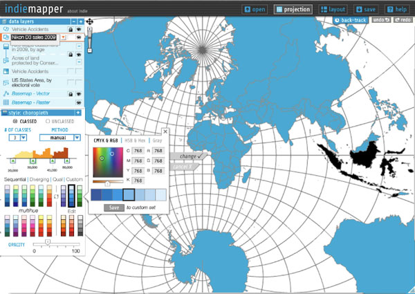
Over at Axis Maps we’ve recently put up a new site to announce a project that will be keeping us busy this spring. It’s called indiemapper.

Indiemapper grew out of a spare-time project that my esteemed colleague Zachary Forest Johnson and I began a little over a year ago in between beer breaks at the University of Wisconsin-Madison. Zach started playing around with loading and projecting shapefiles in Flash, and then I took an interest and joined in. Before long we were envisioning a web-based custom cartography tool, an alternative to the expensive and overly complex GIS that we were unhappily dependent on for making sweet printed or static maps. Zach’s “indiemaps” self-branding provided a name that quite nicely fit our idea.
Anyway, we never got far beyond experiments, and other priorities kept us from working on the project much. Last spring, with Zach’s blessing, the project—name, official Zach Johnson blue (#0099CC), and all—was handed over to Axis Maps. Now we’re finally kicking it off.
On the indiemapper site we’ve described it as “bring[ing] traditional cartography into the 21st century.” We’re recognizing that printed or otherwise static maps are still very much a part of the practice of cartography, but that the necessary tools for producing such maps are not keeping up with the advances in accessibility and ease of use that have been occurring with collaborative web mapping. (I must, of course, point to GeoCommons here.) When we only need to perform some basic cartographic operations to our data before diving into design work, GIS proves to be a costly headache. With indiemapper, we’re trying to create a much simpler and more satisfying middle step between data and map (or vector artwork). So if you’re a cartographer or ever find yourself acting as one, visit the site to see what it’s about and some early ideas, subscribe to our list to be notified of releases in the future, and keep an eye on the product blog to follow our thoughts and updates as we go.
Tagged axis maps | 3 comments
By Andy Woodruff on 17 February 2009
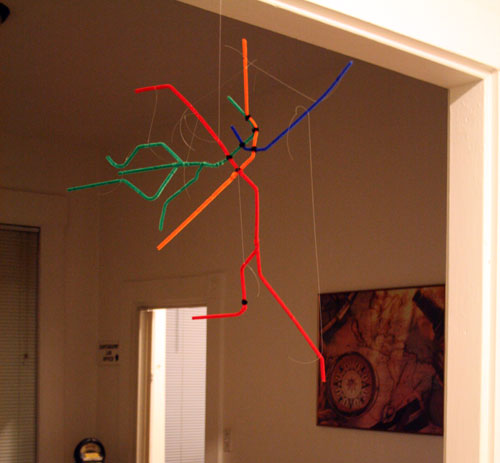
Speaking of metro maps, and in the continued absence of any interesting work to share, permit me this moment to mention a map I recently constructed as a gift: a map of the Boston subway system made of pipe cleaners, to be hung from a ceiling or wall.

Someone should manufacture this kind of thing using legitimate materials. I’d totally buy one.
For reference, here’s the actual Boston map. Ignore the thin purple (commuter rail) lines and the Silver Line, which—and I have nothing against bus rapid transit—is BS.

Tagged Boston, map projects, metro maps | 2 comments
