By Andy Woodruff on 3 September 2009
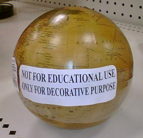
A small globe spotted for sale at Target the other day:

Apparently we’re allowed to just put warning labels on our maps instead of trying to make them, you know, accurate. Either that or this sphere has particularly sharp corners and is not safe for a classroom full of children.
Remember, bad maps kill! Cartographers, always protect yourselves with warning stickers! It’s not our fault if someone decides to use our maps!
Tagged bad maps, ethics | 3 comments
By Andy Woodruff on 30 August 2009
For the next effort from the cartographic sandbox in which I’ve been playing lately, let’s try something ridiculous again. Your typical map, particularly the modern online mashup, exists to show various data that share a common geography. For a change of pace, what about different geographies that share common data?
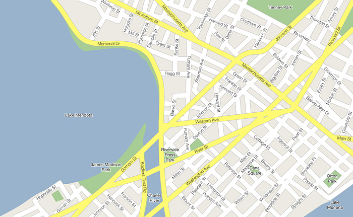
To claim to have actually thought about this as a mind-blowing inversion of data-physical space would be a rotten lie. But whatever the motivation, I considered the idea by taking the attribute “I lived in this spot,” found the two most recent geographies that match that attribute, and then combined them in a map with a Google-ish style. The result is a section of Madbridge, Wiscachusetts. (That’s Madison, Wisconsin and Cambridge, Massachusetts.)


There was deliberate selection of which pieces of each map to include, of course, but these parts of Madison and Cambridge play together rather nicely, as it turns out. Aye, the map’s a keeper for my scrapbook. But nobody besides me is interested in a combined map of the places I have lived.
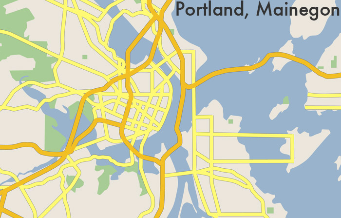
For a more general interest, I thought it might be fun to see what it would look like if different cities of the same name were combined. I tried my hand at a pair of Portlands. I didn’t label this one or include the minor streets because, well, screw that; making these maps can only amuse you for so long. Anyway, here is the city of Portland, Mainegon.


It’s a city marked by long and sometimes meandering bridges. One interesting thing is that even though in the eastern half I’ve pretty much maintained the Maine land and water, Oregon’s I-84 manages to follow an island-hopping route that is not entirely inconceivable. This I take as solid proof that such experiments in cartography are worthwhile and absolutely necessary, and that this city should be carved out and built somewhere.
Cities with the same name are just one way to go. There are or course many commonalities, at varying levels of detail, that link different places and upon which this kind of mapping could be based. And it could go well beyond street locations and physical geography. We could go beyond the map and combine the architecture, flora, and everything to invent complete hybrid places. Imagine the boundless, pointless possibilities!
I could swear I’ve seen somebody do something similar before, but I can’t remember where. Unless it was just in a dream. That is, a dream besides the glorious one I just had the other night as a result of working on this.
Tagged Boston, experiment, frivolous, madison | 4 comments
By Andy Woodruff on 21 August 2009
It seemed like time for another gin-soaked Thursday night map. A theme that’s been floating in my mind lately is mapping the names of things. My intention is to find gobs of data and look for geographic patterns in the names of streets, cities, etc. So here’s a simple start.
I grabbed a shapefile with some 41,000 cities and towns in the United States. It came from here, which I believe is a page hosted by the US Department of Acronyms.
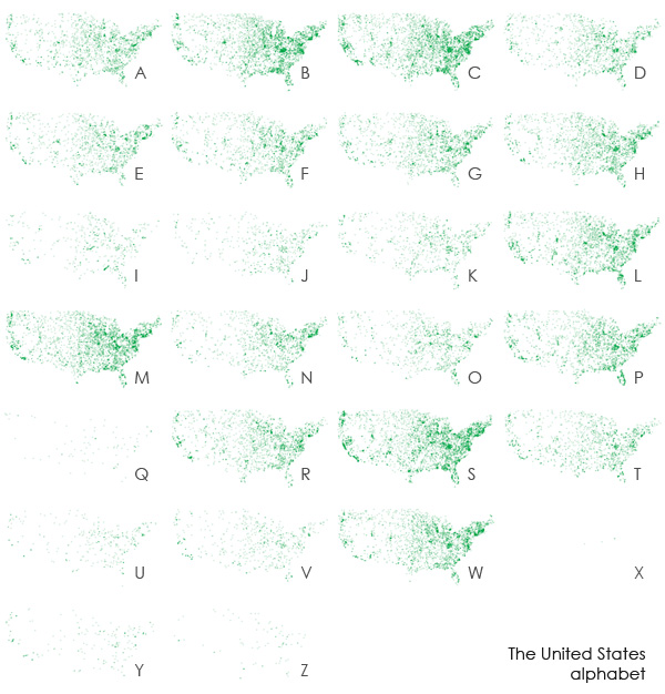
The easiest thing I could think to do was to map the distribution of places whose names begin with each letter of the alphabet. I also adjusted the transparency a bit according to population in an attempt to reveal stronger patterns. Observe:

Click the image for a larger size
Patterns? Well, I’m not sure. Nothing jumps out geographically, though clearly there are differences in the frequencies of letters. By the way, Alaska and Hawaii, you know I love you (Hawaii was my home once!), but you are so cartographically inconvenient. If I’d included those states, you’d see that Hawaii lights up for the letter K. Notice also that there seem to be only three place names beginning with the letter X. Special shout-out to the biggest one: Xenia, Ohio, the town next door to where I grew up and unfortunate repeat tornado victim.
The obvious question is, should we make a typeface out of this?

No, probably not.
Tagged place names | 5 comments
By Andy Woodruff on 19 August 2009

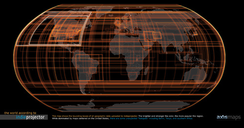
This is just a nudge in the direction of the indiemapper blog, where you can find out what the above image is all about. Even if you don’t care about the data we’re mapping there, I hope you’ll agree that our trusty Mark Harrower has designed a pretty nice look for it!
Tagged axis maps, indiemapper | Comments Off on Indiemapper’s warm glowing warming glow
By Andy Woodruff on 5 August 2009
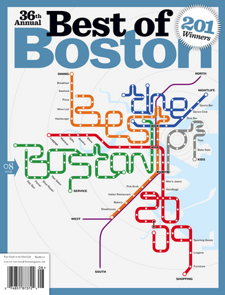
Still being enamored of subway maps, and either out of convenience or some sort of local bias that of the Boston system in particular (see for instance my pipe cleaner map or the “Tea Stop” menu), I nearly wet myself when I saw this magazine cover on newsstands.

The cover for Boston magazine’s annual Best of Boston issue is the Boston subway (“T”) map twisted to spell “the Best of Boston 2009,” with each line representing a category of the awards, and some of the stations labeled as subcategories, while still resembling the approximate geography of the subway system and the form of the official MBTA map. The “map” was done by designer Alex Camlin. See his portfolio entry, where he notes that this is actually modified a bit from the design he submitted. The Best Of article keeps up the theme, using a design incorporating elements of a fare ticket.
Inside the magazine, it is noted that Washingtonian magazine also used a subway map for the cover of its “best of” issue this summer (unfortunately hitting newsstands the same week as the deadly collision in June). This one maintains an unaltered form of the official Metro map. I can’t seem to find any larger images than the one below, so I don’t know what the labels say. Are they also award categories?

Anyway, awesome. Just sayin’.
Tagged Boston, metro maps, Washington | 2 comments
By Andy Woodruff on 30 July 2009

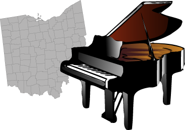
Last month, as I was driving through Ohio to collect my final three counties in the state, it dawned on me: There are 88 counties in this state. There are 88 keys on a piano. I don’t know anything about music, but holy crap, I have to make a map based on this coincidence.
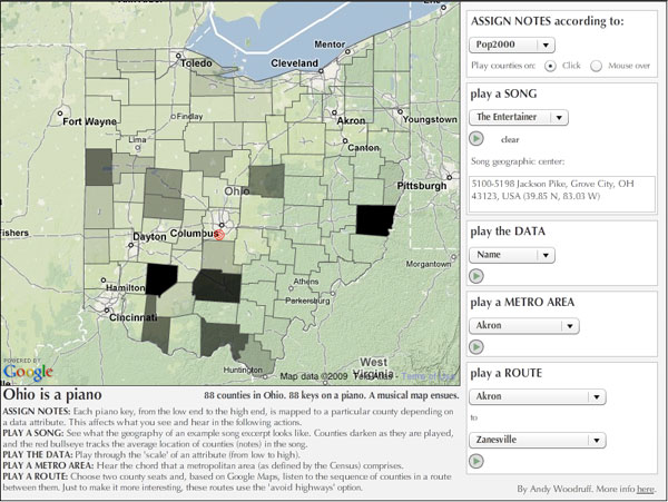
And so I did, bit by bit, gradually descending into madness in the process. It has no purpose, really, apart from being an experiment in some sort of weird artistic musical cartography. Ohio is a piano. Check it out. (It’s in Flash.)

The premise is simply that each of the 88 piano keys is assigned to a single Ohio county. How the keys are mapped to the counties depends on a specified data attribute: the notes and counties are ordered by that attribute and then linked to one another. For example, if the chosen attribute is population, the county with the lowest population is assigned the lowest-frequency piano key, the county with the highest population is assigned the highest-frequency piano key, and so on. The data I have here are a little out of date, but that doesn’t matter for demonstrating the idea.
There are many directions one could go from here. I have chosen a few ways to see the geography of music (songs) and hear the music of geography (data, metro areas, or sequences based on Google Maps routing).
In my experience, most of it sounds like crap, apart from the provided simplified bits of actual songs of course, although even those might sound wrong (but hey, blame the sheet music I found). (Update: Screw it, the Beethoven piece was too horribly out of key, so it’s gone.) But I would be very interested to hear if anyone discovers any patterns that sound decent.
What’s missing, of course, is the ability to compose your own geographic music, that is, bringing in your own songs, sequencing counties into songs, seeing the data and grouping it in different ways, making your own chords and routes, and so on. That and controlling the music from the piano as well as the map. Compositionally, for now you’re stuck with just moving the mouse over the map, but perhaps you can imagine how this concept could be turned into a full-fledged crazy musical cartography application.
A couple final caveats: 1) the piano sounds are exported from GarageBand and on the high end don’t seem to sound great, and 2) this little application is not at all idiot-proofed, so my apologies if you are an idiot. This is just a demonstration of a ridiculous concept; it’s hardly worth the effort to make it a well-designed, smoothly functioning application. For now, no stop buttons, nothing to keep you from playing a cacophony of all the options at once… go nuts, it’s kind of more fun anyway.
Cartographically speaking…
Sonification of data is reasonably commonplace: think metal detectors and Geiger counters. Representing spatial data using sound is a subject about which I know little, but it is an active research topic in cartography. Obviously what I have made here is necessarily an example of mapping with sound, although I don’t believe it to be especially useful for understanding data. It is, rather, artistic in intent, allowing one to hear the “music” of the data and geography (whatever that means) rather than actually explore the data values.
Many, if not most, endeavors in using sound for thematic maps will refer back to a 1994 article by John Krygier (my future undergraduate advisor at Ohio Wesleyan University) called Sound and Geographic Visualization. He has reprinted the article on his Making Maps site.

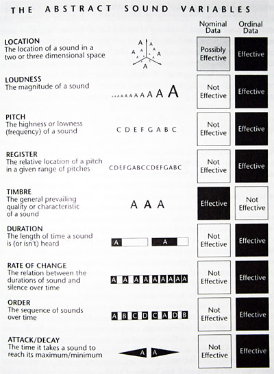
Krygier proposed explaining audio maps through a set of abstract sound variables (above, as reprinted in Alan MacEachren’s How Maps Work), analogous to Jacques Bertin’s graphic variables that are a basis for ordinary thematic mapping. Relative differences in these variables can be used to make data comparisons. Following the path from Krygier’s article will take you to a number of examples of further research or attempts to use sound to enhance or independently convey map data.
Using sound for thematic mapping has also been of interest to those seeking to assist blind or otherwise visually-impaired map users. The HCI folks at the University of Maryland, for example, have worked on software for that purpose. (And I believe I’ve seen Maryland names, such as the famous Ben Shneiderman, on more general articles about using sound to represent map data.)
Anyway, like I said, it’s not an area of my expertise. I’ll just stick to the impractical, wannabe artsy stuff.
Tagged frivolous, map projects, ohio, sound | 56 comments
