By Andy Woodruff on 18 November 2009
Only twenty more miles to Cleveland, where OH MY GOD A TRICERATOPS IS FIGHTING A T-REX!

The compass rose or north arrow on a map is an easy place for a cartographer to leave his or her artistic mark on a map, in the GIS era usually to laughable effect. Or for a more corporate production, it’s a good place to stick a logo. In the days when American road travel was a bit more of an exciting adventure than it is now, gas stations distributed some heavily-branded highway maps encouraging travel powered by their fuel. As I browsed through a few of these in my possession (acquired from items discarded by the Arthur Robinson Map Library over a couple of years), this lovely north arrow from a c. 1937 Sinclair road map of Ohio stood out as particularly amusing.
I don’t think this was ever Sinclair Oil’s actual logo—rather, it’s long been the still-familiar green apatosaurus—but the company has associated itself with dinosaur imagery in general. The map, by the way, was made by Rand McNally.
Tagged dinosaurs, north arrow, old maps | 3 comments
By Andy Woodruff on 12 November 2009
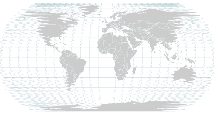
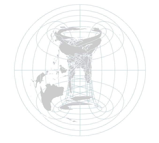
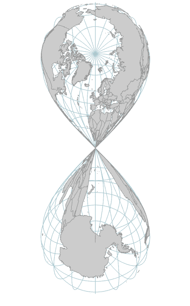
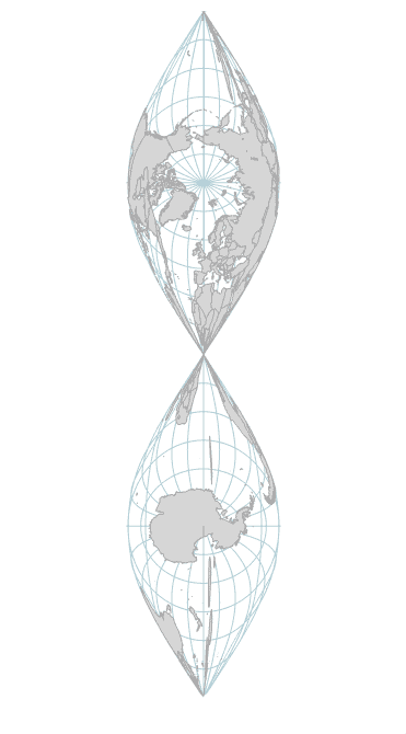
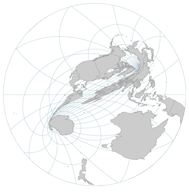
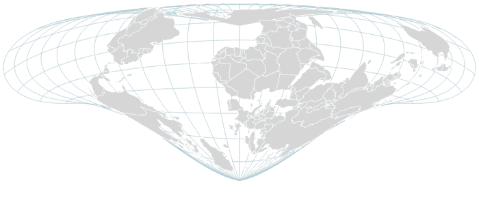
By accidental I of course mean deliberate. Same deal as before. Tweak a map projection formula a bit, and the results can be interesting.


Made with indiemapper. We’ll probably return the map projection code to normal before it’s released.
Tagged indiemapper, math, projections | 3 comments
By Andy Woodruff on 2 November 2009
Time for a follow-up on a my short post about typographic maps nearly a year and a half ago. Maps made up of type are, as the kids say, the bee’s knees. As typography- and map-based designs are rather popular in general, more of these typography maps crop up every so often. Here’s another short list of some more maps I have encountered since writing last year.
[Update: it’s gone now] typographymap.com has said “We’re launching soon” for two harvests now. I still don’t know what it is, but it’s kind of cool.

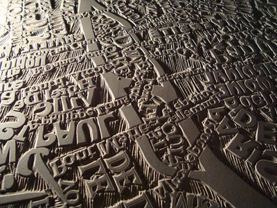
My earlier post mentioned Mark Andrew Webber and his linocut maps, but since then he’s worked on a large and amazing map of Paris, which you’ve probably seen by now. More like awesomecut.

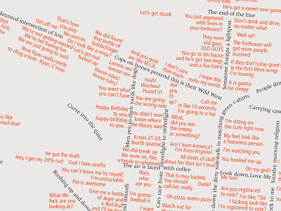
One of my favorite maps from the poster session at this years NACIS conference was Mouths Wide Open by Mike Boruta of Ohio University, mapping Athens, Ohio with things overheard around town as well as his own thoughts. With his permission, here is a larger section of the map. Mike, it must be noted, was the winner of the NACIS student poster competition for a different map, The Million Dollar Highway.

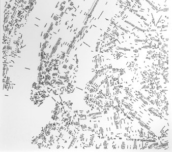
Hand-lettering is not typography of course, but we can be liberal here. Layla Curtis has several drawings of maps that consist, essentially, of labels. I think they are traced. On her site, look for them under Work->Drawings.

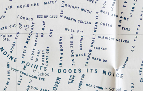
Portsmouth Vernacular by Jodie Silsby is a fabulous map of Portsmouth (UK) with the streets written as local slang phrases. Maps + typography + language? Yes, please!

Here’s a series of maps at Very Small Array showing the US with each state filled in by the most common location mentioned in craigslist “missed connections” posts.

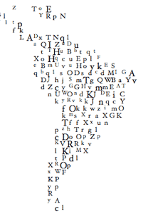
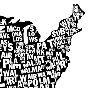
Finally, this is as much as I am willing to show of an unfinished project right now, but here’s a tiny preview of a map I have slowly been working on for a while. For now you’ll just have to take my word that everything besides white space in the image below is made up of type. [Update: it’s more than done now]

Tagged typography | 8 comments
By Andy Woodruff on 21 October 2009
What color is Harvard?
Don’t say something like “white,” smartass. But don’t say “crimson” just yet, either.
This being a blog about maps, I of course mean Harvard not as a school but as a geographic entity. What color is the landscape, physical and cultural? When people look around at whatever interests them, what colors are they looking at?
I came up with one way of answering that. Here’s my logic, if it makes sense:
- People take photos of what interests them.
- Photos typically contain colors.
- Flickr has many thousands of geotagged photos in the vicinity of Harvard.
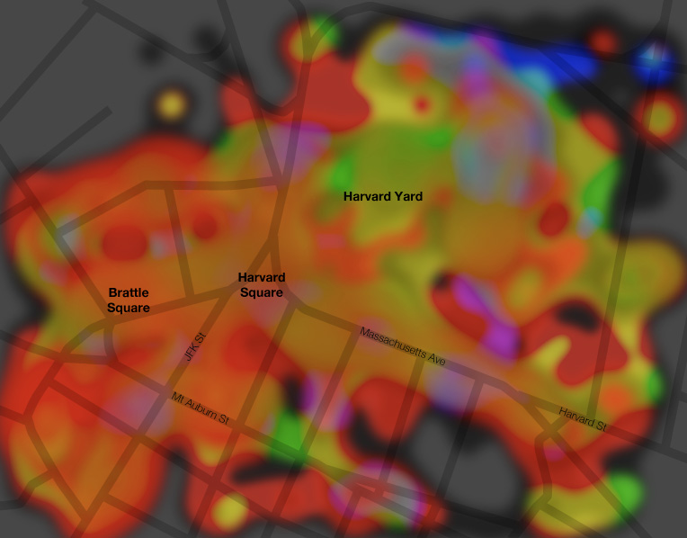
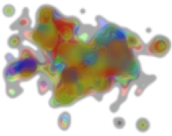
After a few API calls and some code and graphics work, I’ve got a map showing the colors of the physical-cultural landscape around Harvard Square. This is not simply a map of the colors on the ground, which you can get from an aerial photo or systematic documentation like Google Street View, but rather a map of the colors that people on the ground are looking at.

Turns out crimson may be about right, as there’s a lot of red here. But that has less to do with Harvard and more to do with the fact that there is a lot of brick around here. The grass and trees of Harvard Yard are doing all they can to turn the map green in that area and only coming up with something yellowish.
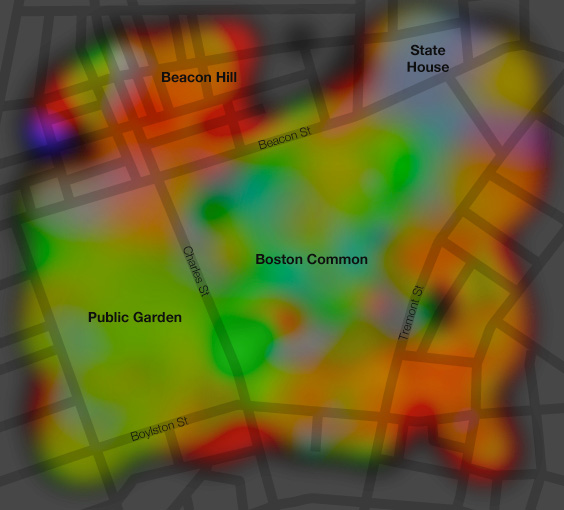
As with much of what I post here, Harvard Square is of course merely a convenient and familiar local cartographic test subject, being just up the street from my home. Here’s another one, Boston Common. Lots of green in the park areas, red and orange in the Beacon Hill neighborhood (bricks again), and kind of blue (sky?) around the state capitol building.

Anyway, WTF is going on here? Quite simply, I’ve grabbed about 2,000 photos in each location from Flickr, determined the dominant color in each, mapped those colors, and interpolated liberally. Here are some dirty details.
Flickr API
These maps are based on the most recent 2,000 or so photos uploaded to Flickr and geotagged within the specified bounding box. This is easily accomplished with the flickr.photos.search request. Now, it would be wonderful to make a silly little web app that draws these maps on the fly, but the next step makes it pretty impractical. That is downloading 2,000 images. Even at the “square” (75×75) size, it takes a while.
Dominant color
Here things are fudged a fair amount. I tried a number of ways of simplifying a photograph down to a single representative color. The most obvious option is to calculate the average color, that is, combine the average red, green, and blue values into one color. But too often that results in a dull grayish color because there is too much color variety in the image. Next I tried the color that appears most frequently. It was sometimes better but also frequently just some dark unsaturated color. Then I looked at histograms and combined the most common red, green, and blue values into a single color. That was hit-or-miss and often produced a color that was not representative of the image at all. After a few other attempts, I decided to simplify a lot: get the average color, but only be concerned with the hue; keep it saturated and fairly bright. As such the maps are showing much stronger colors than most photos actually contain, and they poorly represent the occasionally unsaturated photo, but this seemed like the best way to get a set of very general overall colors. Here’s an example of three basic color options, using one of my own photos of a lovely summer day in the Boston Common; the bottom green color seems most representative and is what I’m using on the map.

Mapping the colors
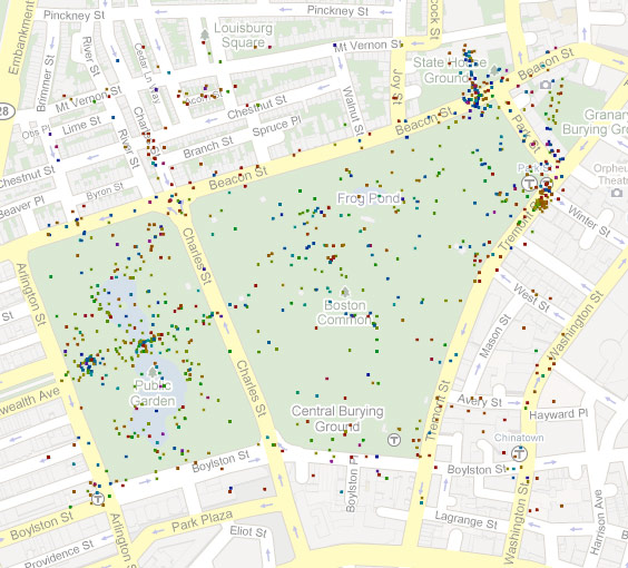
Easy. Just draw a little square at the location of each photo. Here’s the Boston Common.

Sometimes there are multiple photos tagged at the exact same location, however. This time I was lazy and did not take that into account, so the color displayed at such a point is simply that of the last photo to be loaded there. I decided it wasn’t too big a deal given the many other points on the map.
Interpolating
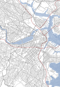
Both of these map extents have thousands upon thousands of geotagged photos within them, but the locations are not at all evenly distributed. To get something more than clustered dots, I employed an interpolation method known as “blurring the crap out of them in Photoshop.” Generally colors fade nicely into one another, but these maps do display some colors that are largely artifacts of the blurring. Still, it works pretty well. I’m sure everyone recognizes the image below as Boston, right? (A shiny nickel to anyone who can explain why Allston-Brighton is so strongly blue/purple, so that I don’t have to go over there and find out for myself.)

In conclusion, call this stuff a work in progress, as I’d like to pursue it further, maybe just because looking at trippy images is fun. There must be a lot of locations that would produce interesting maps. Suggestions?
Tagged color, flickr | 41 comments
By Andy Woodruff on 13 October 2009

I’ve recently returned from Sacramento after attending the 2009 conference of the North American Cartographic Information Society (NACIS), and I wish to briefly plug the organization here in case either of my readers is not already familiar with it.
If you work with maps, you should join NACIS and go to its meetings. Consider these facts:
- NACIS represents all sorts of cartography, and you will see some amazing maps and learn about lots of work that’s going on in the field.
- NACIS comprises all sorts of cartographers, and you will meet some all-around fantastic people and make useful contacts.
- NACIS offers some incentives for students, including several map awards and I believe one or two travel awards.
- NACIS not only accepts, but embraces and encourages your drinking habit.
- NACIS is a darn good time.
Except that an outbreak of swine flu among my friends apparently occurred, I had a blast this year and greatly enjoyed shaking many hands and talking (with varying coherence) to many people whom I hope to call friends and whom I very much look forward to seeing again next year or sooner.
Some quick highlights:
- Stamen Design’s Michal Migurski was the keynote speaker. I was thrilled to meet and chat a bit with Mike, whom I admire to a point just shy of having posters of him on my walls. He’s posted his talk on his site, so check it out. It was very good to see someone like him and a topic like his invited to NACIS, as I think the organization has hitherto been lacking in representatives of some important new trends in cartography.
- Natural Earth Vector was unveiled here by Nathaniel Vaughn Kelso and Tom Patterson. This project is, quite simply, a godsend to cartographers. It’s a big collection of geographic reference vector data designed by cartographers for cartographers (i.e., designed to look good at various scales). Keep an eye out; it’s due to be released soon.
- Cartographic Perspectives, the NACIS journal, was introduced in a new digital, open-access format. You can download the special issue (PDF). Also see the CP page on the NACIS site, where you can access archived issues.
- Another face that was good to see at a NACIS conference: a representative from Google! Andy Szybalski, the designer of Street View, spoke about the powers and limitations of combining immersive views with maps, and gave us a look at the evolution of Street View’s design. All told he seemed to be a hit with everyone and was a pleasure to meet.
- Of course I’m going to promote my own work here. We gentlemen proprietors of Axis Maps showed off indiemapper for the first time, and are getting ever closer to being able to launch this awesomeness. I’ll let the website do the advertising, but if anyone who was present at NACIS should happen by here and didn’t already give us an earful (or, um, suspects that the Axis end of the conversation may not have recalled it the next morning), we welcome your feedback! Hit me or anybody else at Axis Maps.
- There was a bathtub full of beer.
And there were many other excellent people to meet and things to see and hear, too numerous to list. So get in on this! Next year, St. Petersburg, Florida!

A note on the post title: somebody (I don’t remember who) characterized the group this way in the past, so it’s not just me saying it, although we who came up through UW-Madison have tried to be the standard-bearers.
Tagged conference, nacis | 3 comments
By Andy Woodruff on 22 September 2009
I’m rather late to this party, but it’s worth another mention.

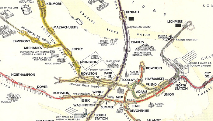
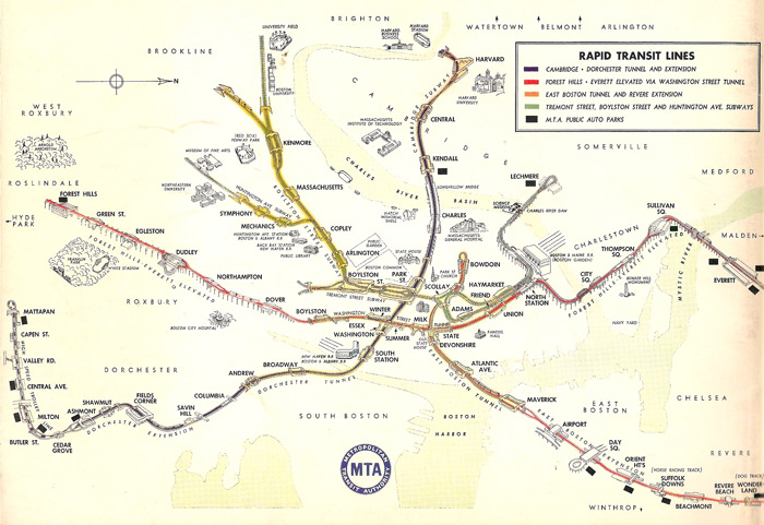
A while ago Vanshnookenraggen (a.k.a. Andrew Lynch) heroically pored over materials in the Massachusetts State Transportation Library and posted a bunch of images of old Boston transit maps to a Flickr set. (He’s got the future covered too with FutureMBTA, an excellent round-up of conceivable transit expansions in the Boston area, complete with system maps.) The most eye-catching of the historical maps is the one shown in part above: a map of the transit system, in what was determined to be 1954, drawn in something of a bird’s-eye perspective. Go to the Flickr image page and view it at its full extent and size. It’s worth looking even if you don’t care a whit about Boston and its transit system, which is fine because Boston doesn’t care about you either.
The map is of course interesting for historical reasons, showing the system as it existed fifty-five years ago before various expansions, severe realignments, station name changes, and new nomenclature and graphic standards. But any old map will show those things. This one is of a style that is unique among any subway maps I’ve encountered.
Pictorial bird’s-eye view maps have been around for a long time, most prominently as illustrations of cities and towns in the Renaissance era in Europe and the 19th century in North America. The Library of Congress has a phenomenal collection of the latter online, which, if you’re anything like me, is liable to consume you for hours and hours as you marvel at old depictions of the places you know today. I know a lot less about the history of these maps than I would like to, but some of the more accurately drawn ones must have represented an astounding amount of legwork on the ground.

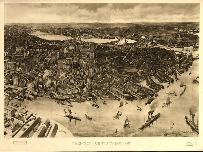
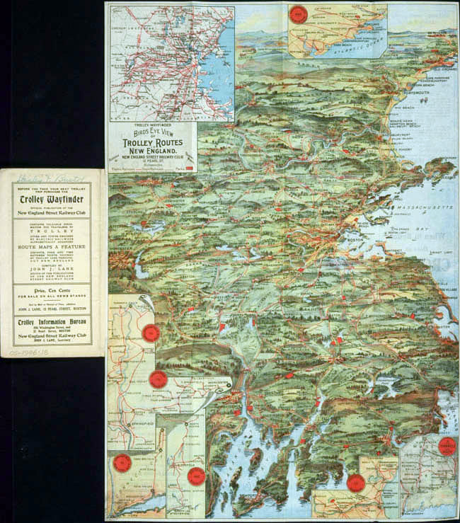
Those maps, I gather, were valued for their artistic worth and as some sort of advertising of cities and towns. Given that history, infrastructure seems like an unusual subject for bird’s-eye views. A few minutes of Googling only turned up two transportation-themed bird’s-eye views from 1909 and 1906, both at the Osher Map Library at the University of Southern Maine, where they’re listed among other Bird’s Eye Views of Maine. Scroll about two-thirds of the way down on that page for the transportation maps. Conveniently for this post, one of them includes Boston.

They are rather low-resolution scans, but at a glance the maps don’t appear to be designed wholly around the concept of a transportation map, but rather look more like traditional bird’s-eye views with transportation routes as an added theme. Note that the one posted above also contains insets from the vertical perspective, which presumably give a clearer picture of the network. Again my uneducated guess is that these bird’s-eye view maps were in some sense advertisements, making the systems look attractive to the trolley or railroad customers who might use them.
Back to the subway map. This map comes well after the era of popularity for city bird’s-eye views. Unlike the trolley and railroad maps above, and certainly unlike the whole-city maps, this one is clearly intended to be a map of the transit system only. I am curious what its exact purpose was. (And if anybody knows anybody who knows where some enthusiast has dedicated a web site to the history of Boston subway maps and graphics, hook me up with a link!) In my opinion this map is decent but not stellar as a usable system map, as it makes sacrifices on the two major (usually conflicting) points on which transit maps now seem to be judged: its geographic accuracy is not perfect and lacks enough detail to be of much use anyway, and its topology is discernible but hardly clear. It does sport an MTA (precursor to the modern MBTA) logo, but that doesn’t necessarily mean it was designed as the everyday system map. Its style reminds me of illustrated visitor maps of cities or tourist sites, which are usable but are meant as much for their image as for their use on—or here sometimes under—the ground. That said, the map does indicate parking lots and ignores most non-transit details, so it must have been intended for at least some practical use.

Useful or not, the map is a faded page of awesome. I especially get a kick out of the fact that the details of all the station and track layouts are illustrated. It’s more than I need to know—or not enough more, if that makes sense—as a rider, but I’m learning things from it that I haven’t yet from any wordy text. (“So that’s where that descending track goes at Boylston!”)
Tagged birds eye view, Boston, interesting maps, metro maps | 2 comments
