
This is a light brown dot
While sauntering down Memory Lane (i.e. file archives) this evening, I was amused by this presentation of several design alternatives for a bench icon on the University of Wisconsin Lakeshore Nature Preserve interactive map, so I thought I’d tell the internet.
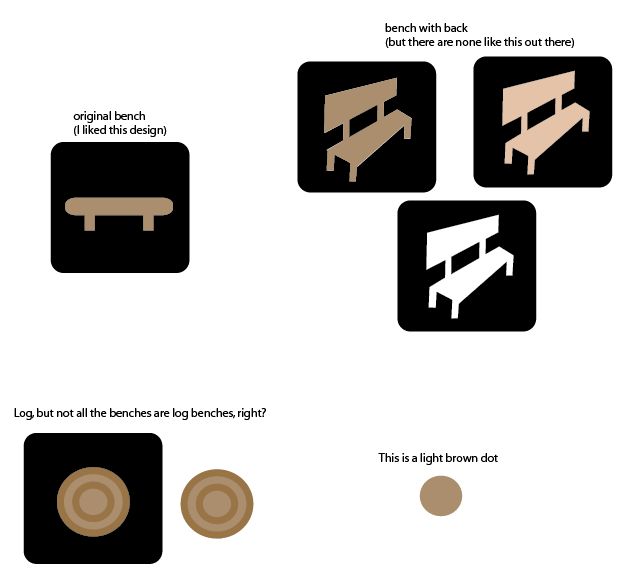
Light brown dot and badly drawn perspective aside, we were clearly going for a National Park Service look. So of course instead of anything like that we ended up with something else entirely.
Why this happened is beyond memory, but I kind of recall having something to do with benches and will take the blame. Believe, though, that we spent as much time on each of the zillion other features on the map, sometimes with better results. And this is how map design goes: endless scrutiny of every tiny detail.
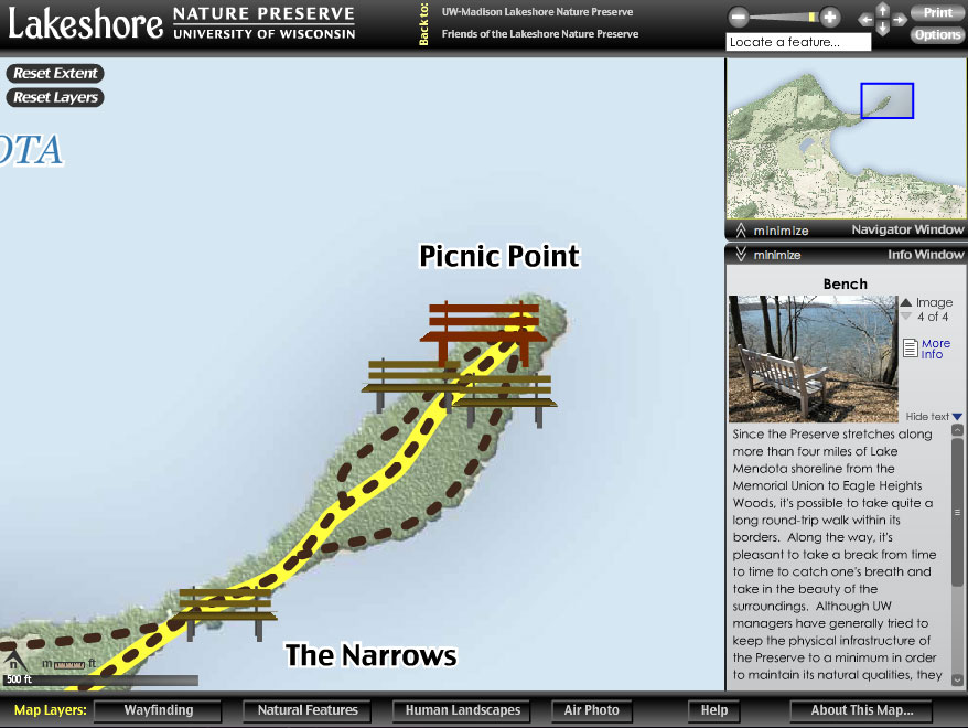
Check out the map to enjoy some fine 2006 Flash cartography. The project was completed in the University of Wisconsin Cartography Lab that summer. A paper (PDF from the Cartographic Perspectives archives)by Robert Roth and Mark Harrower contains a couple more fun design materials from the process, as well as (primarily) some usability lessons learned.
Tagged cart lab, icons, lakeshore nature preserve