The United States carto-alphabet

It seemed like time for another gin-soaked Thursday night map. A theme that’s been floating in my mind lately is mapping the names of things. My intention is to find gobs of data and look for geographic patterns in the names of streets, cities, etc. So here’s a simple start.

I grabbed a shapefile with some 41,000 cities and towns in the United States. It came from here, which I believe is a page hosted by the US Department of Acronyms.

The easiest thing I could think to do was to map the distribution of places whose names begin with each letter of the alphabet. I also adjusted the transparency a bit according to population in an attempt to reveal stronger patterns. Observe:

United States alphabet

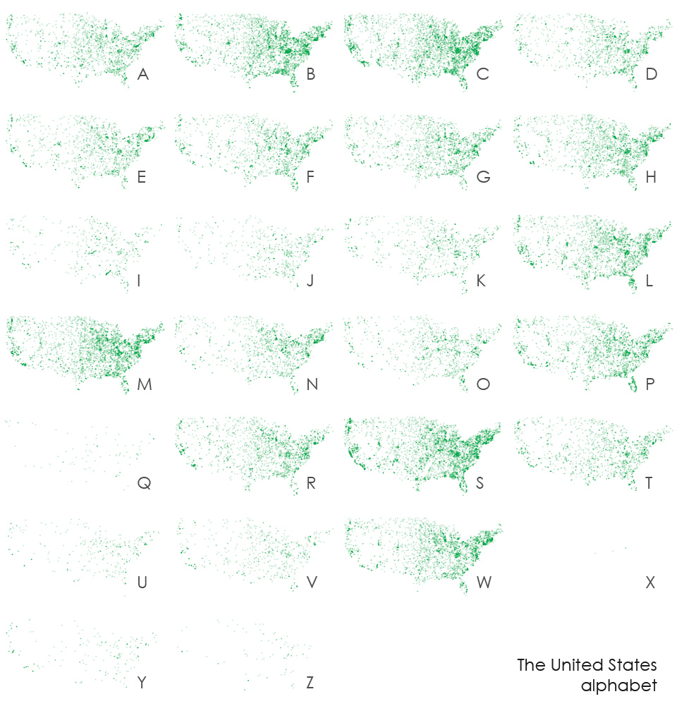
Click the image for a larger size

Patterns? Well, I’m not sure. Nothing jumps out geographically, though clearly there are differences in the frequencies of letters. By the way, Alaska and Hawaii, you know I love you (Hawaii was my home once!), but you are so cartographically inconvenient. If I’d included those states, you’d see that Hawaii lights up for the letter K. Notice also that there seem to be only three place names beginning with the letter X. Special shout-out to the biggest one: Xenia, Ohio, the town next door to where I grew up and unfortunate repeat tornado victim.

The obvious question is, should we make a typeface out of this?

US alphabet writing

No, probably not.

Tagged

5 Comments

  1. Very cool. The only real standout I can see here is with “N”, which appears to have more prevalence in the northeast. I would guess this has to do with all the places named “New ___”. Might be worth trying this same approach using “New”. And maybe “Old”?

    AJ
    21 August 2009 @ 2:20pm

  2. I’m not sure what to make of these maps. It would demand much greater analysis, but it’d be interesting to categorize the etymological origins of place-names, and then see the spatial patterning.

    But I do love the subtle changes to your blog design in the upper right, and the addition of the Twitter and RSS feeds. Shows growing maturity as a web designer.

    huge
    21 August 2009 @ 5:35pm

  3. It looks like the Cincinnati area shows up as a dark spot in many of the maps. Why would that be? Is there a high density of place names around there?

    Joe
    22 August 2009 @ 8:57pm

  4. Indeed, I noticed that area too. I think it’s Kentucky. A really quick glance at the data indicated more than 2,000 place names in Kentucky, compared to, say, neighboring Ohio with less than a thousand. Seems for some reason there are just a lot of place names. Many small towns, perhaps? (In these maps, towns with population as low as 5,000 are 67% opaque.)

    Andy Woodruff
    24 August 2009 @ 1:52pm

  5. Have you thought about colour coding the different letters and then layering them on top of each other – this would be purely for aesthetic effect….

    Dale
    14 September 2009 @ 8:13am