Mapping Flickr colors again. Better late than never.

About two years ago I picked up small side project that involved messing with geotagged Flickr photos to generate maps of the photographed colors of a landscape, and I liked the idea so much that I vowed to keep it up. So I did. With a short two year break in the middle.

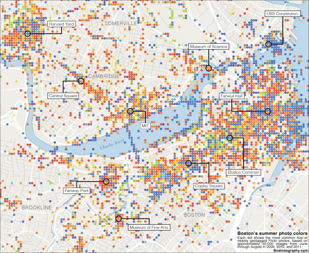
Boston summer photo colors map

I came back to it for the above map, which was done as a feature in the Ideas section of this past Sunday’s Boston Globe. I’d post a link, but after a day or so external links are redirected to some stupid archived text-only version. It’s the second newspaper map to come from the Bostonography blog that Tim Wallace and I write. (See Tim’s Radio Rivalry map.) That’s enough plugging, and I’ll leave the map interpretation talk for my post on Bostonography. Instead let’s get nerdy here.

To recap, the idea in a nutshell is to map the dominant colors of Flickr photos located in places across the map. I had hoped to come up with better ways of doing this than last time, but although I got a bit smarter about the data collection, the overall methods didn’t change much. I’m very interested in any ideas for this sort of map (you know, for when I do it again in 2013), so allow me to explain what I did and where some questions lie, in two stages.

Finding dominant colors

This is tricky, and I have yet to track down easy solutions. There are two obvious tracks at first:

  • Calculate the average color by going over every pixel to come up with average red, green, and blue values, then combining the average of those channels to get the result. I tried this in 2009 when I was young and naïve, and quickly learned that the average color of an ordinary photograph almost always turns out to be something slightly brown, dull, and unsaturated. Unless the photo is almost entirely one color, the average color is not representative of the photo.
  • Find the most common color of a photograph, which is even easier. This is usually a little better but still isn’t great. The most common color is often not the one that sticks out; rather it’s probably something dark and shadowy. Below is a comparison of this and the previous method, in an example from the old blog post.

Methods of calculating dominant color

In the original maps, as you can see above, I ended up deciding to discard all saturation and brightness information and only look at color hue. It was the best way I found to get something that was sort of representative but wasn’t consistently dull and dark. The drawbacks are that colors are exaggerated and it misses out entirely on something like a white, snowy scene. In the old maps I calculated the average color and then mapped its hue at full saturation and brightness. In the new map I looked only at hue to begin with and went with the mode, calculating the most common hue for a given photo or location. I took it a step further by ignoring any especially light or dark and unsaturated pixels.

There have got to be better ways to do this! Any wisdom, internet?

Displaying colors on a map

Last time I simply plotted each photo on the map as a colored point, then “blurred the crap out of it” to get something surface-like. It was quick and dirty, not accounting for overlapping points that obscure one another and excessively interpolating areas on the map. This time I kept it a little more accurate by doing everything based on a grid. For each grid cell I found the most common hue of pixels in photos contained in the cell. Each dot represents one of those cells. I show circles rather than solid squares because, well, it ended up looking a lot nicer. So there’s no interpolation this time, only generalizations due to aggregation. And I think I prefer the results aesthetically.

I’d love to find a clever way to do two things here:

  • Show proportions of many colors, not just the one most common color. The supposed dominant color is interesting, but it isn’t the whole story of the colors of the photo-landscape. Fernanda Viégas and Martin Wattenberg did this brilliantly with Flickr Flow, but that can’t show any spatial variation. Is there a way to apply that concept to a map?
  • Show temporal variation, something also covered by Viégas and Wattenberg. Assuming that many photos are taken outdoors, predominant colors are going to change over the course of a year in a place like Boston which has four distinct seasons. There are some obvious answers to this challenge, but it would be great to come up with something novel and interesting.

The conceptually easy answer to both of those is interactivity, although it would mean a lot of data and/or on-the-fly number crunching. But I don’t know… sometimes interactivity feels like the easy way out. Hit me with some ingenious ideas!

Tagged , ,

11 Comments

  1. I don’t know for the “temporal variation” but what do you think about concentric circles?

    It seems you need to have at least 3 colors on each dot to identify one to another.

    What may works (it works in my head at least:)) :
    + Divide your picture in three parts.
    + Compute the blurred color for each part.
    + Create a dot composed by 3 concentric circles using color 1, 2 and 3.

    Then you obtain a map full of color (indeed) but each dot is unique and closer to the original picture colors.

    Laurent V.
    8 September 2011 @ 10:21am

  2. Have you tried computing averages in a perceptually more uniform space like hsv or (better) hcl? I’d think that would improve the mean colour substantially.

    Display more colours at each location seems like an interesting challenge – I wonder if you could do something like clustering all pixel colours in a few clusters (4? 10?) and then computing the average colour for each cluster. You’d then need to weight the display of each colour by the number of pixels in that cluster. Could be fun! (And I could easily bash out some R code to do it if you were interested)

    Hadley Wickham
    8 September 2011 @ 8:08pm

  3. Just gave it a whirl and it seems to work pretty well.

    Hadley Wickham
    8 September 2011 @ 8:48pm

  4. Hadley, sounds interesting but I can’t quite picture what you mean. Would love to see an example!

    Andy Woodruff
    12 September 2011 @ 10:13am

  5. Sure thing. Super super simple output at http://dl.dropbox.com/u/41902/colour-clusters/index.html – I grabbed 5 pictures of the flickr interesting stream, clustered each picture into 10 colours, and then displayed the average colour of each cluster sized by how many points were in each cluster (ordered by hue). Quick and dirty code is at http://dl.dropbox.com/u/41902/colour-clusters/explore.r.

    The average colours don’t look quite right – they seem a bit washed out to my eye. Don’t know if this is some sort of optical illusion, a problem with the clustering, or a problem with the perceptual colour space that I’m using.

    Hadley Wickham
    12 September 2011 @ 12:14pm

  6. Average colours look much better now – was using polarLUV instead of LUV, so means didn’t work right.

    Hadley Wickham
    12 September 2011 @ 12:25pm

  7. Thanks very much! I’ll check it out and do my best to understand how it works.

    Andy Woodruff
    12 September 2011 @ 9:02pm

  8. Awesome map concept, for starters…definitely going to follow your future projects.

    One thought that popped into my head is tiny pie charts for each photo location, with colored slices representing the proportion of pixels in each color range. Just requires a little remapping of RGB values to the ROYGBIV color spectrum and it could make for an even more informative map.

    Barry Fradkin
    19 September 2011 @ 11:50pm

  9. Q1- about what size is each dot/the grid you used?
    Q2- how did you automate the process of querying individual photos to get the average hue? (what language/main function achieves this – I’m looking for pointers on somewhere to start)

    The map looks great- personally I think that showing more colours on each dot would confuse the issue and mess up the map

    Wade
    11 November 2011 @ 4:11am

  10. Wade, in answer to the first question, the dot size was an arbitrary number that looked about right, and I never did actually measure the size on the ground. Looks like maybe a bit more than 100 feet across.

    For question 2, the short story of my sloppy process is this:

    A list of photos with thumbnail URLs and locations was generated by querying the Flickr API in a PHP script. It was formatted as some kind of tab-delimited file and the load was loaded into Flash. Flash then loaded those thumbnails one by one, did the pixel-by-pixel calculations, and rendered the dots. I’d run the thing and watch for half an hour as the dots appeared and changed colors while the photos were being processed.

    To get the actual hues, I used Flash’s BitmapData class to get a hex color value for each pixel, then somebody’s class that can extract a hue (0-360) from that. There was some two-dimensional array representing the grid, and each cell recorded a count of the number of pixels for each integer hue from 0-360. So for each photo, it would figure out the correct grid cell (based on whatever that cell size was), then go through each pixel, find its hue, and add to that hue’s count in the cell. Eventually, of course, the dots were drawn for each cell according to the hue in that cell that had the highest count. Very light or dark pixels were discarded, by the way.

    Andy Woodruff
    14 November 2011 @ 3:13pm

  11. Nice idea & realisation. Reshared on my blog. Cheers.

    Pawel
    28 February 2012 @ 1:28pm