
Charts in the landscape
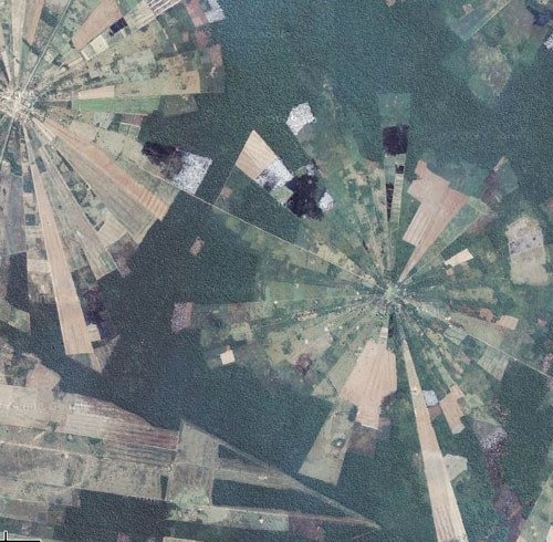
A couple of weeks ago Nathaniel Kelso tweeted a link to an interesting Bolivian land use pattern seen in Google Maps. First thing that popped into my nerd brain: polar area diagram!
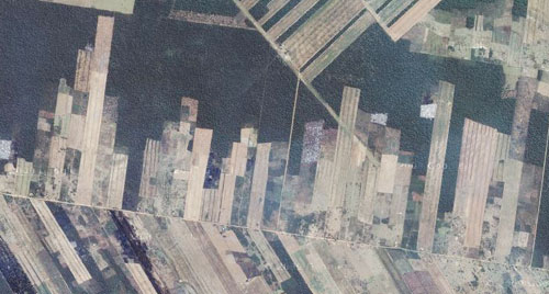
There are also some (possibly stacked) bar charts nearby.
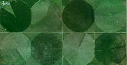
Over in the United States are some ordinary pie charts. Poor contrast among those colors, though!
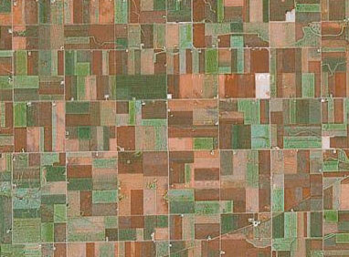
Much of the rural U.S. is a big treemap, of course.
There must be a whole world of statistical graphics out there. Anybody have more examples?
Tagged aerial, charts, google maps
7 Comments