
A legend in its time
Robert Roth—PhD candidate at Penn State, incoming faculty at the UW-Madison Department of Geography, and infamous county collector—recently alerted me to a nice interactive, animated map that he worked on with a couple of his students, Matt Murdock and Nick Maziekas. It’s called BOOMsys and it shows the location and number of IED attacks in Iraq over the course of a year. Get into it with the GeoVISTA Center news article.
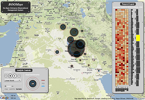
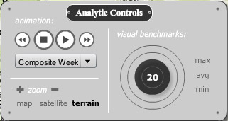
Apart from the subject matter, there are several interesting things about the controls and functionality, but what caught my attention most was the temporal legend, shown in a bit more detail below.
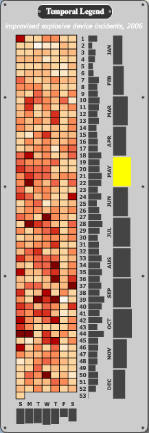
It shows the number of incidents for every day (colored squares), week (first column of bars), and month (second column of bars) of the year, as well as composite totals for each day of the week (at the bottom). So much data in a single, relatively simple display!
It’s not merely a chart, of course. It’s fully interactive, allowing the user to probe for number values and click on any part of it to make the map display data for a particular day, week, or month. You can also play the animation across any of the units. Playing through a composite week is an example of temporal re-expression (about two-thirds of the way down the page in that link), a powerful way of viewing temporal data in composite slices instead of normal linear time.
The legend here is an adaptation of the “Reruns” view from former GeoVISTA researcher Chris Weaver’s Improvise software, in this case designed specifically for a year of daily data. In a more open visualization environment, it would allow for user-defined views of cyclical time.

I don’t know exactly how revolutionary this kind of control is in high-end visualization, but it’s really nice to see it accomplished so clearly in a more accessible interactive web map meant for public consumption.
Tagged animation, geovista, legends, temporal data
1 Comment